Warm and Cool Colors in Landscape Painting
Learn how warm and cool color relationships shape the mood of a landscape. Discover simple palette tricks to shift temperature and depth.

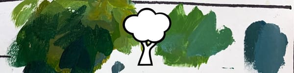
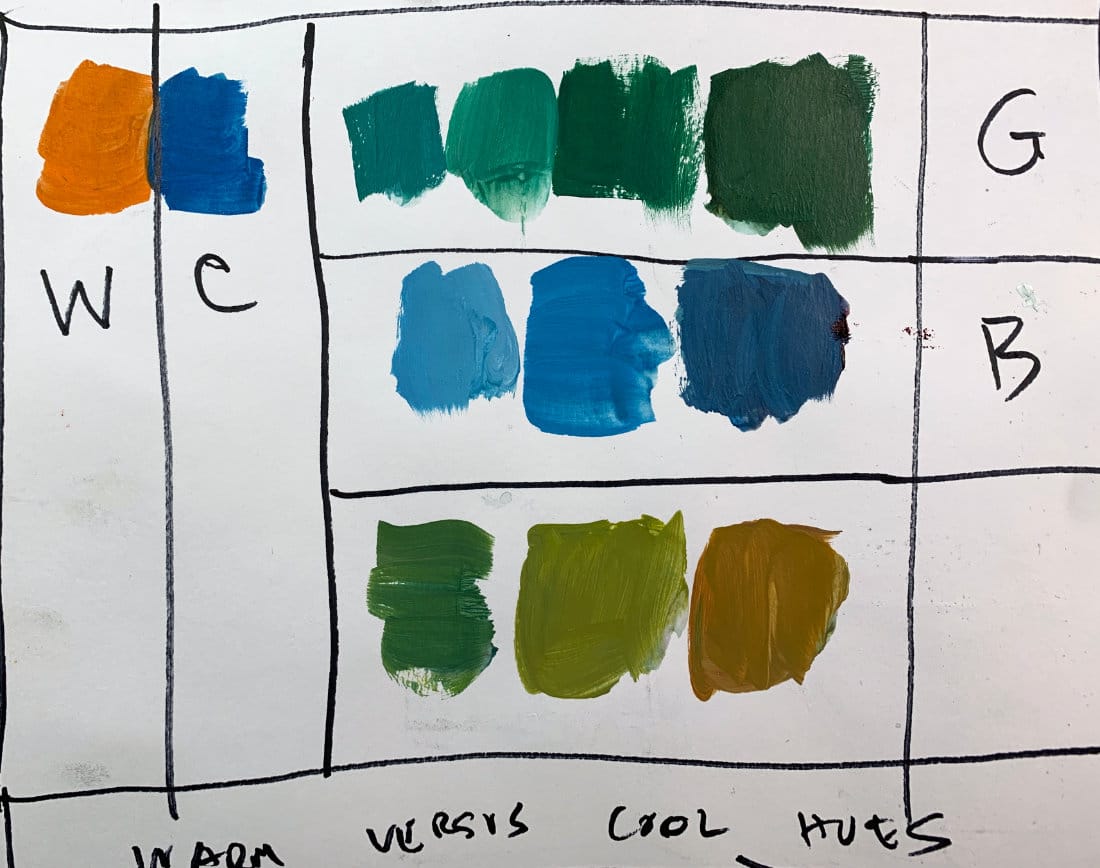
Color temperature can completely change how your landscapes feel. A color isn’t automatically warm or cool on its own — it’s all about comparison. In this lesson, I’ll show how side-by-side color relationships shift the temperature and mood of a painting using simple green, blue, and orange swatches.
This lesson is part of the Acrylic Landscape Painting Fundamentals Course.
Understanding Color Temperature
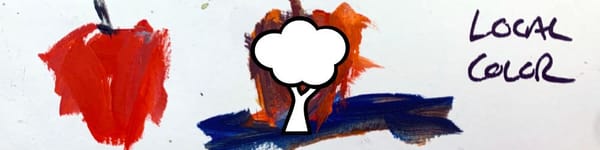
Orange naturally reads as warm, blue as cool — but temperature is relative. When you place them next to each other, both colors react. Push the mix slightly, and their relationship flips.
Practical Mixing Demo
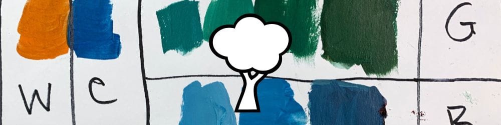
- Warm Green vs Cool Green: Add yellow ochre to warm a green, or white/blue to cool it down.
- Warm Blue vs Cool Blue: Add red or orange for a warmer blue; add white or alizarin crimson for a cooler tone.
- Relative Judgment: Cover one swatch and the other instantly changes character. Temperature only exists in context.
Key Takeaways
- Every hue has both warm and cool variations.
- Temperature is determined by nearby colors.
- Test your palette with simple side-by-side swatches.
- Don’t chase formulas — rely on perception and relationships.
Course Navigation
Previous Lesson: Master's Analysis for Lighting Conditions
Next Lesson: Chroma, Saturation & Intensity
Visit the Acrylic Landscape Painting Hub for all resources.
Learn & Improve Your Acrylic Skills
- Acrylic Hub– Your go-to guide for tutorials, tips, and resources.
- Ultimate Beginner Acrylic Course - Start painting with confidence.
- Subscribe for More Great Content - Get tutorials, tips, and updates straight to your inbox.
- Follow Me on Pinterest - Daily inspiration, tips, and fresh ideas.
Recommended Acrylic Painting Materials
-
Princeton Catalyst Brushes – Flats (#6, #12), Rounds (#4, #8), Fan (#4), Liner Brush
Durable synthetic bristles for versatile acrylic techniques -
Liquitex Heavy Body Acrylic Paint – Essential Colors
Cadmium Yellow, Yellow Ochre, Alizarin Crimson, Cadmium Red Light, Ultramarine Blue, Cobalt Blue, Burnt Sienna, Titanium White -
Winsor & Newton Cotton Canvas
Reliable stretched canvas for studio and plein air work -
Strathmore 400 Series Mixed Media Paper
Heavyweight, acid-free paper for acrylic and mixed media -
Fabriano Artistico 140lb Cold Press Paper
Excellent for acrylic, mixed media, and textured effects -
Blick Multi-Colored Painting Knife Set
Variety of shapes for texture, scraping, and bold strokes - Miscellaneous: Two pint-sized water containers, paper towels (from Home Depot or Walmart)
- Note: I use canvas or sturdy cardboard as my palette — no store-bought palettes needed.