Demystifying Color Intensity, Saturation, and Chroma for Acrylics
Unraveling color intensity, saturation, and chroma is essential for any acrylic painter. Delve into these terms to understand their meanings.


Unraveling the mysteries of color intensity, saturation, and chroma is essential for any acrylic painter. In this beginner-friendly blog article, we delve into these terms to understand their meanings, similarities, and how they can be effectively utilized in your artwork.
Understanding Color Intensity, Saturation, and Chroma: Explained
Here is a list of key ideas shared in the video demonstration. Read through them as a reminder of what you learned so that these facts stick!
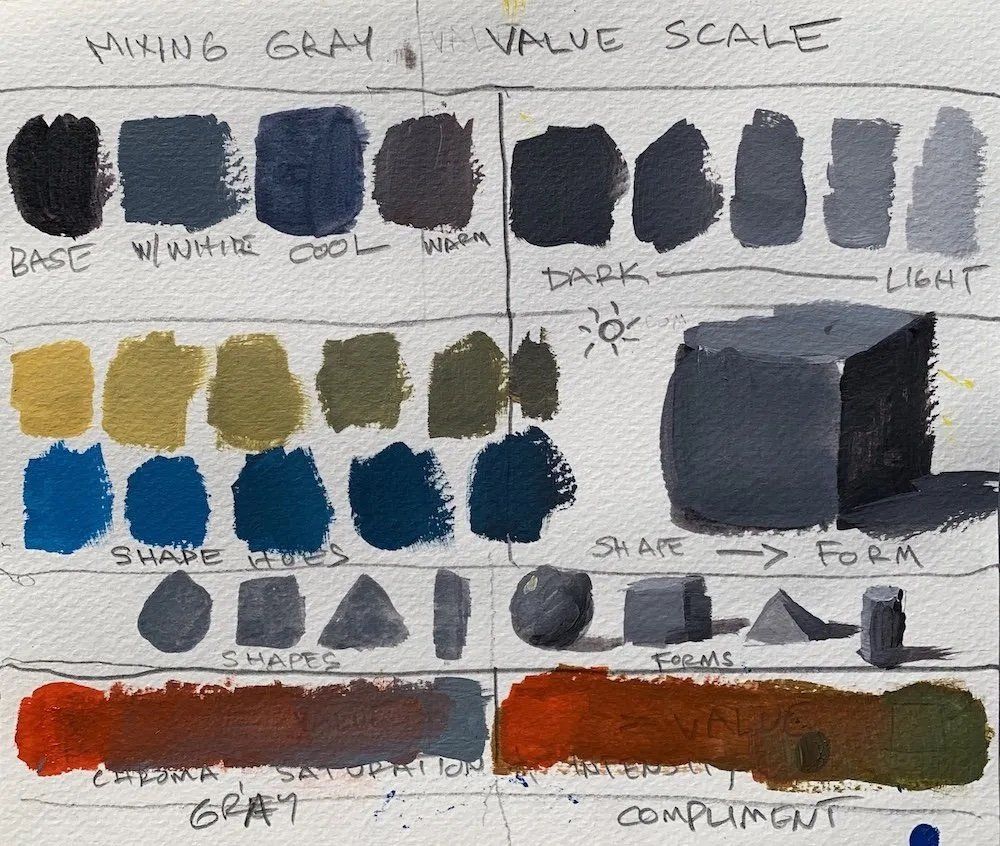
- Exploring Color Saturation, Intensity, and Chroma: Gain clarity on these concepts and discover any potential differences between them. Understanding their significance will enhance your learning experience and artistic journey.
- Debunking the Differences: Uncover the truth that color saturation, intensity, and chroma are interchangeable terms. They represent the purity of a hue directly from the tube or its degree of mixing with other colors.
- Techniques to Reduce Color Intensity, Chroma, and Saturation: Explore various methods to achieve this effect. Whether through the use of complementary hues or by mixing with other colors, you can successfully diminish the vibrancy and saturation of a hue.
- High Chroma, Low Chroma, and Saturation: Gain insights into these terms and their significance. High chroma refers to vibrant, saturated paintings, while low chroma signifies desaturated hues with reduced intensity.
Hopefully you have a better understanding of color intensity, saturation, and chroma, enabling you to confidently incorporate these concepts into your acrylic paintings. Now you can discuss these topics with more clarity and confidence as you continue to master the art of manipulating color in captivating ways.
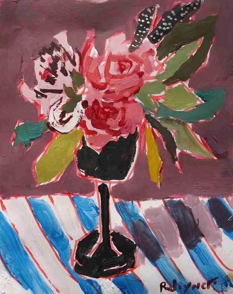
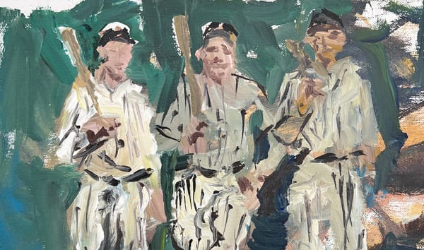
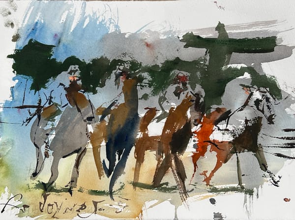
Exploring Painting Examples: Understanding Low Chroma, Desaturated, and Less Intense Artworks
In the world of art, the concept of chroma and saturation plays a crucial role in defining the intensity and vibrancy of a painting. In this article, we delve into the realm of low chroma artworks, where colors are intentionally desaturated and subdued.
Through visual examples, we examine the reasons behind the reduced intensity in these paintings. Discover the techniques and artistic choices employed by artists to achieve a low chroma effect, as well as the impact it creates on the overall composition.
By exploring these painting examples, you’ll gain insights into the subtleties of color manipulation and how it can evoke different moods and visual experiences. Whether you’re an art enthusiast or a fellow artist, join us on this journey of understanding low chroma and the artistry behind creating desaturated, less intense paintings.
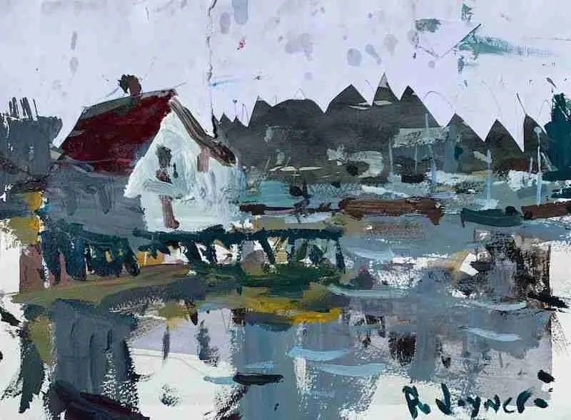
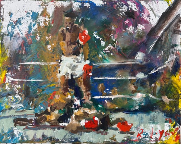
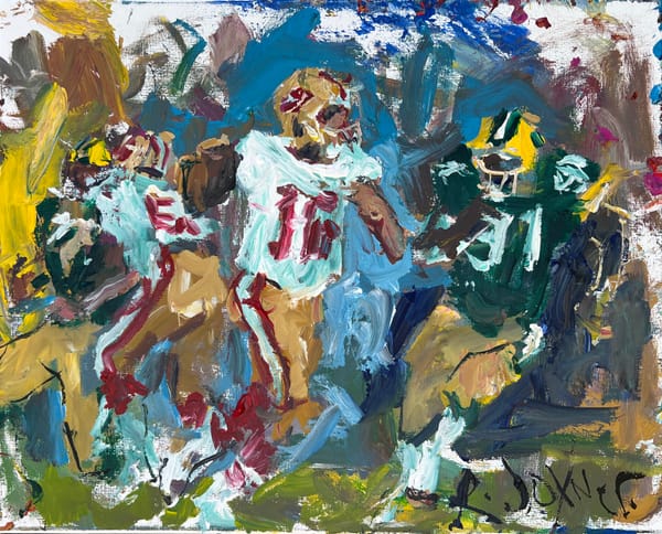
Decoding High Chroma: Exploring Intense, Saturated, and Vibrant Artworks
Delve into the world of high chroma paintings, where colors come alive with intensity and vibrancy. In this article, we unravel the secrets behind a captivating artwork that exudes saturation and a sense of heightened chroma.
Through careful analysis and visual examination, we uncover the reasons why this particular painting is considered intense, saturated, and high in chroma. Explore the techniques employed by artists to achieve such vividness, and discover the impact it creates on the viewer.
Join us on this journey of understanding the nuances of high chroma, as we delve into the artistic choices, color theories, and compositional elements that contribute to the captivating allure of intense and saturated artworks.
Whether you’re an art enthusiast or an aspiring artist seeking inspiration, this exploration of high chroma will deepen your understanding of color and its expressive potential in the realm of visual art.