Understanding Hues Versus Colors in Acrylic Painting
Learn how hue defines a color’s family and why that distinction helps create harmony and depth in acrylic landscape painting.

When artists talk about hue, they’re referring to the color family a pigment belongs to — red, blue, yellow, green, and so on. It’s the “pure” identity of a color before you start changing it with mixing, tinting, or muting. In this short lesson, I show how small shifts in hue can move a color from red to orange, or from green to blue, and why that matters when building a cohesive palette.
This lesson is part of the Acrylic Landscape Painting Fundamentals Course.
What Hue Actually Means
Hue and color are often used interchangeably, but hue focuses specifically on the type of color — the family it belongs to. For example, a red, a red-orange, and an orange all live within the same neighborhood of hues, even though they’re slightly different.
Think of hue as the base identity of a color before you adjust its saturation, value, or temperature.
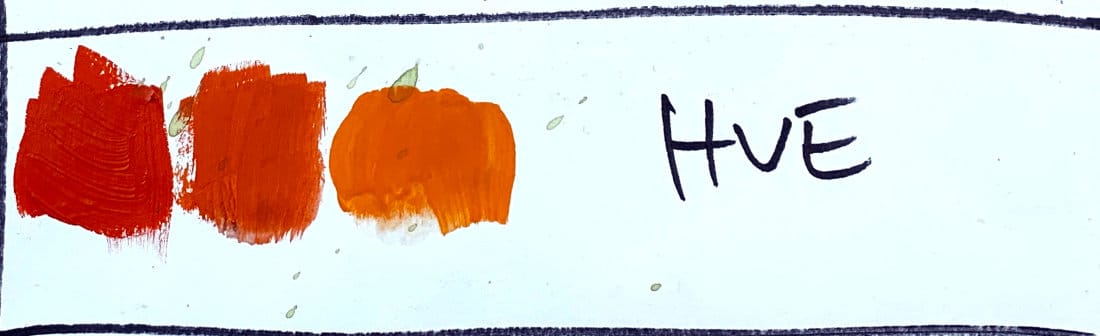
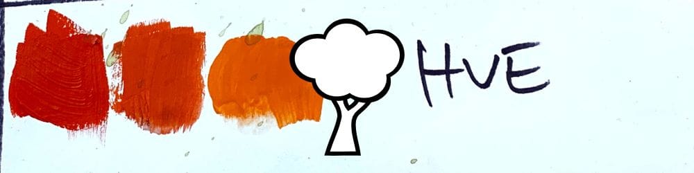
The Hue Demo
In the video, I lay down several swatches of paint starting with red, then a red-orange, and finally a pure orange. Each still belongs to the same family, but with subtle shifts that move along the color wheel.
You can do the same with any color:
- Blue to blue-green
- Green to yellow-green
- Orange to red-orange
As long as it stays within that range, you’re still within the same hue family.
Why This Matters in Landscape Painting
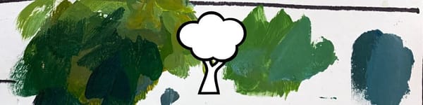
Understanding hue helps you mix natural color transitions in your landscapes — for example, moving from warm earthy reds to cooler yellow-greens in foliage, or from intense blue skies to muted blue-grays in the distance. Recognizing those shifts gives your painting more harmony and depth.
Key Takeaways
- Hue defines the color family (red, blue, green, etc.).
- You can shift hue without changing value or intensity.
- Hue relationships help you create harmony across a palette.
- Every color you mix can be traced back to a base hue.
Course Navigation
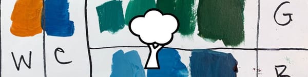
Previous Lesson: Understanding Color Intensity, Saturation & Chroma
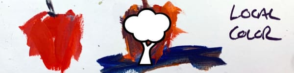
Next Lesson: Local Color in Landscape Painting
Acrylic Landscape Painting Hub - view all lessons
Learn & Improve Your Acrylic Skills
- Acrylic Hub– Your go-to guide for tutorials, tips, and resources.
- Ultimate Beginner Acrylic Course - Start painting with confidence.
- Subscribe for More Great Content - Get tutorials, tips, and updates straight to your inbox.
- Follow Me on Pinterest - Daily inspiration, tips, and fresh ideas.
Recommended Acrylic Painting Materials
-
Princeton Catalyst Brushes – Flats (#6, #12), Rounds (#4, #8), Fan (#4), Liner Brush
Durable synthetic bristles for versatile acrylic techniques -
Liquitex Heavy Body Acrylic Paint – Essential Colors
Cadmium Yellow, Yellow Ochre, Alizarin Crimson, Cadmium Red Light, Ultramarine Blue, Cobalt Blue, Burnt Sienna, Titanium White -
Winsor & Newton Cotton Canvas
Reliable stretched canvas for studio and plein air work -
Strathmore 400 Series Mixed Media Paper
Heavyweight, acid-free paper for acrylic and mixed media -
Fabriano Artistico 140lb Cold Press Paper
Excellent for acrylic, mixed media, and textured effects -
Blick Multi-Colored Painting Knife Set
Variety of shapes for texture, scraping, and bold strokes - Miscellaneous: Two pint-sized water containers, paper towels (from Home Depot or Walmart)
- Note: I use canvas or sturdy cardboard as my palette — no store-bought palettes needed.