The Color Choices That Actually Matter in Expressive Painting
I used to spend twenty minutes arranging my palette and planning 'harmonious schemes' before ever touching brush to canvas. Then everything changed when I stopped choosing colors and started responding to them.

Traditional color theory has its place - I certainly went that route when I started. Complementary colors, analogous schemes, all those textbook approaches work fine for color harmony. But as you advance and get more skilled, there are other options that can take your expressive painting much further.
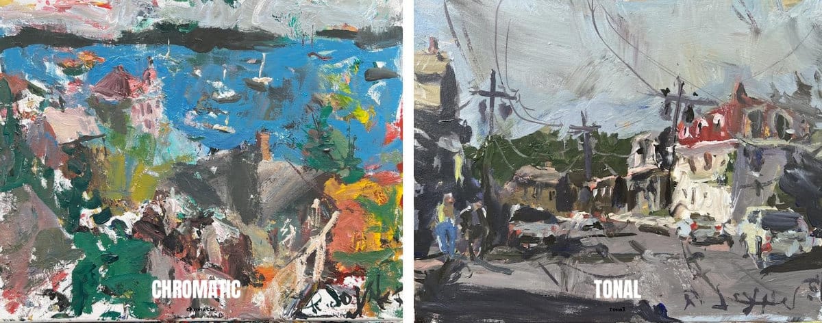
Two Main Palette Approaches That Changed My Work
I've gravitated toward thinking about color in terms of two main strategies: tonal palettes and chromatic palettes.
Tonal Palette: Colors are less saturated, more muted through mixing techniques. If I'm doing a landscape and there's a yellow building in real life, I'll knock it back with some gray. The shadows become grayish blues or purples instead of pure colors.
Chromatic Palette: This steers away from grays and neutrals, embracing more colorful choices. That same yellow building becomes an intense, bright vivid yellow. Instead of gray shadows, I might choose deep purple or eggplant. Everything has that vibrant color quality.
Both approaches work, but they create completely different emotional responses.
Related Articles You May Enjoy;
Four Studio-Tested Ways to Start Loose, Expressive Paintings - perfect connection since color choices happen after you start
Garage Artist Color Theory vs Traditional Color Theory - color theory doesn’t have to be confusing
The Value Problem That Kills Color
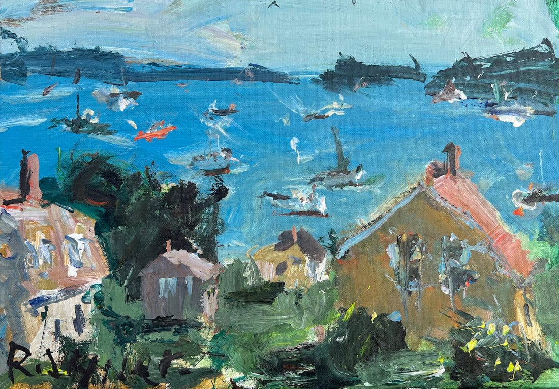
Here's something crucial that many artists miss: if you don't have enough value contrast and all your colors are similar in lightness or darkness, your painting becomes flat. It doesn't matter how beautiful your color choices are.
Conversely, if everything is too high in contrast, the painting becomes visually loud and obnoxious. Every square inch clamors for attention.
When evaluating your work, ask yourself: "Is the color screaming at me?" If every area demands equal attention, you probably have too much contrast everywhere.
Study the landscape image above: It shows why you need some strong darks: the deep green vegetation gives the eye a value anchor, making all those mid-tone blues and warm house colors feel more vibrant by comparison
My Design Philosophy: Emphasis Through Restraint
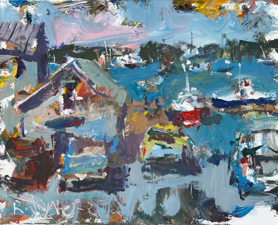
My work blends traditional ideas with unconventional techniques I've developed over the years. In terms of design and composition, I try to emphasize one main area and downplay everything else.
Areas I want to de-emphasize get reduced color intensity and contrast. The focal point gets stronger brushwork quality, more color pop, small accents that draw the eye. It's about creating hierarchy, not visual chaos.
Study the image above: The overall loose landscape shows emphasis through restraint - the small pops of red and yellow draw attention because most of the painting stays in the blue-gray family. Too many bright accents would kill the impact.
Limited Palettes That Actually Work
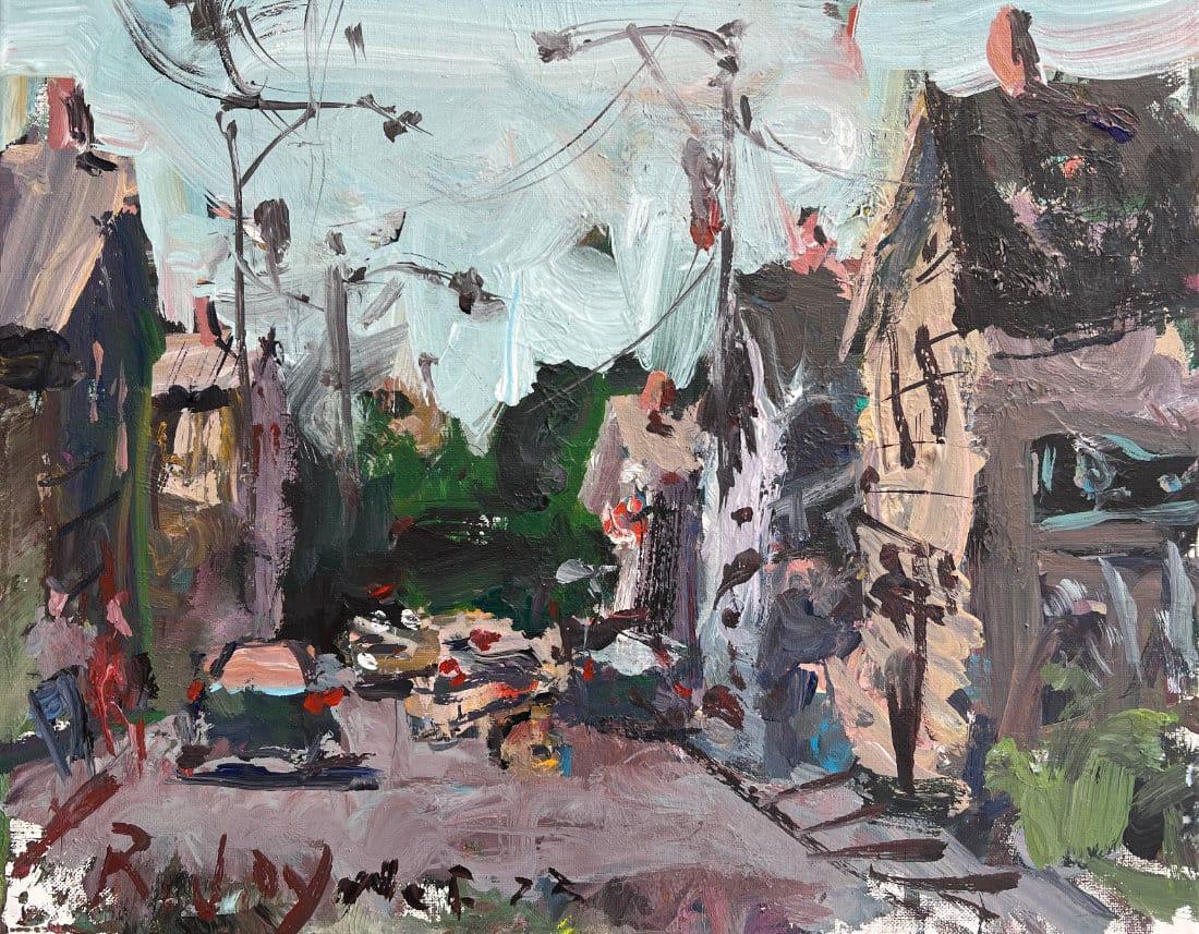
Working with a limited palette can be incredibly effective. Pink, blue, and white works well. Green, pink, and a neutral creates interesting tensions. The key is understanding that even within a "tonal" approach, you can have small pops of color as accents - they just can't be spread all over the painting.
Same with chromatic palettes - you'll have neutrals and grays, but the overall feeling should lean toward vibrant color.
Study the image above: Working with just a few main colors - greens, grays, and earth tones with small red accents - creates unity while still allowing for plenty of variety in mixing and temperature shifts.
The Acrylic Reality Check
Since I work a lot with acrylics, here are some practical warnings: dirty water and contaminated brushes create problems you won't see until the paint dries. That contamination tends to surface as the acrylic dries, often creating muddy results in paintings that looked good wet.
Keep your water fresh. When it gets really dirty, change it. This has caused me problems in the past - I've finished paintings that looked great, then returned an hour later to find them completely different once dry.
The Over-blending Trap
Over-blending is another color killer. It makes everything flat and lifeless. Put your color down, spread it a bit if needed, then leave it alone. Don't overwork it.
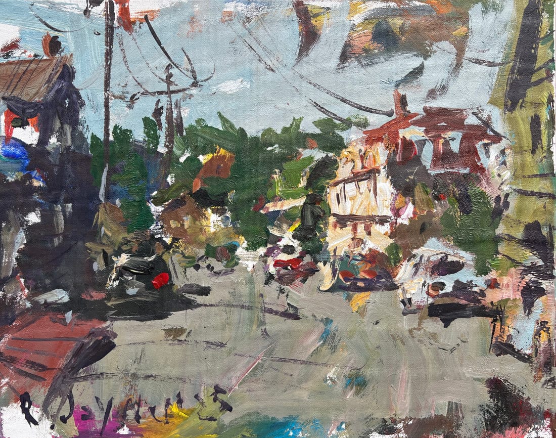
It's better to have that impressionistic feel where you can see individual brushstrokes - dark values and light values that don't necessarily blend perfectly from one to another. That visible brushwork and color separation often creates more life than smooth transitions.
Study the image above: You can see individual brushstrokes and color patches that haven't been smoothed together - this creates much more life and energy than if everything was perfectly blended into smooth transitions.
Beyond Color Theory
Understanding basic color temperature, value relationships, and mixing fundamentals gives you the foundation. But the real growth happens when you become comfortable enough with those basics to start breaking the rules and responding to what's actually happening on your canvas.
The best color choices aren't always the most harmonious ones - sometimes they're the ones that create the right kind of tension or surprise that makes your painting come alive.
Start with Fundamentals, Then Experiment
My advice: get comfortable with basic color relationships first. Learn how temperature affects color, understand value contrast, practice mixing clean colors and interesting grays. Once those become second nature, you can start making more intuitive, expressive color choices.
The goal isn't perfect color harmony - it's color choices that support the energy and honesty of your expressive work.
Continue Learning
If you enjoyed this hand drawing course, explore even more lessons on our Drawing Tutorials & Courses Hub
Want new tutorials delivered to your inbox? Subscribe here and get free lessons, tips, and inspiration sent directly to you.


