Watercolor Seaside Scene with Coastal Homes – Loose & Expressive
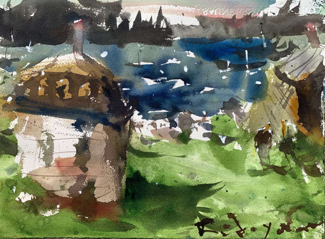
Forget the usual broad washes—this watercolor seaside scene with coastal homes uses an unconventional, block-by-block approach. Loose, expressive, and full of fresh surprises.

You don’t always have to follow the traditional rules of watercolor. Most seaside scenes begin with broad washes that cover the entire paper. But in this tutorial, I’ll show you a different way—a direct, block-by-block approach that feels more like painting with acrylics, but still keeps the freshness and sparkle of watercolor.
Watch Video: hit play and see how these unconventional watercolor techniques work.
Starting the First Wash: Local Color Blocks
Instead of laying down a single wash, I bounce around the page—adding bits of local color to a house, the harbor, the land, or the sea. I keep things loose, almost playful, but I’m always careful to leave bits of white paper showing through. Those untouched spots are golden—they’ll later transform into boats, waves, or the sparkle of light on a rooftop.
At this stage, the painting looks rough, even chaotic—more like child’s play than a finished piece. But that’s exactly the point. It’s all about setting up opportunities for the second wash.
The Second Wash: Where It Comes Alive
After drying the first wash with a hairdryer, I dive in with darker hues to start creating light and shadow. This is where flat shapes become forms—simply darkening one side of a house can instantly make it feel three-dimensional.
I move through the painting, adding:
- Shadows under waves
- Suggestive details on boats
- Darker passages that define rooflines, masts, or harbor edges
The forms remain loose, but they begin to tell the story of the scene.

Finishing Touches
Once the second wash has settled in, I dry sections again and start using the remaining bits of white paper to suggest boats, figures, or highlights along the water. A final touch of white gouache adds extra sparkle—just enough to suggest sunlight catching the surface.
Why This Approach Works
It may look unconventional, but this direct method keeps your watercolor fresh, alive, and expressive. By skipping the blanket washes, you gain flexibility and spontaneity—and you allow the medium to surprise you along the way.
Continue Learning
👉 Next stop: check out my Free Watercolor Painting Course or browse the Watercolor Tutorials Hub to keep building your skills.
👉 Follow me on Pinterest for daily watercolor inspiration!
If you enjoy these kinds of raw insights and loose watercolor demos, you’ll feel right at home here. Subscribe to Crafted by Robert and follow along as I share painting inspiration, tips, and behind-the-scenes stories straight from my garage studio. 👉 Subscribe to Crafted by Robert
Here are the materials I use all the time and have for decades. I only buy from Blick Art but feel free to shop where you prefer.
Recommended Watercolor Materials
-
Holbein Professional Watercolor Paints – 8 Essential Hues
Yellow Ochre, Cadmium Lemon Yellow, Ultramarine Blue, Cerulean Blue, Alizarin Crimson, Cadmium Red Light, Neutral Tint, Burnt Sienna -
Fabriano Artistico Watercolor Paper – 140lb Cold Press
Buy full sheets and cut into quarter sheets for best value -
Silver Jumbo Wash Brush
Great coverage, excellent quality for the price -
Princeton Neptune Point Rounds (No. 12 & 6)
Reliable and affordable detail & wash brushes -
Princeton Neptune Dagger (1/2")
Versatile size for lines, edges, and detail work -
Masterson Aqua Pro Palette
Durable, with deep wells for generous mixing space -
Gator Board
Lightweight, long-lasting painting support board -
Holbein White Gouache
Optional for highlights and fine details - Miscellaneous: plastic water containers, paper towels, masking tape
This post contains affiliate links. If you make a purchase through these links, I may earn a commission at no extra cost to you.