Watercolor Coastal Landscape
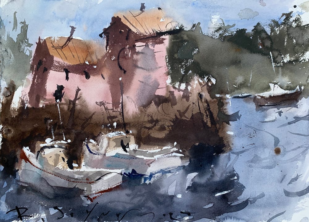
This tutorial demonstrates a wash-dominated approach to coastal landscape painting, emphasizing how to let watercolor's natural properties drive the construction while maintaining compositional control.


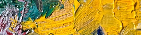
This tutorial demonstrates a VERY loose wash-dominated approach to coastal landscape painting, emphasizing how to let watercolor's natural properties drive the approach while maintaining compositional control. You'll learn systematic wash application, value planning, and strategic drying stages for building atmospheric coastal scenes.
Continue Learning
👉 Next stop: the Watercolor Tutorials Hub to keep building your skills.
Looking for my full painting courses? Get instant access here →
Recommended Watercolor Materials
-
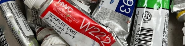
Holbein Professional Watercolor Paints – 8 Essential Hues
Yellow Ochre, Cadmium Lemon Yellow, Ultramarine Blue, Cerulean Blue, Alizarin Crimson, Cadmium Red Light, Neutral Tint, Burnt Sienna -
Fabriano Artistico Watercolor Paper – 140lb Cold Press
Buy full sheets and cut into quarter sheets for best value -
Silver Jumbo Wash Brush
Great coverage, excellent quality for the price -
Princeton Neptune Point Rounds (No. 12 & 6)
Reliable and affordable detail & wash brushes -
Princeton Neptune Dagger (1/2")
Versatile size for lines, edges, and detail work -
Masterson Aqua Pro Palette
Durable, with deep wells for generous mixing space -
Gator Board
Lightweight, long-lasting painting support board -
Holbein White Gouache
Optional for highlights and fine details - Miscellaneous: plastic water containers, paper towels, masking tape