How to Paint Water, Reflections and Boats in Watercolor
Stop trying so hard with watercolor boats and water. I avoided painting reflections for 10 years, but here's how to do it loose without getting fussy.


The secret to painting convincing boats and water? Stop trying so hard. And don't do what I did - put it off for 10 years because it seemed too complicated.
For years I painted rustic Maine harbors with lobster boats, but the water was just a few strokes of blue-gray, maybe a touch of green if I was feeling adventurous. I figured I needed to finally practice what I preach: get uncomfortable, do the things that help you construct to deconstruct.
So here's a well-rounded tutorial that's the result of actually studying how to paint reflections like all the other landscape painters, but with garage-style authenticity. Fair warning though - now that I've done this properly once, I'm probably going back to my two-stroke harbor blue water.
👉 Want step-by-step lessons? Visit the Watercolor Hub for tutorials and free courses.
Most painters get hung up on perfect details and lose the flowing, natural feel that makes watercolor sing. This harbor scene is all about working with what you've got and letting happy accidents become part of the magic.
Watch the video: hits play and learn to paint reflections, water and more.
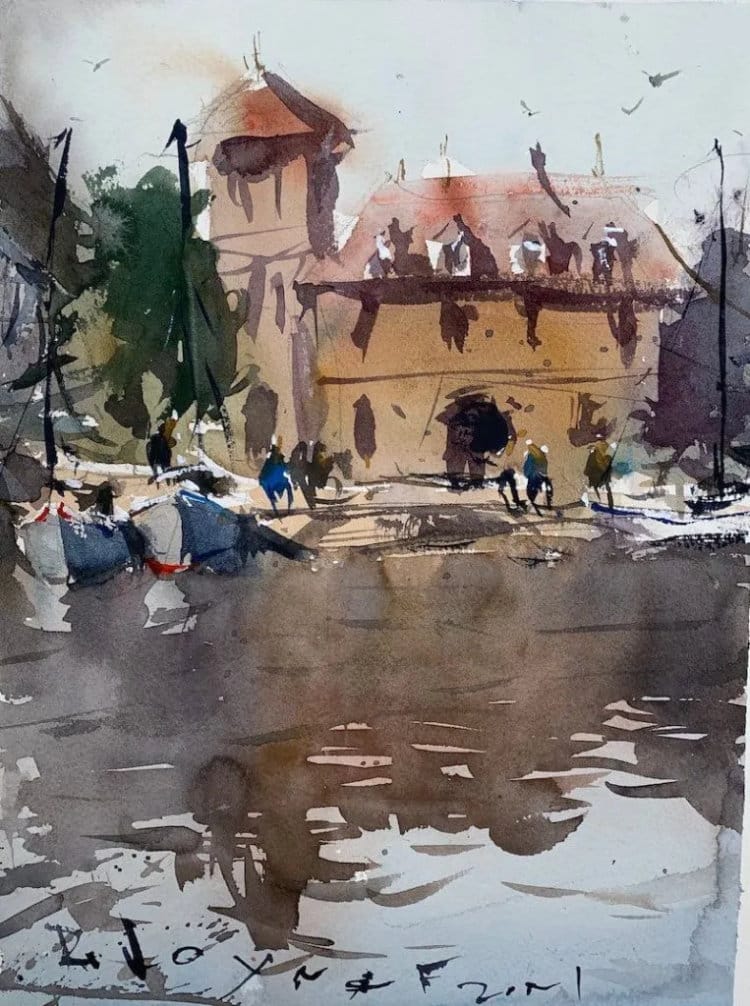
Watercolor landscape demo - water & reflections
Start Loose, Stay Loose
I rough in the basic composition with a looser drawing than usual - horizon line, simple house shapes, a tree. The key is putting more energy into the drawing itself rather than getting caught up in precise measurements.
For the boats, I'm not trying to duplicate every detail from the reference. That white boat looks great in the photo, but if I tried to copy it exactly, I'd tighten up and kill the spontaneity. So maybe this boat doesn't get a mast. Maybe that one gets a short one instead. Keep the decision-making fluid.
Windows, rigging, all those fussy details? Leave most of them out in the drawing stage. Include too much detail upfront and you'll paint tight. Guaranteed.
Work Your Dirty Palette
Here's where experience pays off - I've got grays already mixed on my palette from previous washes. Instead of starting fresh, I'm working with what's there. How can I use this "dirty" palette to my advantage?
Mix some reds into those grays, touch in some blue for broken color in that roof. The goal isn't perfect color matching - it's getting interesting, varied hues that feel natural rather than artificial.
The buildings get rough color blocking. Side building, dormers, that red roof up top. Everything's too saturated at first, so I knock it back with complementary colors. Let it dry before going further - watercolor needs those pause points.
Let the Sky Bleed
Clean spot on the palette for the sky wash. Cerulean blue with plenty of water, let it bleed down into the wet building washes below. This creates those soft, natural edges you can't get by carefully painting up to lines.
Touch in some ochres and yellows for the walkway while things are still damp. Few gray strokes for boat shadows. Everything's mingling and finding its own edges.
Fix Problems As You Go
I'm getting symmetry issues - two same-sized shapes in the corners. Got to fix that before it becomes a real problem. Raise this one up, pull that one down. Sometimes you've got to adjust on the fly rather than sticking rigidly to your initial plan.
The shadow direction gets confused too - put a shadow on the wrong side of the boat. No choice but to add a dark side and lose the white boat for now. Mistakes happen when you work fast, but they're not disasters if you adapt.
Reflections Simplified
Water reflections aren't mirrors - they're interpretations. Things far away bunch together, closer elements break up more. The reflections can be darker than the objects, but you're free to interpret however the design needs.
Pull down some soft reflection colors with vertical strokes. Touch in boat shapes, but keep them loose and flowing. Less is better than more with water - underpaint rather than overpaint.
Details That Don't Overwork
Once everything's dry, you get control back. Few masts on the boats, some cast shadows, couple of figures. Windows here and there, but not every single one.
The key is knowing when to stop. Start adding too many details and next thing you know, it looks fussy. Better to leave viewers wanting slightly more than giving them too much.
The Real Lesson
This isn't about copying boats perfectly. It's about capturing the feeling of light on water, the casual rhythm of a harbor scene. Work with your palette's accidents, fix problems as they arise, and trust watercolor to give you things you couldn't plan.
Muted colors often work better than heavily saturated ones anyway. Those grays and subtle hues feel more natural than colors straight from the tube.
The goal is painting water that feels wet, boats that feel like they're floating, and a scene that breathes rather than sits stiffly on the paper.
Continue Learning
👉 Next stop: check out my Free Watercolor Painting Course or browse the Watercolor Tutorials Hub to keep building your skills.
👉 Follow me on Pinterest for daily watercolor inspiration!
If you enjoy these kinds of raw insights and loose watercolor demos, you’ll feel right at home here. Subscribe to Crafted by Robert and follow along as I share painting inspiration, tips, and behind-the-scenes stories straight from my garage studio. 👉 Subscribe to Crafted by Robert
Here are the materials I use all the time and have for decades. I only buy from Blick Art but feel free to shop where you prefer.
Recommended Watercolor Materials
-
Holbein Professional Watercolor Paints – 8 Essential Hues
Yellow Ochre, Cadmium Lemon Yellow, Ultramarine Blue, Cerulean Blue, Alizarin Crimson, Cadmium Red Light, Neutral Tint, Burnt Sienna -
Fabriano Artistico Watercolor Paper – 140lb Cold Press
Buy full sheets and cut into quarter sheets for best value -
Silver Jumbo Wash Brush
Great coverage, excellent quality for the price -
Princeton Neptune Point Rounds (No. 12 & 6)
Reliable and affordable detail & wash brushes -
Princeton Neptune Dagger (1/2")
Versatile size for lines, edges, and detail work -
Masterson Aqua Pro Palette
Durable, with deep wells for generous mixing space -
Gator Board
Lightweight, long-lasting painting support board -
Holbein White Gouache
Optional for highlights and fine details - Miscellaneous: plastic water containers, paper towels, masking tape
This post contains affiliate links. If you make a purchase through these links, I may earn a commission at no extra cost to you.