Urban Landscape Demonstration Using Wash Techniques (Wash Series Finale)
See how flat, graded, and variegated washes bring a cityscape to life. This finale shows watercolor washes in action with bold, loose results.


This lesson brings everything together from the Watercolor Wash Series. Instead of focusing on one technique, we’ll apply multiple washes to build a complete urban scene. It’s a chance to see how flat, graded, and variegated washes can transform simple shapes into a lively cityscape.
In case you missed them here are the wash series links, I highly recommend you watch them if you want full explanations for how this piece was created!
👉 Wet-in-wet watercolor series
👉 Wet-on-dry watercolor series
Unlike earlier lessons, this painting begins with no preliminary drawing. By jumping straight in with washes, the composition develops naturally, keeping the results loose and expressive.
👉 Want step-by-step lessons? Visit the Watercolor Hub for tutorials and free courses.
Step 1 – Laying the First Wash
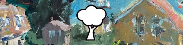
The first wash sets the stage. A light blue sky flows into the yellow of the central building, while neighboring structures pick up hints of magenta and neutral tones. At this point, the goal is to establish big shapes and color harmony, not details.
Key tip: allow the washes to mingle on the paper. This prevents stiffness and gives watercolor that fresh, spontaneous feel.
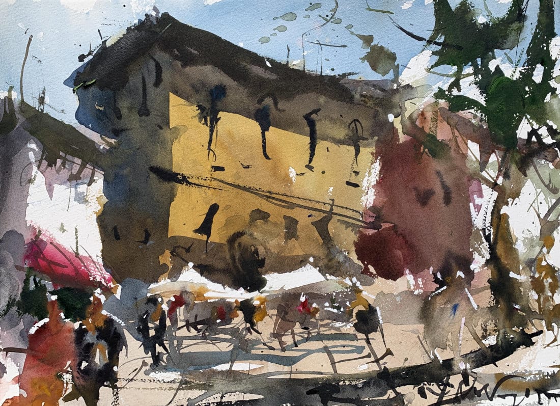
Step 2 – Building Depth with a Second Layer
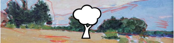
Once the first wash dries, it’s time to layer again. Here the paint consistency moves to “milk strength” — thicker and more substantial than the first pass.
This second wash adds shadows, carves out light vs dark, and prevents areas from looking flat or pale. The yellow building becomes more varied and interesting as deeper pigment is dropped into it.
Step 3 – Adding Figures and Movement
With a needle brush, figures are suggested beneath umbrellas and across the street. These aren’t drawn in detail — just shapes and highlights that hint at life and activity.
By keeping figures loose and painterly, the painting avoids fussiness and stays focused on atmosphere.
Step 4 – Anchoring the Scene with Strong Color
A rich green tree is added on the right-hand side. Its darker value balances the dominant yellow building and keeps the viewer’s eye inside the composition.
Using stronger, thicker paint (milk to honey consistency) ensures the tree feels bold and intentional, not weak or hesitant.
Step 5 – Final Touches
Dark accents suggest windows and doorways. Figures are refined with tiny highlights — just enough for the eye to recognize them.
The result is a painting that feels lively and energetic, where washes do the heavy lifting instead of tight details.
Key Takeaways
- Use washes to build structure, not just background.
- Vary paint consistency (tea → milk → honey) for depth and interest.
- Suggest detail instead of forcing it — let washes create variation.
- Anchor your composition with strong color to guide the viewer’s eye.
Closing
This urban scene brings together everything from the Wet-in-Wet and Wet-in-Dry Wash Series. From the first mingling washes to the bold finishing strokes, it’s a demonstration of how advanced wash techniques can shape an expressive cityscape.
👉 Up next: check out the Student Critique of the Wash Series Final Project, where we review how others approached their own versions of this exercise.
Continue Learning
👉 Next stop: check out my Free Watercolor Painting Course or browse the Watercolor Tutorials Hub to keep building your skills.
👉 Follow me on Pinterest for daily watercolor inspiration!
If you enjoy these kinds of raw insights and loose watercolor demos, you’ll feel right at home here. Subscribe to Crafted by Robert and follow along as I share painting inspiration, tips, and behind-the-scenes stories straight from my garage studio. 👉 Subscribe to Crafted by Robert
My Toolbox
Here are the materials I use all the time and have for decades. I only buy from Blick Art but feel free to shop where you prefer.
Recommended Watercolor Materials
-
Holbein Professional Watercolor Paints – 8 Essential Hues
Yellow Ochre, Cadmium Lemon Yellow, Ultramarine Blue, Cerulean Blue, Alizarin Crimson, Cadmium Red Light, Neutral Tint, Burnt Sienna -
Fabriano Artistico Watercolor Paper – 140lb Cold Press
Buy full sheets and cut into quarter sheets for best value -
Silver Jumbo Wash Brush
Great coverage, excellent quality for the price -
Princeton Neptune Point Rounds (No. 12 & 6)
Reliable and affordable detail & wash brushes -
Princeton Neptune Dagger (1/2")
Versatile size for lines, edges, and detail work -
Masterson Aqua Pro Palette
Durable, with deep wells for generous mixing space -
Gator Board
Lightweight, long-lasting painting support board -
Holbein White Gouache
Optional for highlights and fine details - Miscellaneous: plastic water containers, paper towels, masking tape