Your color work isn't a color problem.
It's a value problem. And this course fixes that.
Most artists spend years chasing the right color. The perfect mix. The exact hue. And most of them end up with flat, muddy paintings they can't figure out.
Here's the truth: your eye reads value first. Light and dark. Always. Color is just the accent.
Get the values right and you've got enormous flexibility with everything else — including color.
That's what this course is built on.
What You’ll Learn
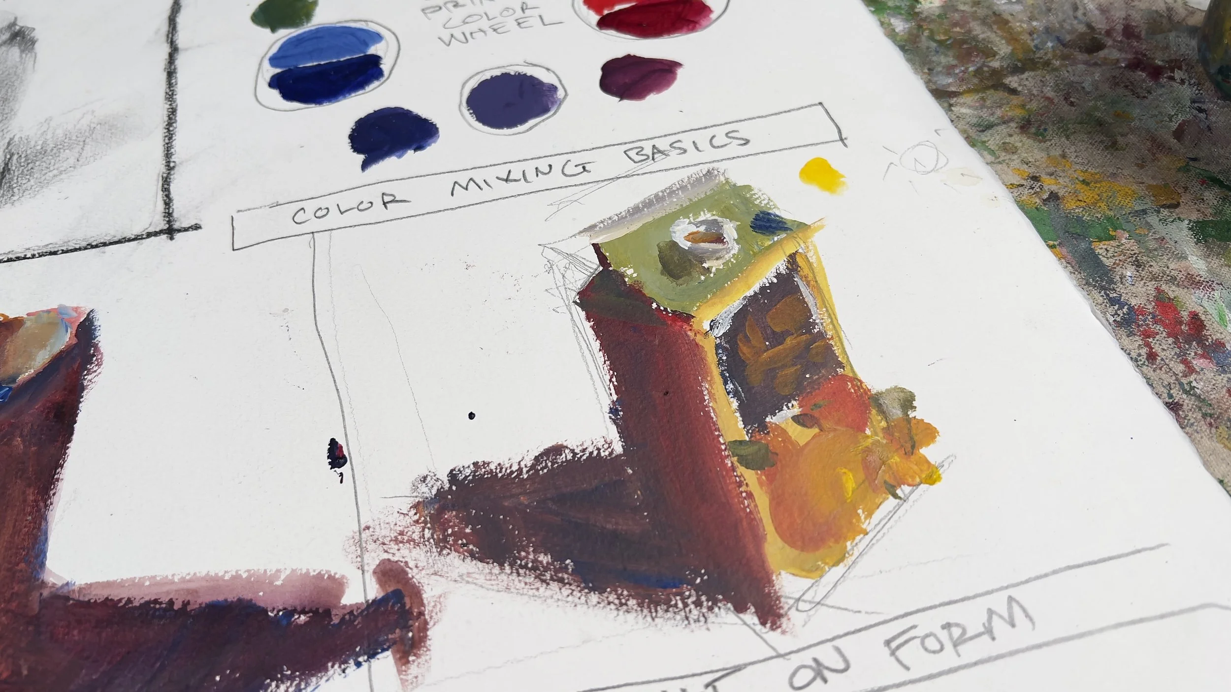
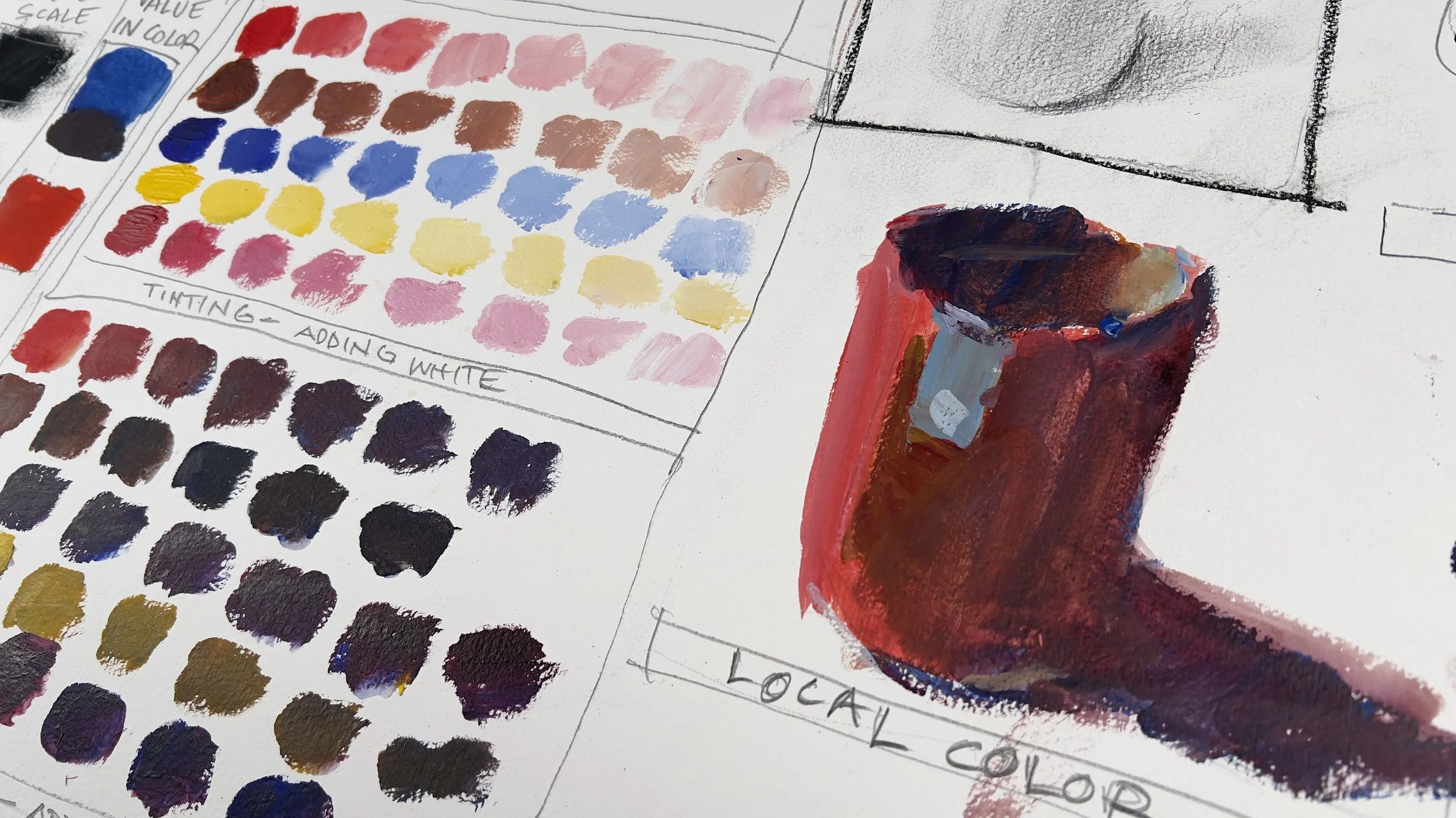
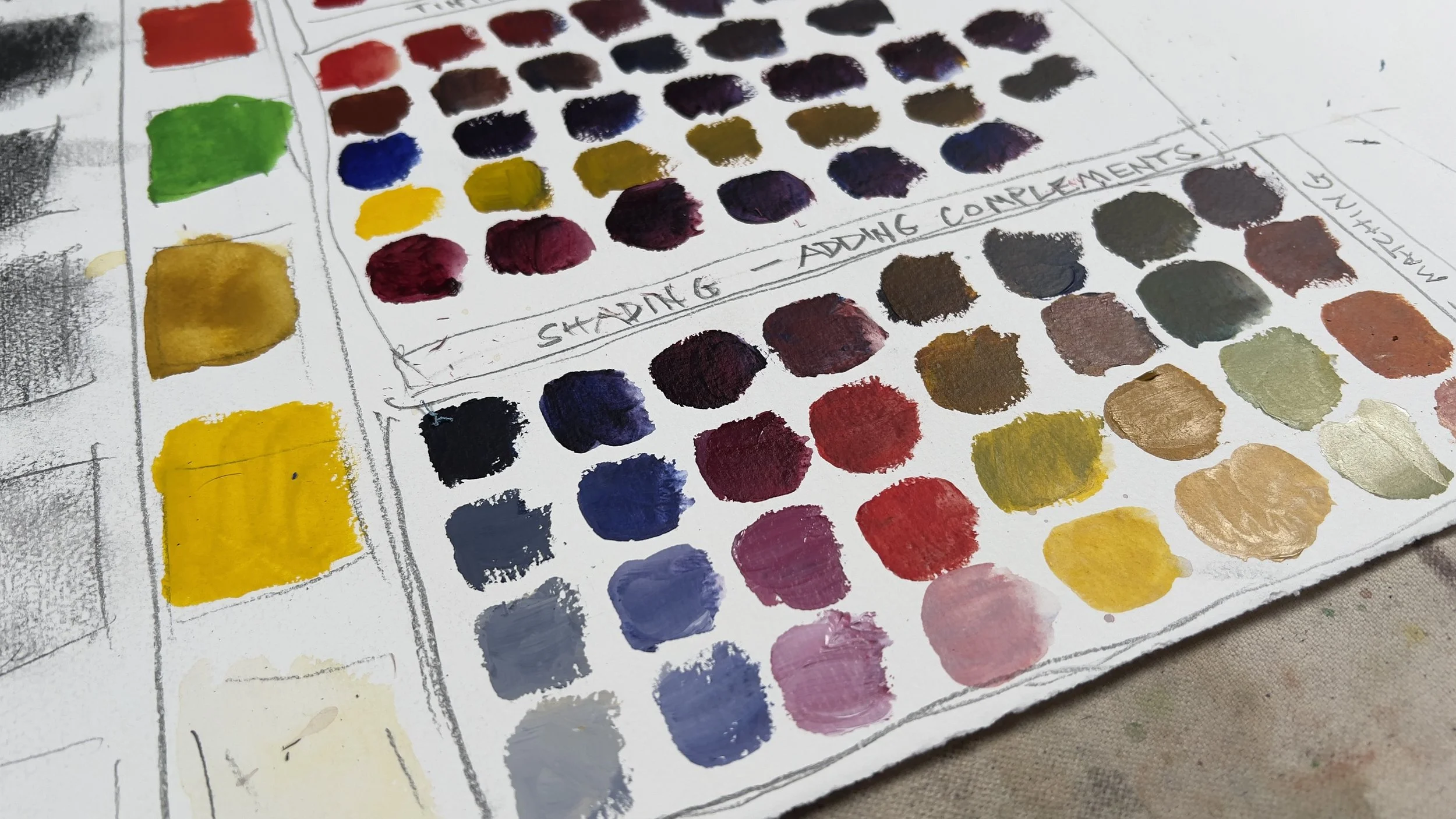
How to build and use a value scale
Where your colors actually sit on that scale
How to tint and shade without killing your color
The split primary palette and why it matters
Tonal vs. chromatic painting — two lanes, two completely different results
How to paint light on form using any medium

This course is part of the Deconstruction Lab ecosystem.
Value & Color builds directly on the system taught in the foundation courses. Before diving in, here's what's recommended:
Highly Recommended
Drawing Is Everything — the core philosophy and progression system. Referenced throughout this course.
Values & Color — value structure and the tonal vs. chromatic system are used extensively in every section. (You Are Here)
Design & Composition - Pre-painting decisions. The blueprint. What goes where and why.
New to art or drawing?
Drawing Fundamentals — start here before anything else. Covers observation, line, mark making, and structural drawing from the ground up.
The Deconstruction Lab
A complete foundation pathway
Drawing Is Everything - The philosophy. Everything builds on top of this. You don't have a drawing problem. You have a thinking problem.
Drawing Fundamentals - Structure is the permission slip. This is where you build it.
Values & Color - Most painting problems aren't color problems. They're value problems. This fixes that. (You Are Here)
Design & Composition - Most painting problems aren't paint problems. They're composition decisions you never made.
Watercolor One: Loose On Purpose - Watercolor isn't fragile. This course proves it.
Acrylic One - Most acrylic courses teach you how to finish a painting. This one teaches you how to think with paint.
Mixed Media One (Coming Soon)
Materials List
NOTE: You can use one medium. In the course I used watercolor and acrylics along with standard drawing materials.
Watercolor materials:
Paints — Holbein
Alizarin Crimson
Cadmium Red Light
Cadmium Yellow
Yellow Ochre
Ultramarine Blue
Cobalt Blue
Neutral Tint
Burnt Sienna
Brushes
Medium pointed round
Sword brush
Palette
John Pike palette (or any large well palette)
Paper
140lb cold press — full sheets recommended
Everything Else
Two water reservoirs (one clean, one dirty)
Paper towels or an old rag
Full materials list with links available on the website →
Acrylic materials:
Paint
Heavy body acrylic only — any brand works, but heavy body is important.
Ultramarine Blue
Cerulean Blue
Alizarin Crimson
Cadmium Red Medium
Cadmium Yellow Light
Yellow Ochre
Titanium White
Brushes
Medium Round
Small Round
Liner / Rigger Brush
Medium Flat
Large Flat
Surfaces
2 sheets 140lb Cold Press Watercolor Paper
Other
Scrap cardboard (palette)
3 water reservoirs
Palette knife (for scooping paint)
Full materials list with links available on the website →