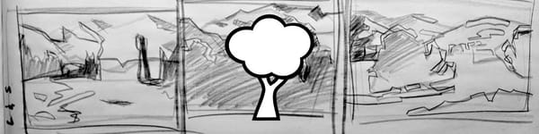
My Results – Value Hierarchy Practice Reel
Five fast value studies, four minutes each. Here’s what I learned about simplifying shapes and keeping clear value hierarchy in acrylic landscape painting.

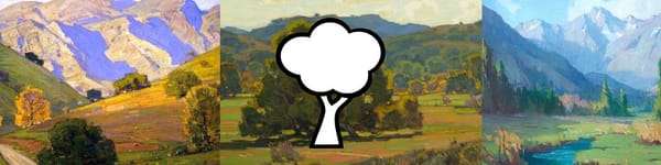
Here are my results from the Value Hierarchy Practice Reel.
Five images, four minutes each, and one big takeaway — quick studies like this remind you just how much you can say with simple shapes and clear values.
Each scene had a different challenge, from wide open skies to crowded tree lines, and I tried to stay focused on the main goal — keep it simple, stay loose, and make quick, confident value decisions.
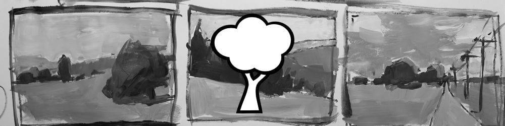
Study 1 – Aerial Perspective
The first scene had great aerial perspective and some subtle elevation changes.
I started with my darkest darks — mainly the rock shapes and trees in the midground — and connected those into one solid shape. From there, I kept stepping back in space with slightly lighter values.
The sky was pretty plain, so I left it simple, just enough contrast to separate it from the land.
Nothing fancy — just learning to recognize how the land breaks into clear layers of light and dark.

Study 2 – Simple Country Road
This one had a nice, basic composition — a road leading in with a few tree shapes.
I began, as usual, with the darkest darks on the tree, then built up from there.
The trick was to avoid over-modeling the light planes and to keep the relationships close in value.
The road was lighter, but not too light — I wanted the main tree to stay dominant.
In four minutes, you can’t overthink it, which is the beauty of this kind of study.
Study 3 – Quiet Field with Tree
A simple layout — one strong shape for the tree, one big field, and a little background structure.
I started with the sky first this time, just to shake things up.
I kept the ground slightly lighter and added a dark band for the distant field to balance the composition.
The key was holding those seven values — pushing a little darker under the tree to anchor it, but not letting those darks spread everywhere.
Study 4 – Distant Hills and Tree Line
This one came together quickly. The overlapping hills gave a great chance to practice value compression — making distant shapes just slightly lighter and softer.
I started with the sky, then worked down through the middle hills, pushing a bit more light into the near ground.
You can see how each layer steps forward just a touch in value — that’s the backbone of landscape depth.
Study 5 – Country Road with Poles
The final one was a low, quiet design with a few poles leading the eye back.
I kept the sky very light, the road just a touch darker, and made the tree shapes the anchors again.
The value pattern of the poles and shadows helped balance the composition.
It’s not about getting everything “right” — it’s about reacting fast and learning to group your values before the clock runs out.
Course Navigation
Next Lesson: Light & Planes in Landscape Painting
Previous Lesson: Value Hierarchy Assignment Reel
Return to Hub: Acrylic Landscape Painting Fundamentals
Final Thoughts
These quick value studies are powerful little exercises.
They force you to see the big design, not the details, and to decide what really matters in a painting. If your values are clear, your painting will hold together no matter what colors you use later.
Try this assignment for yourself and see how much you can learn in just twenty minutes of focused practice.
Learn & Improve Your Acrylic Skills
- Acrylic Hub– Your go-to guide for tutorials, tips, and resources.
- Ultimate Beginner Acrylic Course - Start painting with confidence.
- Subscribe for More Great Content - Get tutorials, tips, and updates straight to your inbox.
- Follow Me on Pinterest - Daily inspiration, tips, and fresh ideas.
Recommended Acrylic Painting Materials
-
Princeton Catalyst Brushes – Flats (#6, #12), Rounds (#4, #8), Fan (#4), Liner Brush
Durable synthetic bristles for versatile acrylic techniques -
Liquitex Heavy Body Acrylic Paint – Essential Colors
Cadmium Yellow, Yellow Ochre, Alizarin Crimson, Cadmium Red Light, Ultramarine Blue, Cobalt Blue, Burnt Sienna, Titanium White -
Winsor & Newton Cotton Canvas
Reliable stretched canvas for studio and plein air work -
Strathmore 400 Series Mixed Media Paper
Heavyweight, acid-free paper for acrylic and mixed media -
Fabriano Artistico 140lb Cold Press Paper
Excellent for acrylic, mixed media, and textured effects -
Blick Multi-Colored Painting Knife Set
Variety of shapes for texture, scraping, and bold strokes - Miscellaneous: Two pint-sized water containers, paper towels (from Home Depot or Walmart)
- Note: I use canvas or sturdy cardboard as my palette — no store-bought palettes needed.