Value Hierarchy Basics: Why Your Paintings Look Flat
Without value, you're staring at a blank page. Value is what makes things visible - not just visible, but three-dimensional and spatially convincing. Most artists copy colors from references without thinking about value relationships, and that's why their paintings feel flat.


In this tutorial you will learn value hierarchy and how it impacts your paintings. Without value, you're staring at a blank page. I could tell you there's a square on this white screen and you'd think I'm lying - because until I add value around it or inside it, that square doesn't exist visually.
Value is what makes things visible. Not just visible, but three-dimensional. Not just three-dimensional, but spatially convincing.
Want drawing lessons? Visit the Free Drawing Tutorials & Courses hub →
Watch video: hot play and learn how value hierarchy can improve your artwork.
Step 1: Making Things Exist
Two ways to see a shape: put value around it, or put value inside it. Either method works to define the edges and make the form readable. The white square surrounded by gray value becomes visible. The gray square on white paper does the same thing.
That's the foundation - without value contrast, nothing exists on your page.
Step 2: Creating Form
Turn that square into a cube and suddenly you need a plan. Light source hits the top, so that's your lightest value. The vertical side facing the light gets a medium value. The side in shadow gets your darkest value.
Three values, three planes, instant illusion of three-dimensional form.
The cast shadow? Lighter than the shadow side of the cube itself. Always. Because that cast shadow is catching bounce light from surrounding surfaces. Keep it between your lightest and second-darkest values.
This is value hierarchy in action - strategic placement of lights and darks to sell the illusion.
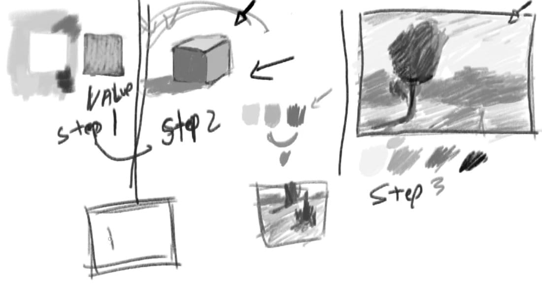
Step 3: Planning Complex Scenes
Now apply that thinking to a landscape. You've got sky, distant trees, ground plane, foreground tree, cast shadows, a path cutting through. How do you organize all those values so the scene reads with depth?
The landscape hierarchy:
- Sky = lightest value (almost always)
- Distant elements = lighter than foreground (atmospheric perspective)
- Ground plane = darker than sky, lighter than vertical elements
- Vertical forms (trees, buildings) = darkest values
- Cast shadows = lighter than the vertical objects casting them
You're creating a blueprint. A value plan that says "this is near, that's far, this catches light, that sits in shadow."
The Trap Most Artists Fall Into
They copy colors from their reference without thinking about value. The photo shows a dark hill in the background, so they paint a dark hill. Now that background competes with the foreground tree for darkest value, and suddenly the spatial logic collapses.
The painting feels flat because nothing is strategically darker or lighter - it's all just copied.
Your reference photo is a starting point, not a rulebook. You're the one deciding what gets the darkest dark, what stays light, where the middle values live. That's the hierarchy - you're establishing dominance and relationships between values.
Why This Matters
A painting is a lie you're trying to sell. The only tools you have are drawing accuracy, value relationships, and color choices. Get the value plan wrong and no amount of beautiful color saves it.
Vertical elements tend toward dark. Horizontal planes tend lighter. Distance fades toward the sky value. Those aren't absolute rules, but they're reliable patterns. When you break them, you better have a reason.
The process: Establish your lightest light and darkest dark first. Everything else finds its place between those two anchors. If something in your reference photo would mess up that hierarchy, adjust it. You're in control.
Making It Work
Look at your subject and ask:
- Where's my light source?
- What's my lightest value? (Usually sky or a direct light-facing plane)
- What's my darkest dark? (Usually vertical foreground elements)
- How do I arrange everything else to create depth?
That cube example demonstrates it simply. Three planes, three values, instant form. Scale that thinking up to a landscape with twenty different elements and the principle stays identical - you're just juggling more values within the same framework.
Plan it. Don't copy what you see without understanding why those values work or don't work for your composition.
The Bottom Line
Without value, nothing exists on your page. With poorly planned value, things exist but feel flat and spatially confused. With strategic value hierarchy, you create convincing depth and form.
This is foundational. You can't skip it. Every painting you do requires this thinking, whether you're working from life, photo reference, or imagination.
Get your value plan right and you're halfway to a successful painting before you even pick up a brush.
Building on Perspective Foundations
Value hierarchy works hand-in-hand with the perspective skills you've been developing:
Coming from perspective work? Drawing Complex Scenes: Multiple Objects in One-Point Perspective taught you to coordinate buildings, vehicles, and backgrounds in unified space. Now you need to add light and shadow to those structures using strategic value planning.
Start with drawing basics: Drawing Hub - If you're jumping into value work without solid perspective foundations, go back and work through the drawing fundamentals first.
What comes next in this series: This lesson covers the theory. The next post demonstrates applying value hierarchy to an actual scene, followed by student value studies and critiques.
Continue Learning
If you enjoyed this hand drawing course, explore even more lessons on our Free Drawing Tutorials & Courses Hub — including the complete How to Draw – Beginner’s Course.
Want new tutorials delivered to your inbox? Subscribe here and get free lessons, tips, and inspiration sent directly to you.