Master Painters and Composition in Landscape Painting
Discover how master painters organized shapes, values, and color to create powerful landscape compositions. Learn to simplify your own acrylic designs for impact.

One of the best ways to understand composition is to study how the masters handled design. In this lesson, I’ll break down several landscape paintings to show how artists organized their shapes, values, and color masses to create strong, unified designs.
This lesson is part of the Acrylic Landscape Painting Fundamentals Course.
Observing Big Masses First
When you look at a great painting, don’t get lost in the details — start by identifying the big masses.
Most successful landscapes can be simplified into three main areas:
- Large (L) – Often the sky or open field
- Medium (M) – Middle ground or large tree groupings
- Small (S) – Accents like buildings, tree clusters, or dark focal shapes
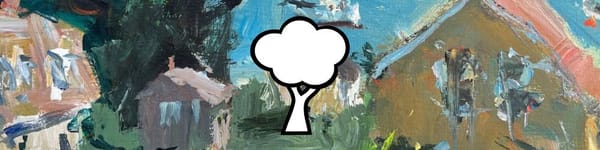
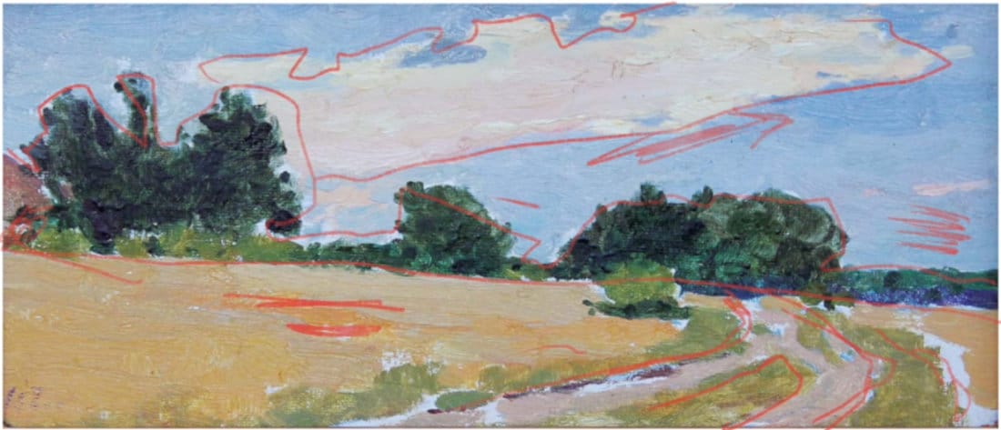
This balance of large, medium, and small gives the composition rhythm and prevents monotony. The first image shows this clearly: the artist used a large open sky, a mid-sized tree grouping, and smaller land divisions to create variety and depth.
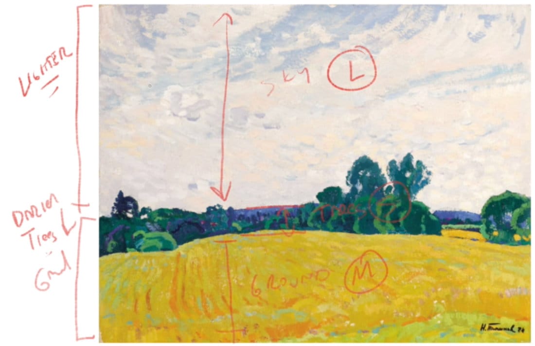
Light, Medium, and Dark Values
In strong compositions, value masses are easy to read. The masters often simplified nature into three value zones:
- Light (L) – Sky or sunlit planes
- Medium (M) – Ground or middle-value masses
- Dark (D) – Tree groups or shadows
By arranging these areas in unequal proportions (for example, ½ light, ¼ medium, ¼ dark), they created harmony and visual balance.
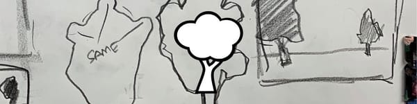
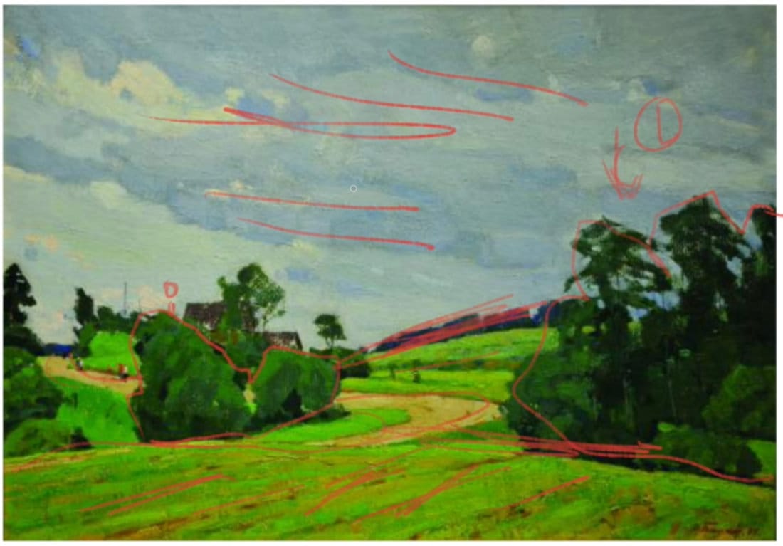
Notice how the dark tree line in the second painting sits beautifully between the lighter sky and the golden ground — a perfect example of value contrast and spacing.
Direction and Flow
In every strong landscape, there’s a subtle movement that leads the eye through the painting.
This can come from:
- Curving roads or rivers
- Diagonal slopes
- Cloud formations
- Brush direction
In the first and last images, you can see how the artist used brushstrokes, slope lines, and cloud shapes to guide the viewer’s eye from one side of the painting to the other.
This movement gives the piece a sense of life and energy — nothing feels static.
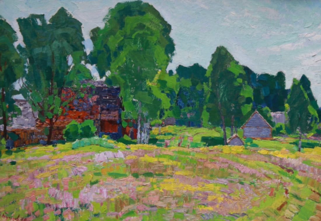
Overlapping Shapes Create Depth
Depth isn’t achieved by detail — it’s built through overlapping shapes and value hierarchy.
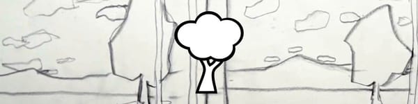
In the third image, the large trees overlap smaller buildings, while middle shapes fade into the background.
The result feels believable without relying on intricate detail.
Whenever you paint, think about what sits in front, what’s behind it, and how those relationships define space.
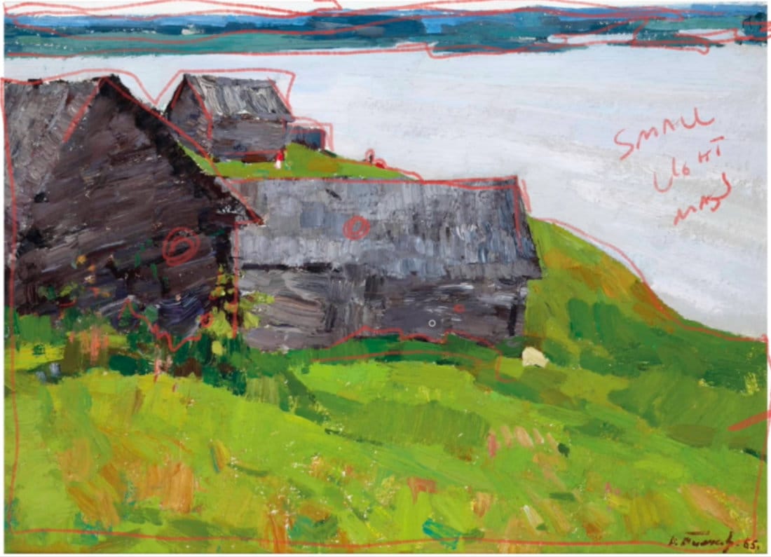
Balance Through Uneven Proportions
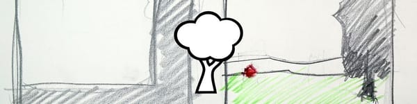
The masters understood that equal parts can feel stiff. In the fourth image, note how the barns are grouped unevenly — one dominant, one secondary, one smaller.
That natural imbalance makes the composition feel organic and full of character.
You’ll rarely see identical spacing or equal divisions in a great landscape — they kept things slightly irregular to create rhythm.
Simplifying the Scene
The goal of studying master compositions isn’t to copy, but to simplify.
You’re learning how to reduce visual noise into a few powerful shapes and clear value relationships.
When you start your next painting, ask yourself:
- What’s my large, medium, and small area?
- Are my light, medium, and dark values balanced?
- Is there a directional flow through the scene?
If those three are working, your painting will already have strong bones.
Course Navigation
Previous Lesson: Advanced Composition Tips for Landscape Painting
Next Lesson: Landscape Design & Composition Assignment
Acrylic Landscape Painting Hub - see all lessons
Learn & Improve Your Acrylic Skills
- Acrylic Hub– Your go-to guide for tutorials, tips, and resources.
- Ultimate Beginner Acrylic Course - Start painting with confidence.
- Subscribe for More Great Content - Get tutorials, tips, and updates straight to your inbox.
- Follow Me on Pinterest - Daily inspiration, tips, and fresh ideas.
Recommended Acrylic Painting Materials
-
Princeton Catalyst Brushes – Flats (#6, #12), Rounds (#4, #8), Fan (#4), Liner Brush
Durable synthetic bristles for versatile acrylic techniques -
Liquitex Heavy Body Acrylic Paint – Essential Colors
Cadmium Yellow, Yellow Ochre, Alizarin Crimson, Cadmium Red Light, Ultramarine Blue, Cobalt Blue, Burnt Sienna, Titanium White -
Winsor & Newton Cotton Canvas
Reliable stretched canvas for studio and plein air work -
Strathmore 400 Series Mixed Media Paper
Heavyweight, acid-free paper for acrylic and mixed media -
Fabriano Artistico 140lb Cold Press Paper
Excellent for acrylic, mixed media, and textured effects -
Blick Multi-Colored Painting Knife Set
Variety of shapes for texture, scraping, and bold strokes - Miscellaneous: Two pint-sized water containers, paper towels (from Home Depot or Walmart)
- Note: I use canvas or sturdy cardboard as my palette — no store-bought palettes needed.