Complete Guide to Loose Watercolor Landscape Painting
This comprehensive 35-minute tutorial demonstrates my complete watercolor landscape construction process from initial concept through finished painting. You'll see the entire systematic approach.


Watercolor landscapes don’t need to be stiff or overworked. The best ones breathe — washes that run, edges that blur, little accidents that give the piece life. That’s the beauty of painting loose and expressive. This guide shows how I build landscapes step by step while letting watercolor do its thing.
Like many artists, I learned this the hard way after years of copying images and mimicking styles, thinking that would lead to landscape mastery. It didn't. Eventually I realized I needed foundational skills: design and composition, value hierarchy, and color theory. Taking time to research and develop these fundamentals changed everything and led to the systematic approach I use today.
Start With a Why
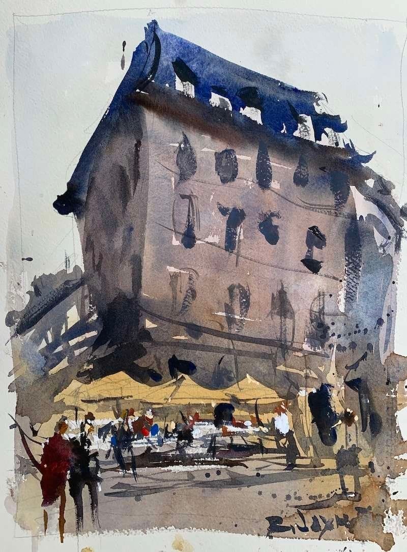
Loose painting doesn’t mean careless. Ask yourself what makes the scene worth painting. For me it was a café with yellow umbrellas and a couple of figures drifting out. That simple detail gave me a focal point and the freedom to keep everything else soft.
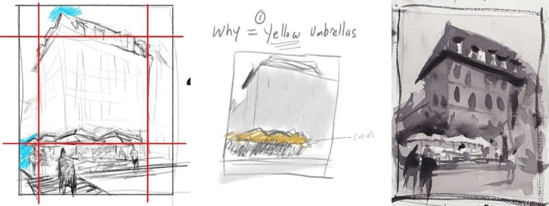
Composition and Design
A loose painting still needs structure. Push the focal point off-center, add smaller shapes to balance it, and let the eye move through the piece. I kept the edges soft everywhere but the umbrellas and figures — that contrast makes them pop without tightening up the whole painting.
Quick Value Study
Before the fun starts, do a fast value sketch. Watercolor dries lighter, so push your darks deeper than feels safe. In loose work, strong value contrast is what keeps the chaos looking intentional.
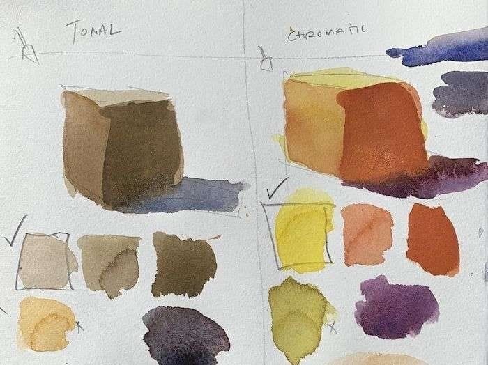
Color Choices
You don’t need perfect matches — you need harmony. Pick a few warms, a few cools, and let them mingle. I went with a chromatic palette here to punch up the umbrellas and figures, then let the background fade in softer neutrals.
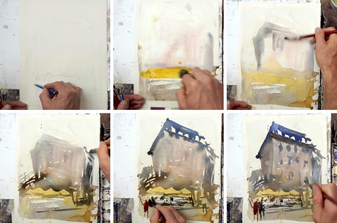
Step by Step
- Contour Drawing → Just enough pencil to place the shapes, no detail.
- Variegated Wash → A sky wash that runs, warm neutrals on the ground, a blush of red for the building.
- Add Darks → Go bold around the umbrellas. Crisp edges here, soft everywhere else.
- Side Buildings → Charged washes that bleed and blend — don’t fuss.
- Figures → A slash of color, a dot for a head. Suggest, don’t render.
- Finishing Touches → A few windows, cast shadows, maybe a splash of white gouache. Keep it light-handed.
Final Thoughts
Loose watercolor landscapes aren’t about control. They’re about knowing just enough — composition, values, color harmony — and then letting go. Get those foundations down, then allow the paint to wander. That’s where the magic lives.
Continue Learning
👉 Next stop: the Watercolor Tutorials Hub to keep building your skills.
Recommended Watercolor Materials
-
Holbein Professional Watercolor Paints – 8 Essential Hues
Yellow Ochre, Cadmium Lemon Yellow, Ultramarine Blue, Cerulean Blue, Alizarin Crimson, Cadmium Red Light, Neutral Tint, Burnt Sienna -
Fabriano Artistico Watercolor Paper – 140lb Cold Press
Buy full sheets and cut into quarter sheets for best value -
Silver Jumbo Wash Brush
Great coverage, excellent quality for the price -
Princeton Neptune Point Rounds (No. 12 & 6)
Reliable and affordable detail & wash brushes -
Princeton Neptune Dagger (1/2")
Versatile size for lines, edges, and detail work -
Masterson Aqua Pro Palette
Durable, with deep wells for generous mixing space -
Gator Board
Lightweight, long-lasting painting support board -
Holbein White Gouache
Optional for highlights and fine details - Miscellaneous: plastic water containers, paper towels, masking tape