Landscape Composition Types: L-Shape and Fulcrum Designs
Discover two of the most effective composition types for landscape painting — the L-shape and Fulcrum design. Learn how to balance weight, color, and structure.

In this lesson, I break down two of my favorite composition structures for landscape painting — the L-shape and the Fulcrum (or Steelyard) design. Both are simple, flexible, and incredibly useful for building strong, balanced compositions that work in any format.
This lesson is part of the Acrylic Landscape Painting Fundamentals Course.
Keep It Simple
There are hundreds of composition theories out there, but in my experience, sticking to just a few tried-and-true setups is the best approach.
Too many options can paralyze you. If you master two or three reliable formats, you can fit almost any subject into one of them — and spend more time painting than planning.
The two I rely on most are the L-shape and the Fulcrum (Steelyard) composition. Let’s look at how each one works.
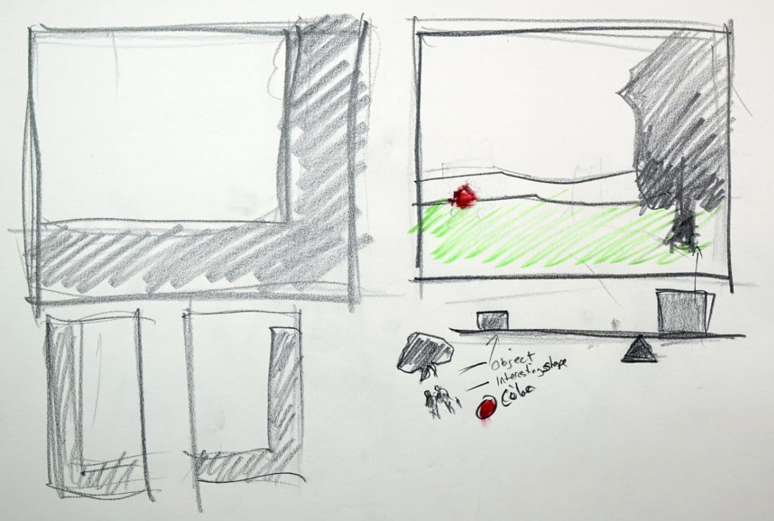
The L-Shape Composition
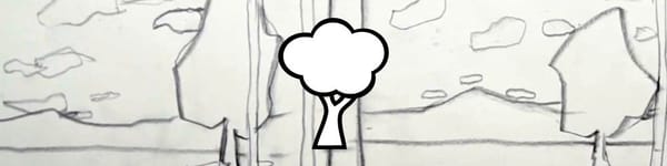
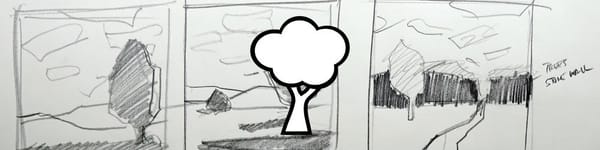
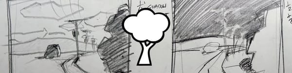
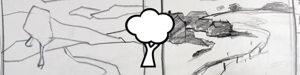
The L-shape is built around a dominant vertical or diagonal element combined with a strong horizontal base. Think of it as framing the scene from one side — creating a natural “frame within a frame.”
That vertical mass could be:
- A tree or group of trees
- A building with a shadow stretching across the ground
- A large foreground rock or structure
The “L” helps guide the viewer’s eye into the scene and adds structure.
It can appear on the left or right side of the painting and works beautifully in both vertical and horizontal formats.
It doesn’t have to be a literal “L,” either — just the feeling of that shape, where a vertical meets a horizontal edge to anchor the design.
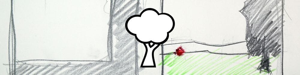
The Fulcrum (Steelyard) Composition
The Fulcrum composition focuses on balance and weight distribution.
Imagine your painting as a seesaw — one large shape on one side balanced by a smaller, lighter shape on the other.
- The large mass could be a tree, building, or cluster of dark shapes.
- The smaller counterbalance could be:
- A smaller object like a distant tree or figure
- An interesting shape or pair of figures
- A bold accent color (like a red barn or umbrella)
The goal is to offset visual weight without symmetry. A large dark tree on the right might feel balanced by a small, vivid shape (like a red barn) on the far left. That distance between them creates dynamic tension and keeps the painting from feeling lopsided.
As I demonstrate in the sketch, that small accent could be anything — a figure, a color note, or a shape that simply feels “interesting.” The power comes from placement, not size.
Why These Work
Both of these compositions rely on clear structure and intentional imbalance:
- The L-shape gives the viewer a visual frame to enter the scene.
- The Fulcrum uses visual tension to create energy and balance.
You can combine these ideas, too — using an L-shape design while placing a counterbalance element in the distance.
Key Takeaways
- Keep composition options simple — two or three structures are plenty.
- The L-shape composition frames the scene and adds direction.
- The Fulcrum (Steelyard) composition balances large and small elements.
- Counterbalance with placement, not symmetry.
- Use color accents as visual weight to offset large shapes.
Course Navigation
Previous Lesson: Leading the Viewer Into the Painting
Next Lesson: Avoiding Common Composition Pitfalls in Landscapes
Acrylic Landscape Painting Hub - view all lessons
Learn & Improve Your Acrylic Skills
- Acrylic Hub– Your go-to guide for tutorials, tips, and resources.
- Ultimate Beginner Acrylic Course - Start painting with confidence.
- Subscribe for More Great Content - Get tutorials, tips, and updates straight to your inbox.
- Follow Me on Pinterest - Daily inspiration, tips, and fresh ideas.
Recommended Acrylic Painting Materials
-
Princeton Catalyst Brushes – Flats (#6, #12), Rounds (#4, #8), Fan (#4), Liner Brush
Durable synthetic bristles for versatile acrylic techniques -
Liquitex Heavy Body Acrylic Paint – Essential Colors
Cadmium Yellow, Yellow Ochre, Alizarin Crimson, Cadmium Red Light, Ultramarine Blue, Cobalt Blue, Burnt Sienna, Titanium White -
Winsor & Newton Cotton Canvas
Reliable stretched canvas for studio and plein air work -
Strathmore 400 Series Mixed Media Paper
Heavyweight, acid-free paper for acrylic and mixed media -
Fabriano Artistico 140lb Cold Press Paper
Excellent for acrylic, mixed media, and textured effects -
Blick Multi-Colored Painting Knife Set
Variety of shapes for texture, scraping, and bold strokes - Miscellaneous: Two pint-sized water containers, paper towels (from Home Depot or Walmart)
- Note: I use canvas or sturdy cardboard as my palette — no store-bought palettes needed.