How to Study Cloud and Sky Techniques from the Masters
Discover how to study cloud and sky techniques from master artists. Analyze gradation, structure, and light to improve your own acrylic landscapes.

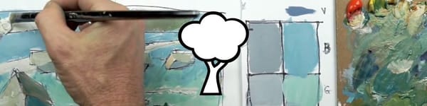
In this lesson, I analyze how a few master painters used color, gradation, and light structure to create believable skies. By breaking their clouds down into basic shapes and planes, we can learn how to simplify and apply these same concepts in our own work.
This lesson is part of the Acrylic Landscape Painting Fundamentals Course.
Understanding Gradation in the Sky
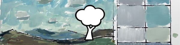
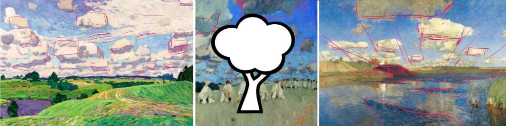
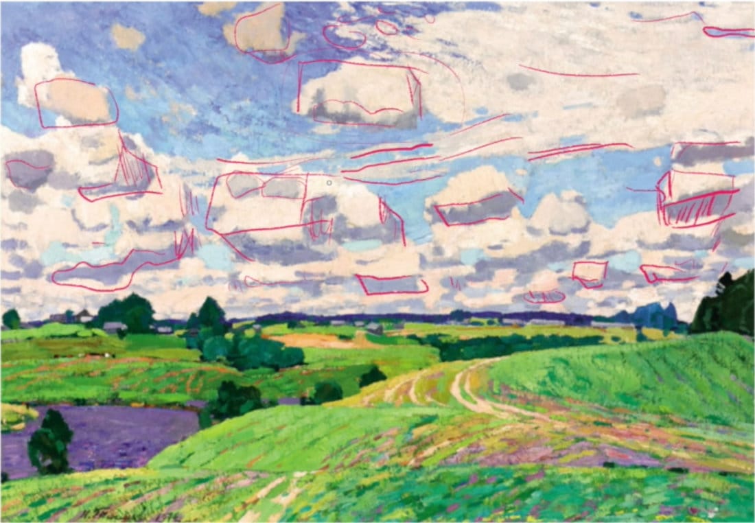
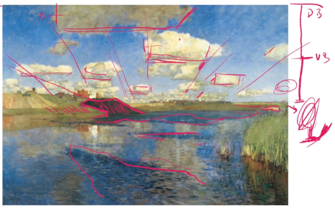
A recurring theme in all of these paintings is sky gradation—darker and cooler at the top, gradually lightening and warming toward the horizon. In some examples, the upper blue even shifts slightly toward violet before softening into pale blue and yellow near the ground.
This gentle shift not only suggests atmosphere but also helps frame the clouds. Notice how the lighter values near the horizon make the darker “bellies” of cumulus clouds stand out clearly.
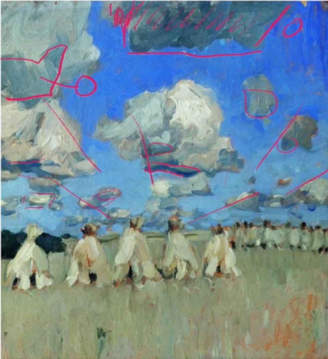
Cloud Planes and Light Direction
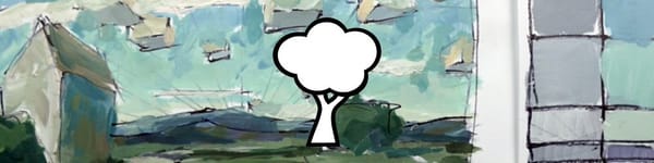
Each cloud contains planes of light just like a building or cube. The underplanes are typically darker than the surrounding sky, while the side planes catch indirect light and color. The upper planes are the brightest, often showing subtle temperature shifts—warm on the sunlit sides, cooler in shadowed areas.
Even though the painters handled them loosely, they always considered the source of light. By placing warmer highlights where sunlight hits and cooler tones underneath, they created a strong sense of structure and form.
Variation and Linear Perspective
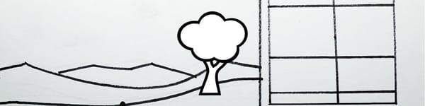
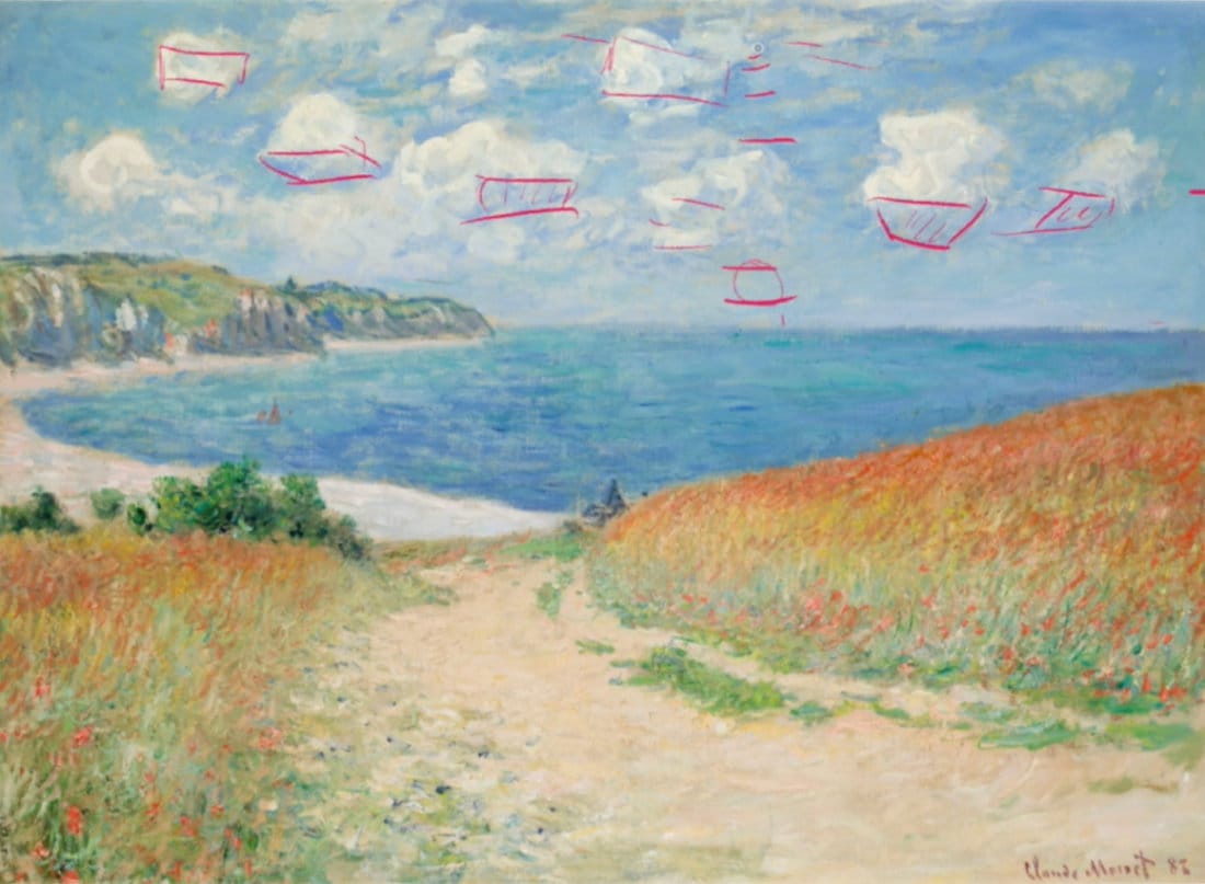
The masters understood that not all clouds follow predictable size patterns. Large, small, and medium forms are often mixed throughout the sky, avoiding monotony. As clouds recede, their undersides narrow and their edges soften, creating natural perspective and depth.
They also used overlapping and alignment of cloud edges to enhance linear perspective. Subtle directional strokes or angled cloud bands help lead the eye toward the horizon.
Warmth, Reflection, and Landscape Connection
Several paintings show how clouds echo the landscape. Warm tones from the earth reflect upward into the clouds’ lower edges, while cooler sky tones blend into distant hills and water. In one example, a hill’s upward slope aligns with a cloud’s angle, suggesting how light follows terrain and atmosphere together.
This integration between sky and land gives the scene unity. The masters didn’t paint the sky and ground separately—they treated them as one system of color and light.
Key Takeaways
Studying these works reminds us that painting skies isn’t about copying clouds—it’s about capturing movement, depth, and light relationships.
- Start with a smooth sky gradation from dark to light.
- Build clouds using simple planes: top, side, and underplane.
- Mix warm and cool tones to define shape and temperature.
- Vary sizes and edges to avoid repetition.
- Connect the clouds’ light and color with the landscape below.
Applying these timeless principles will make your own acrylic skies feel more natural and cohesive.
Course Navigation
Next Lesson: Assignment – Painting Your Own Sky & Cloud Study (coming soon)
Previous Lesson: Turning Boxes Into Clouds & Sky Recap
Landscape Hub: View All Acrylic Landscape Lessons
Learn & Improve Your Acrylic Skills
- Acrylic Hub– Your go-to guide for tutorials, tips, and resources.
- Ultimate Beginner Acrylic Course - Start painting with confidence.
- Subscribe for More Great Content - Get tutorials, tips, and updates straight to your inbox.
- Follow Me on Pinterest - Daily inspiration, tips, and fresh ideas.
Recommended Acrylic Painting Materials
-
Princeton Catalyst Brushes – Flats (#6, #12), Rounds (#4, #8), Fan (#4), Liner Brush
Durable synthetic bristles for versatile acrylic techniques -
Liquitex Heavy Body Acrylic Paint – Essential Colors
Cadmium Yellow, Yellow Ochre, Alizarin Crimson, Cadmium Red Light, Ultramarine Blue, Cobalt Blue, Burnt Sienna, Titanium White -
Winsor & Newton Cotton Canvas
Reliable stretched canvas for studio and plein air work -
Strathmore 400 Series Mixed Media Paper
Heavyweight, acid-free paper for acrylic and mixed media -
Fabriano Artistico 140lb Cold Press Paper
Excellent for acrylic, mixed media, and textured effects -
Blick Multi-Colored Painting Knife Set
Variety of shapes for texture, scraping, and bold strokes - Miscellaneous: Two pint-sized water containers, paper towels (from Home Depot or Walmart)
- Note: I use canvas or sturdy cardboard as my palette — no store-bought palettes needed.