How to Refine Ground and Sky Planes in Acrylic Landscapes
Discover how to refine ground and sky relationships in acrylic painting. Adjust values, color temperature, and reflections for better realism.

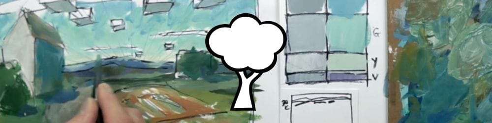
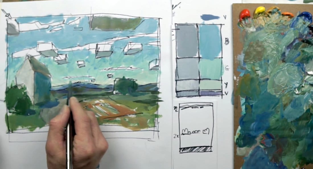
Small adjustments can make a big difference. In this lesson, I’ll demonstrate how to correct values, adjust shadows, and refine edges so the ground plane, sky, and structures all read naturally together. These subtle edits pull the entire painting into balance and help the light feel consistent across the scene.
This lesson is part of the Acrylic Landscape Painting Fundamentals Course.
Re-balancing the Composition
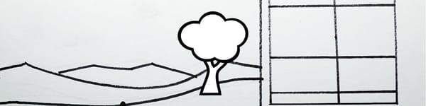
A few quick line and shape changes can completely shift the flow of your composition. I extend the main path downward for better breathing space and adjust its curve to lead the eye toward the horizon. Even minor tweaks to a road or shadow direction can enhance perspective and rhythm.
Refining Values and Planes
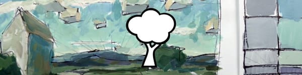
Vertical planes—such as barns, trees, and fences—should generally be darker than the ground plane. When they share the same value, the scene looks flat. I lighten the ground slightly and cool the vertical surface to separate them. Adjusting one or two neighboring shapes often reveals hidden imbalances you didn’t see before.
Introducing Temperature and Reflection
Where the barn meets the ground, I add a touch of warm reddish-orange-green into the lower edge, suggesting reflected light bouncing upward. Nearby, a faint cool tone at the top of the shadow keeps the effect believable. Mixing a hint of blue-violet into cast shadows connects them with the surrounding atmosphere.
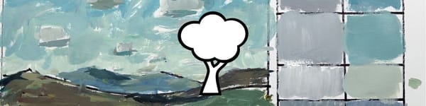
Correcting Mountain and Sky Transitions
At the horizon, mountain hues can blend into the sky so smoothly that you lose separation. To fix this, I blend a touch of the sky color into the top of the range, then reinforce the lower edges with slightly warmer, earthier tones. This keeps the distant ridge soft but still readable.
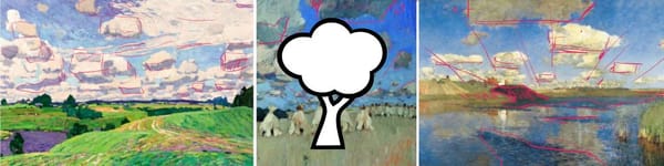
Softening Edges and Cleaning Shapes
As light and form interact, edges need variety—some crisp, some lost. I soften transitions where cloud shadows hit the land and strengthen darker shapes where trees overlap hills. Each correction improves depth without over-defining detail.
Course Navigation
Next Lesson: Adding Color and Shape to Clouds
Previous Lesson: Ground and Mountain Planes
Landscape Hub: View All Acrylic Landscape Lessons
Learn & Improve Your Acrylic Skills
- Acrylic Hub– Your go-to guide for tutorials, tips, and resources.
- Ultimate Beginner Acrylic Course - Start painting with confidence.
- Subscribe for More Great Content - Get tutorials, tips, and updates straight to your inbox.
- Follow Me on Pinterest - Daily inspiration, tips, and fresh ideas.
Recommended Acrylic Painting Materials
-
Princeton Catalyst Brushes – Flats (#6, #12), Rounds (#4, #8), Fan (#4), Liner Brush
Durable synthetic bristles for versatile acrylic techniques -
Liquitex Heavy Body Acrylic Paint – Essential Colors
Cadmium Yellow, Yellow Ochre, Alizarin Crimson, Cadmium Red Light, Ultramarine Blue, Cobalt Blue, Burnt Sienna, Titanium White -
Winsor & Newton Cotton Canvas
Reliable stretched canvas for studio and plein air work -
Strathmore 400 Series Mixed Media Paper
Heavyweight, acid-free paper for acrylic and mixed media -
Fabriano Artistico 140lb Cold Press Paper
Excellent for acrylic, mixed media, and textured effects -
Blick Multi-Colored Painting Knife Set
Variety of shapes for texture, scraping, and bold strokes - Miscellaneous: Two pint-sized water containers, paper towels (from Home Depot or Walmart)
- Note: I use canvas or sturdy cardboard as my palette — no store-bought palettes needed.