How to Paint Sky Gradations and Cloud Hues in Acrylic
Learn how to paint sky gradations and clouds with acrylics. This lesson covers color transitions, hue shifts, and atmosphere for natural skies.

Painting skies that feel believable comes down to one thing—gradations. In this lesson, I’ll walk through how to layer color from horizon to upper atmosphere, plus how to mix subtle variations that make clouds fit naturally into your composition.
This lesson is part of the Acrylic Landscape Painting Fundamentals Course.
Understanding Sky Gradations
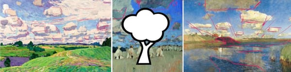
When you look up, the color of the sky isn’t flat—it shifts from a warm, pale blue near the horizon to a cooler, deeper blue overhead. In acrylics, this means gently blending colors while paying attention to value relationships.
Start with greens and warm grays near the horizon, then gradually transition toward cooler blues and violets as you move upward. Avoid sharp lines or “bands.” Let colors overlap slightly to keep the transition natural.
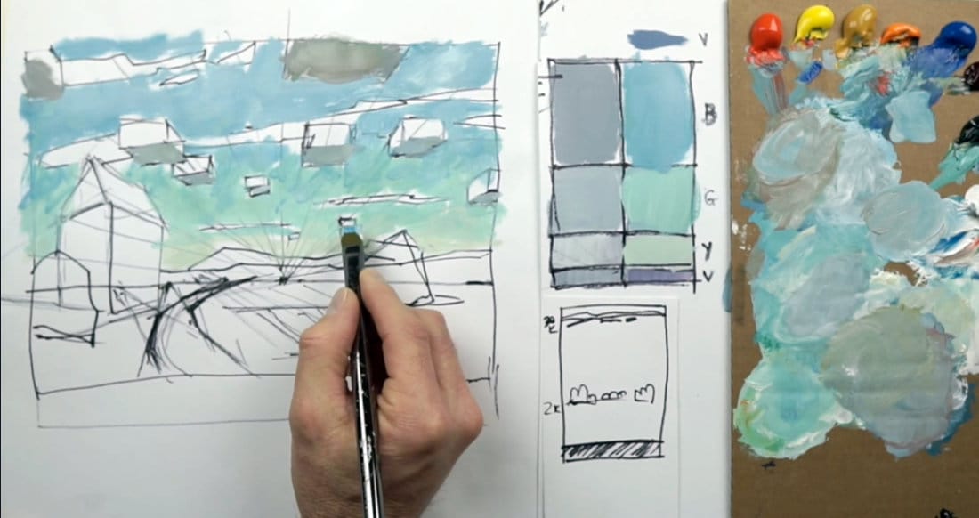
Choosing the Right Colors
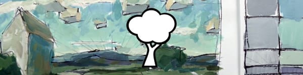
For this demo, I used a familiar palette: cad red light, cad yellow light, yellow ochre, cad orange, cerulean blue, alizarin crimson, viridian green, and titanium white. The goal isn’t to copy nature perfectly but to suggest atmosphere with color temperature and value control.
Use a bit of viridian to soften blues, or add ochre and orange to warm them up. When acrylics dry, they darken slightly—so always paint a touch lighter than you think you need.
Adding Cloud Hues and Planes
Cumulus clouds behave like floating boxes with light and shadow planes. The underside is usually darker in value, especially when compared to the surrounding sky. As clouds recede into distance, their values lighten and edges soften.
A simple way to test relationships is to compare what’s underneath the cloud with the sky beside it—sometimes one will appear darker, other times lighter. Don’t assume; observe and compare.
Using Atmospheric Perspective
As clouds move farther away, they lose yellow and warmth, taking on cooler blue and violet tones. Closer clouds often show subtle greens or yellows in their base color. This shift is part of atmospheric perspective, and using it helps separate near and far shapes without over-detailing.
Course Navigation
Next Lesson: Ground and Mountain Planes
Previous Lesson: Linear Perspective & Cloud Types
Landscape Hub: View All Acrylic Landscape Lessons
Learn & Improve Your Acrylic Skills
- Acrylic Hub– Your go-to guide for tutorials, tips, and resources.
- Ultimate Beginner Acrylic Course - Start painting with confidence.
- Subscribe for More Great Content - Get tutorials, tips, and updates straight to your inbox.
- Follow Me on Pinterest - Daily inspiration, tips, and fresh ideas.
Recommended Acrylic Painting Materials
-
Princeton Catalyst Brushes – Flats (#6, #12), Rounds (#4, #8), Fan (#4), Liner Brush
Durable synthetic bristles for versatile acrylic techniques -
Liquitex Heavy Body Acrylic Paint – Essential Colors
Cadmium Yellow, Yellow Ochre, Alizarin Crimson, Cadmium Red Light, Ultramarine Blue, Cobalt Blue, Burnt Sienna, Titanium White -
Winsor & Newton Cotton Canvas
Reliable stretched canvas for studio and plein air work -
Strathmore 400 Series Mixed Media Paper
Heavyweight, acid-free paper for acrylic and mixed media -
Fabriano Artistico 140lb Cold Press Paper
Excellent for acrylic, mixed media, and textured effects -
Blick Multi-Colored Painting Knife Set
Variety of shapes for texture, scraping, and bold strokes - Miscellaneous: Two pint-sized water containers, paper towels (from Home Depot or Walmart)
- Note: I use canvas or sturdy cardboard as my palette — no store-bought palettes needed.