How to Paint Ground and Mountain Planes in Acrylic Landscapes
Learn how to paint ground and mountain planes in acrylic. Explore warm and cool color shifts, aerial perspective, and realistic land forms.

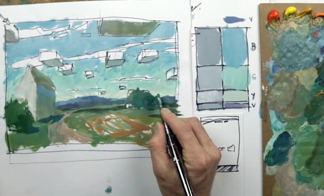
In this lesson, I’ll show how to apply color to the ground and mountain planes in your landscape while keeping everything consistent with light direction and atmosphere. We’ll build on the earlier sky gradation and cloud studies, then block in the land shapes using color temperature and aerial perspective to create depth.
This lesson is part of the Acrylic Landscape Painting Fundamentals Course.
Understanding Planes and Light
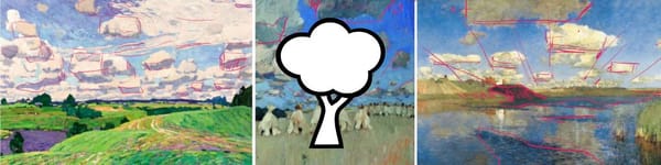
Every landscape can be broken into three main planes: sky, ground, and upright forms like trees or buildings. Each one receives light differently. In this exercise, I focus on the ground and mountain planes — defining them with color, value, and edge variation to keep the light source consistent.
The distant mountain sits cooler and lighter, while the closer shapes take on warmer, darker tones. The small shifts in temperature and value create a strong sense of depth without overworking the detail.
Blocking in Distant Hills
I begin with distant blue-grays for the far hills — think cooler tones with less contrast. As these recede, they lose yellow and saturation. Keep edges soft and transitions subtle. The goal is to make them feel far away without needing sharp lines or texture.
A touch of ultramarine with white and a small amount of alizarin crimson gives a great atmospheric hue for these layers.
Adding Warmth to the Foreground
As we move forward in the landscape, the ground plane picks up warmth and texture. I introduce muted greens and yellow ochre, then small hits of orange and red near the mid-ground to keep visual energy near the center — not the edge — of the composition.
Avoid overly bright yellows in the foreground; they can pull attention out of the frame. Instead, keep your warmest notes just behind the focal point, letting color guide the viewer’s eye inward.
Integrating Shadows and Reflected Light
The clouds above cast subtle shadows over the ground and hills, helping tie the land and sky together. I mix neutral violets and gray-greens for these soft, moving shadows. On upright forms like buildings, I add a touch of bounced light— warm tones reflecting upward from the ground plane into the walls.
This interplay between warm and cool keeps everything believable and cohesive.
Course Navigation
Next Lesson: Refine Ground & Sky Planes
Previous Lesson: Adding Sky Gradations and Cloud Hues
Landscape Hub: View All Acrylic Landscape Lessons
Recommended Acrylic Painting Materials
-
Princeton Catalyst Brushes – Flats (#6, #12), Rounds (#4, #8), Fan (#4), Liner Brush
Durable synthetic bristles for versatile acrylic techniques -
Liquitex Heavy Body Acrylic Paint – Essential Colors
Cadmium Yellow, Yellow Ochre, Alizarin Crimson, Cadmium Red Light, Ultramarine Blue, Cobalt Blue, Burnt Sienna, Titanium White -
Winsor & Newton Cotton Canvas
Reliable stretched canvas for studio and plein air work -
Strathmore 400 Series Mixed Media Paper
Heavyweight, acid-free paper for acrylic and mixed media -
Fabriano Artistico 140lb Cold Press Paper
Excellent for acrylic, mixed media, and textured effects -
Blick Multi-Colored Painting Knife Set
Variety of shapes for texture, scraping, and bold strokes - Miscellaneous: Two pint-sized water containers, paper towels (from Home Depot or Walmart)
- Note: I use canvas or sturdy cardboard as my palette — no store-bought palettes needed.