How to Paint Clouds and Add Form in Acrylic Landscapes
Discover how to paint cumulus clouds in acrylic landscapes. Learn how to simplify form, use light direction, and add realistic color temperature shifts.

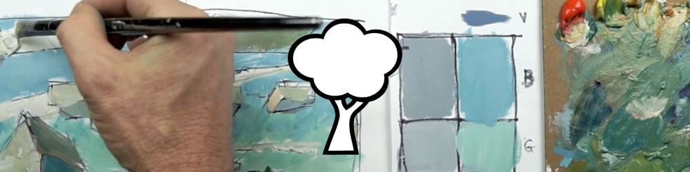
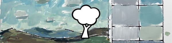
In this lesson, I’ll show how to add color and structure to cumulus clouds using planes of light and shadow. We’ll break down clouds into simple box-like shapes so we can understand how light affects each side. This approach keeps the process loose but believable, while also integrating the clouds naturally into the landscape.
This lesson is part of the Acrylic Landscape Painting Fundamentals Course.
Understanding Cloud Planes and Light Direction
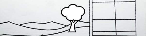
Think of a cloud as a soft, rounded cube. The underplane—the bottom of the cloud—is key. It often carries a slightly darker, cooler value, while the top plane catches light from above. The side planes vary depending on the light direction, and that’s where most of the form comes from.
In this scene, the light comes in at an angle. I use that to decide which faces of the “box” are in shadow and which are lit. Even though clouds aren’t literal boxes, this simplification helps control light placement and structure.
Adjusting Color Temperature and Value
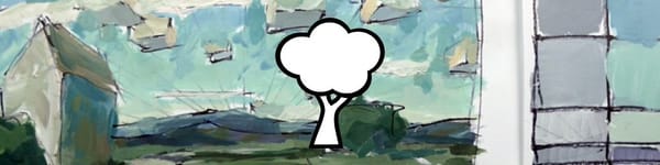
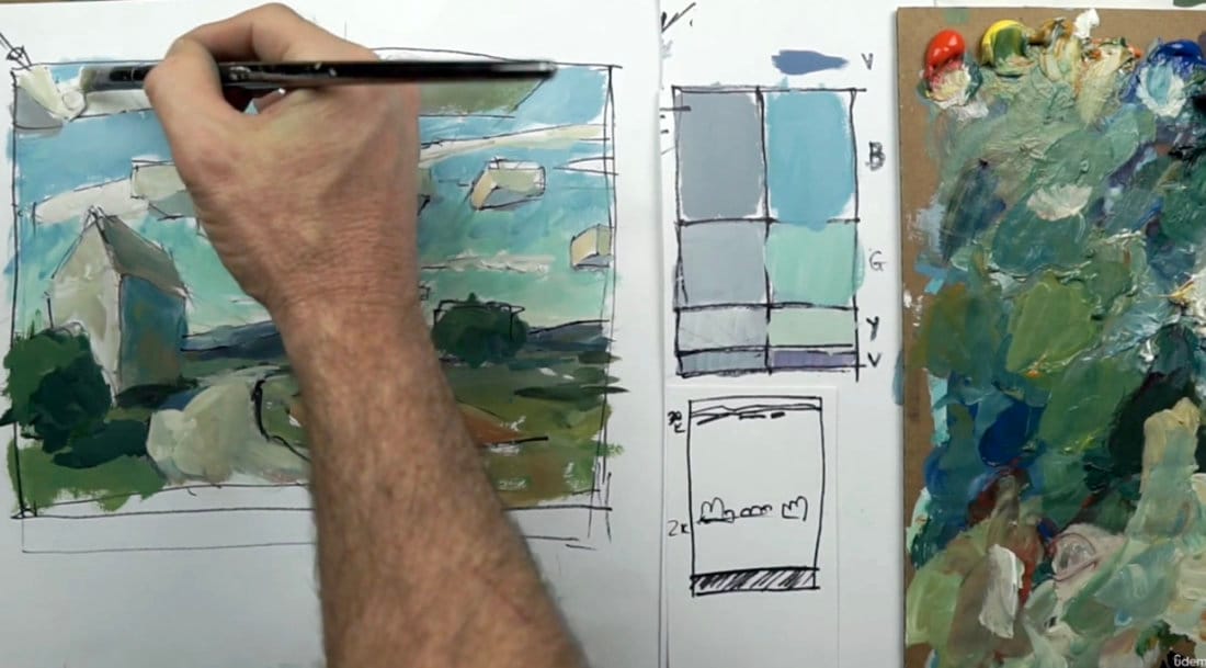
Closer clouds tend to appear warmer and more yellow, while distant ones cool toward blue. As I move back in the composition, I gradually shift from warm yellow-whites to softer blue-grays. These small changes in color temperature help suggest atmosphere and distance.
To mix these hues, I combine white, ultramarine blue, and touches of orange or red to neutralize. The result is a believable range of off-whites and grays that still feel alive. Avoid using pure white—it flattens form and kills the sense of light.
Layering and Building Form
Each cloud is developed in layers. I start with a light midtone for the mass, then layer slightly lighter paint for the illuminated top planes. The undersides get a thin glaze of cooler grays or violets to indicate shadow and thickness.
Adding just a hint of bounce light—warm tones reflecting upward from the ground—can make the bottom edges feel more integrated with the scene. It’s subtle, but it ties everything together.
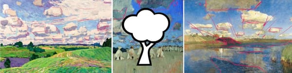
Cirrus Clouds and Depth
To break up the solid masses of cumulus clouds, I add thin, wispy cirrus streaks behind them. Their lighter, cooler values contrast nicely with the warmer cloud fronts, helping create depth and variety in the sky. This layering effect gives the illusion of multiple atmospheric layers without much effort.
Course Navigation
Next Lesson: Turning Boxes Into Clouds & Recap
Previous Lesson: Making Corrections and Refining Planes
Landscape Hub: View All Acrylic Landscape Lessons
Recommended Acrylic Painting Materials
-
Princeton Catalyst Brushes – Flats (#6, #12), Rounds (#4, #8), Fan (#4), Liner Brush
Durable synthetic bristles for versatile acrylic techniques -
Liquitex Heavy Body Acrylic Paint – Essential Colors
Cadmium Yellow, Yellow Ochre, Alizarin Crimson, Cadmium Red Light, Ultramarine Blue, Cobalt Blue, Burnt Sienna, Titanium White -
Winsor & Newton Cotton Canvas
Reliable stretched canvas for studio and plein air work -
Strathmore 400 Series Mixed Media Paper
Heavyweight, acid-free paper for acrylic and mixed media -
Fabriano Artistico 140lb Cold Press Paper
Excellent for acrylic, mixed media, and textured effects -
Blick Multi-Colored Painting Knife Set
Variety of shapes for texture, scraping, and bold strokes - Miscellaneous: Two pint-sized water containers, paper towels (from Home Depot or Walmart)
- Note: I use canvas or sturdy cardboard as my palette — no store-bought palettes needed.