Repurposing Failed Paintings: Mixed Media Cat Study Construction
Turn a discarded Bristol paper palette into a colorful, playful mixed media cat painting using acrylics and creative brushwork. Beginner-friendly and fun!

This tutorial demonstrates how to transform reject paintings and used palette surfaces into successful mixed media studies. Using simple cat contours as subject matter, you'll learn systematic approaches to working over existing marks, controlling acrylic transparency, and building cohesive compositions from discarded materials.
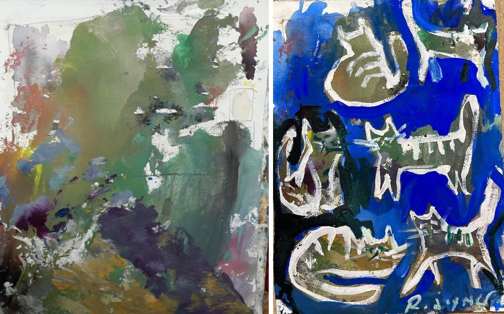
Using sketches, bad art and drawer-kept rejects as a starting point for paintings such as these cats has probably been the most resourceful and satisfying thing I've done in the studio since making storage shelves out of dumpster-dived 2x4's someone tossed away last year.
π Discover more mixed media painting techniques in my Mixed Media Hub
Anyhow, what makes this mixed media project really versatile is you can add any subject, any one color background, and scale it up to any size and it just works!
Watch video: smash that play button and start your new journey, can't wait to hear what you do!
Cat painting video
Materials and Setup
Titanium white, cobalt blue, dark olive green acrylics, small signature brush, reject painting or used palette surface. The key material here is the foundation - a painting that didn't work or cardboard/paper previously used for paint mixing. See my full mixed media toolbox below.
Foundation Assessment
Working Over Existing Marks
Rather than starting with clean surfaces, evaluate your reject paintings and palette papers for underlying texture and color relationships. These accidental marks often provide better foundation interest than intentionally prepared surfaces.
Surface Selection Criteria
Choose foundations with varied mark-making but not overwhelming color complexity. The underlying layer should support rather than compete with new imagery.

Reference and Planning Strategy
Simple Subject Selection
Cat contours work well for this technique because they require minimal detail while offering recognizable forms. Source simple, playful graphics rather than complex reference photos that demand precise rendering.
Loose Sketching Approach
Practice cat proportions and poses through quick sketches before committing to the painting surface. This builds confidence in essential shapes without getting caught in detail work.
Application Technique
Contour Construction
Use deliberate brushwork to establish cat forms with titanium white. The contrast against the colored foundation creates immediate form definition while allowing underlying marks to show through.
Transparency Control
Vary paint application thickness to control visibility of underlying layers. Thicker application provides opacity where needed, while thinner applications maintain transparency for textural interest.
Color Integration Strategy
Working with Existing Colors
Rather than fighting the foundation colors, integrate them through strategic color choices. Cobalt blue works with most underlying warm tones, creating natural color harmony.
Systematic Color Addition
Add colors gradually, testing how they interact with both the foundation and previously applied paint. The olive green addition demonstrates how small color introductions can enhance rather than overwhelm.
Technical Considerations
Paint Consistency Management
Use water to adjust acrylic flow and transparency. This allows control over how much underlying texture shows through each application.
Accidental Mark Integration
Embrace unintentional paint pickup on brushes as design elements rather than mistakes. These accidents often create more interesting variation than deliberate effects.
Advanced Applications
Layering Strategy
Build complexity through multiple transparent layers rather than single opaque applications. Each layer adds depth while preserving important underlying elements.
Edge Variation
Alternate between defined contour work and soft, blended areas to create visual rhythm and prevent monotonous handling.
Problem-Solving Approach
When Foundations Are Too Busy
If underlying marks compete with new imagery, use selective opaque coverage to quiet problem areas while preserving beneficial textures.
Color Harmony Issues
Introduce bridging colors that relate to both foundation and new applications. This creates unified color relationships across the mixed timeline of mark-making.
Studio Efficiency Benefits
This approach maximizes material usage while providing ready-made textural foundations. Failed paintings become resources rather than waste, and palette surfaces gain second lives as artwork foundations.
The technique builds confidence in working over complex surfaces while teaching transparency control and color integration skills essential for advanced mixed media work.
Want to go deeper with collage & mixed media?
π Explore the Mixed Media Hub
π Browse Collage Painting Ideas
π Dive into the Garage Collage Barrage
Supplies I Use All the Time
These are my go-to materials for almost every mixed media project I create. Do I add new ingredients occasionally? You betcha! But these are the go-to materials I rely on most. I know how they behave, how they layer, and how to get the best results from them.
- Acrylic Paints β I only buy heavy body for their thick texture and thin them with water for fluid glazing and washes. See my favorite set β
- Watercolors Paints β Great for transparent layers and unexpected color effects. Exact colors are below. Shop my watercolor picks β
- Acrylic Inks - Excellent way to add transparent layers to mixed media artwork. Mixes well with everything! See the inks β
- Synthetic Acrylic Brushes - You need a variety and I have listed my go-to's below. I use Princeton brands, very dependable! See the brushes β
- Watercolor Brushes - Get a decent grade but avoid all-natural as synthetic blends have come a long way. Shop my picks β
- Collage Papers β A mix of pattered, and printed paper you see me use is from Hobby Lobby, and it's usually found in the scrapbook section. Browse paper packs β
- Palette Knives β Good to have around for scooping paint and smearing techniques. See what I use β
- Blick Super Value Canvas Packs - Comes in many small and medium sizes up to 20x16". Love em'. Best bulk stretched canvas β
- Mixed Media Paper β Sturdy enough to handle wet and dry techniques. Strathmore is the way to go! Best paper for mixed media β
- Watercolor Paper - Top choice is 140 lb. cold press by Fabriano Artistico. Cost effective and crispy white. Best watercolor paper β
- Caran d'Ache Water-Soluble Crayons β Perfect for adding scribbles and linear interest to mixed media art. Check them out β
- Gator Board - Best firm boards you can find! Buy a large sheet and cut out down. These are used as backing for my paper when I paint. Check it out β
- Mod Podge - Reliable and affordable adhesive for paper, thick and thin. And get the Matte! View the glue β
My preferred hues; Cadmium Yellow, Yellow Ochre, Alizarin Crimson, Cadmium Red Light (or Medium), Ultramarine Blue, Cobalt Blue, Burnt Sienna, Titanium White
My preferred acrylic brushes; #12 Large round, 2x Medium rounds, 2x Detail, or liner brushes, Large and medium fan brush, a few medium size bristles and old, small house painting brush for glue.