Acrylic Landscape Painting – Three Planes & Light Shadow Demo
Robert demonstrates how to simplify light and form in acrylic landscape painting, breaking down planes and values inspired by the masters.

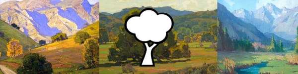
In this final landscape painting lesson for Section 3, we’ll review how to interpret planes and light directly from the masters. Using three classic plein air works, I will sketch quick studies that identify ground, vertical, and angled planes, then moves on to light vs. shadow mapping.
This two-step breakdown reinforces your understanding of form while keeping things simple — each sketch only takes a few minutes but reveals a lot about how master painters designed light and structure.
This lesson is part of the Acrylic Landscape Painting Fundamentals Course.
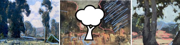
Plane Identification
I start with a Marion Wachtel landscape, marking out:
- Ground plane – lightest area, mostly horizontal.
- Angled planes – hills and distant mountains receding into atmosphere.
- Verticals – trees and upright masses anchoring the scene.
I add quick tonal notes (not value hierarchy) just to distinguish each plane type visually.
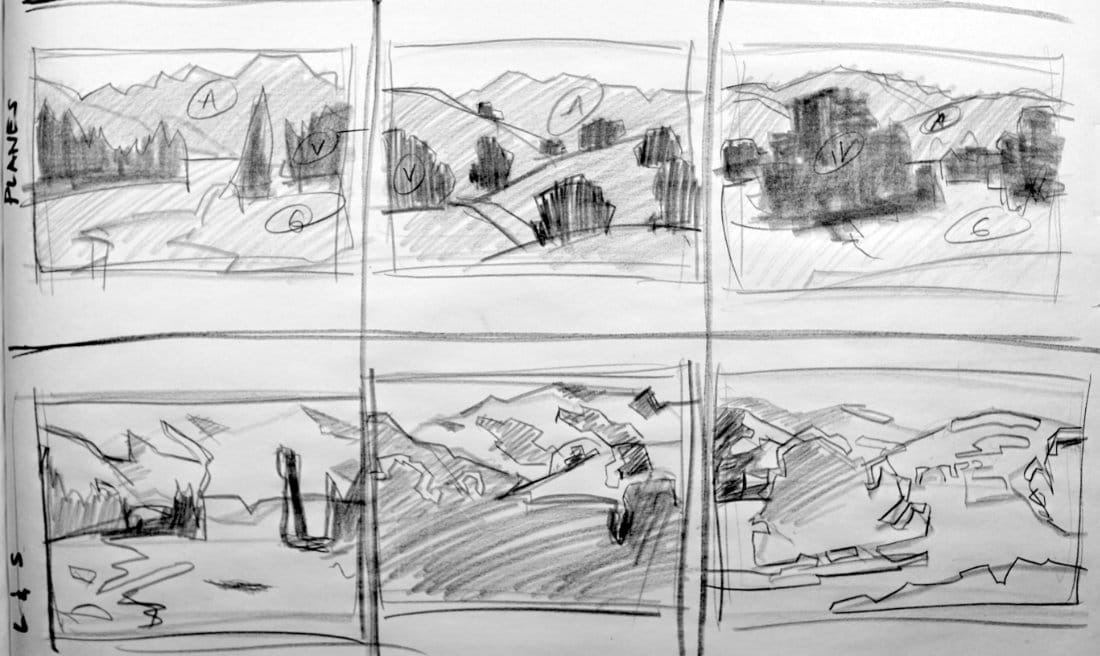
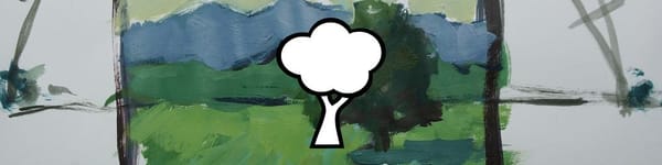
Moving to Rolling Hills
Next, I analyze a William Wendt piece — full of soft rolling shapes and layered forms.
- Every hill reads as an angled plane; there’s almost no truly flat ground.
- Vertical elements like trees clearly break the rhythm and catch bits of reflected sky light.
- Notice how Wendt simplifies distance using clean, organized shapes and limited contrast
This is a great reminder that simplicity often communicates form better than extra detail.
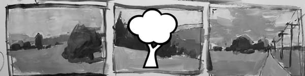
Applying Light & Shadow
Once the planes are mapped, I shift to light and shadow passes.
- Light-catching tree edges and hilltops guide the eye.
- Shadowed foregrounds push the viewer into depth.
- Backlit shapes create dramatic silhouettes and rhythm through
Rather than focusing on rendering, the exercise is about learning to see how light defines form.
Key Takeaways
- Simplify each subject into three planes before color.
- Observe how light direction affects plane value.
- Don’t over-model — clarity > detail.
- Practice with quick 3–5 minute sketches to train your eye.
Each pass adds another layer of understanding, preparing you for the more advanced lessons coming next.
Navigation
Previous Lesson: Three Planes & Light Shadow Assignment
Next Section: Section 4 – Atmospheric Perspective (coming soon)
Return to Hub: Free Acrylic Landscape Painting Course
This lesson concludes Section 3! Congrats on making it this far.
Learn & Improve Your Acrylic Skills
- Acrylic Hub– Your go-to guide for tutorials, tips, and resources.
- Ultimate Beginner Acrylic Course - Start painting with confidence.
- Subscribe for More Great Content - Get tutorials, tips, and updates straight to your inbox.
- Follow Me on Pinterest - Daily inspiration, tips, and fresh ideas.
Recommended Acrylic Painting Materials
-
Princeton Catalyst Brushes – Flats (#6, #12), Rounds (#4, #8), Fan (#4), Liner Brush
Durable synthetic bristles for versatile acrylic techniques -
Liquitex Heavy Body Acrylic Paint – Essential Colors
Cadmium Yellow, Yellow Ochre, Alizarin Crimson, Cadmium Red Light, Ultramarine Blue, Cobalt Blue, Burnt Sienna, Titanium White -
Winsor & Newton Cotton Canvas
Reliable stretched canvas for studio and plein air work -
Strathmore 400 Series Mixed Media Paper
Heavyweight, acid-free paper for acrylic and mixed media -
Fabriano Artistico 140lb Cold Press Paper
Excellent for acrylic, mixed media, and textured effects -
Blick Multi-Colored Painting Knife Set
Variety of shapes for texture, scraping, and bold strokes - Miscellaneous: Two pint-sized water containers, paper towels (from Home Depot or Walmart)
- Note: I use canvas or sturdy cardboard as my palette — no store-bought palettes needed.