Avoiding Common Composition Mistakes in Landscape Painting
Learn to spot and fix common composition errors like kissing edges and flat spacing. Discover how overlapping, spacing, and vertical placement add depth.

No matter how long I paint and study composition and design, it's easy to fall into a few classic composition traps — things that flatten space or make the scene feel awkward. In this lesson, I’ll show some of the most common design mistakes and how to fix them using simple overlapping, spacing, and depth adjustments.
This lesson is part of the Acrylic Landscape Painting Fundamentals Course.
Overlapping Creates Depth
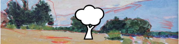
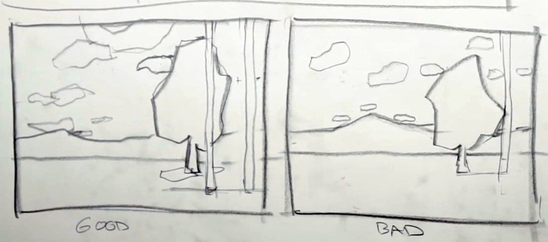
One of the easiest ways to create depth is through overlapping. When one object sits in front of another — like a tree overlapping a cloud or hill — it immediately tells the viewer which object is closer.
In the “good” example, the tree slightly overlaps the background cloud, creating space and perspective. In the “bad” version, the tree and cloud are side-by-side, or “kissing,” which flattens the scene and confuses depth.
Whenever you have two shapes meeting, decide which one is in front and make sure that relationship is clear.
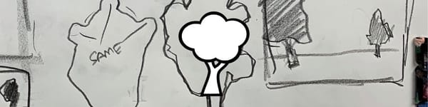
Avoid “Kissing” Edges
A “kiss” happens when two shapes barely touch — for example, a telephone pole just touching the edge of a tree. It’s a subtle but common problem that instantly weakens a design.
To fix it, either:
- Overlap one shape clearly in front of the other, or
- Separate them with visible space.
A small adjustment can turn a stiff, awkward design into one that breathes and feels natural.
Use Uneven Spacing for Better Rhythm
When placing clouds, trees, or buildings, avoid identical spacing or equal-size shapes. Variety is key to visual rhythm.
For instance:
- Make clouds smaller and lighter as they move into the distance.
- Use different shapes — not just repeated blobs of similar size.
- Vary the gaps between shapes to add movement and life.
Even small changes in spacing and proportion make a painting feel intentional instead of mechanical.
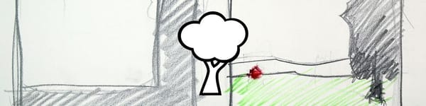
Depth Through Vertical Placement
Objects lower in the picture plane feel closer to the viewer, while higher objects appear farther away.
If you want a pole, tree, or rock to appear closer, drop it lower in the frame.
In the bad example, the tree and pole are at the same height, so the viewer reads them as flat. Lowering the pole (or raising it, depending on the design) instantly restores perspective and depth.
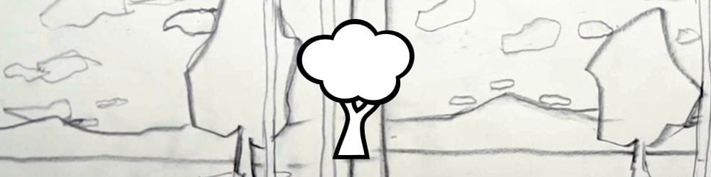
Avoid “Tracing” Around Shapes
Another easy trap is outlining shapes — like arranging clouds to perfectly trace around a tree or hill. It feels artificial and draws attention away from the main subject.
Instead, let some clouds or shapes overlap slightly into or behind objects to create natural layering.
Key Takeaways
- Overlap shapes to show depth and hierarchy.
- Avoid kissing edges — separate or overlap objects.
- Use uneven spacing for variety and rhythm.
- Create depth through vertical placement on the picture plane.
- Avoid tracing around shapes — let edges breathe and interlock naturally.
Course Navigation
Previous Lesson: Landscape Composition Types: L-Shape and Fulcrum Designs
Next Lesson: Advanced Composition and Design Tips
Acrylic Landscape Painting Hub - view all lessons and modules
Learn & Improve Your Acrylic Skills
- Acrylic Hub– Your go-to guide for tutorials, tips, and resources.
- Ultimate Beginner Acrylic Course - Start painting with confidence.
- Subscribe for More Great Content - Get tutorials, tips, and updates straight to your inbox.
- Follow Me on Pinterest - Daily inspiration, tips, and fresh ideas.
Recommended Acrylic Painting Materials
-
Princeton Catalyst Brushes – Flats (#6, #12), Rounds (#4, #8), Fan (#4), Liner Brush
Durable synthetic bristles for versatile acrylic techniques -
Liquitex Heavy Body Acrylic Paint – Essential Colors
Cadmium Yellow, Yellow Ochre, Alizarin Crimson, Cadmium Red Light, Ultramarine Blue, Cobalt Blue, Burnt Sienna, Titanium White -
Winsor & Newton Cotton Canvas
Reliable stretched canvas for studio and plein air work -
Strathmore 400 Series Mixed Media Paper
Heavyweight, acid-free paper for acrylic and mixed media -
Fabriano Artistico 140lb Cold Press Paper
Excellent for acrylic, mixed media, and textured effects -
Blick Multi-Colored Painting Knife Set
Variety of shapes for texture, scraping, and bold strokes - Miscellaneous: Two pint-sized water containers, paper towels (from Home Depot or Walmart)
- Note: I use canvas or sturdy cardboard as my palette — no store-bought palettes needed.