Applying Value Hierarchy to Complex Scenes: From Theory to Practice
Understanding value hierarchy theory is one thing - applying it to complex scenes with buildings, vehicles, and figures is another. This demonstration shows the strategic decision-making process: setting up perspective structure, then layering value relationships that create depth and focus.


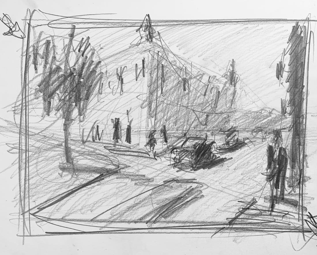
You understand the theory - lightest lights, darkest darks, everything organized between those anchors. Now let's apply it to an actual scene with buildings, vehicles, figures, and a tree all competing for attention.
Want drawing lessons? Visit the Free Drawing Tutorials & Courses hub →
Starting with Structure
Before values matter, the drawing has to work. I'm setting up a street scene with buildings receding to two vanishing points, a road curving through, cars positioned at correct scale, figures walking across. This is the perspective foundation we covered earlier - everything needs to agree about where the viewer is standing before we start thinking about light and shadow.
The dome building sits on the corner. Taller structures on the left, shorter buildings receding into the background. A tree in that little park area. Cars scaled correctly - their tops sit just below eye level, which runs at about head height for the standing figures.
That's the blueprint. Now for the value plan.
Making Strategic Decisions
Light source comes from the left, which means the front face of that corner building catches direct light. But here's the strategic thinking: I'm making the sky darker than usual, which lets me keep that sunlit building face relatively light without it disappearing against a white sky.
The shadow side of that corner building becomes my darkest dark. That's the anchor. Everything else finds its value relative to that decision.
The tree: It's a vertical element in the foreground, which normally means dark value. But if I make it as dark as the shadow side of the building, now I've got two competing darks and the focal point gets confused. So I'm keeping the tree lighter - still darker than the ground plane, but subordinate to the building shadow.
That's hierarchy thinking. Not "what's the actual value I see" but "what value serves the composition."
Building the Value Map
The ground plane stays lighter than vertical elements. The crosswalk lines read as lighter strips against that mid-tone ground. Cars get individual treatment - maybe a dark blue one here, a lighter one there - but their shadows all respect the same light source direction.
Distant buildings fade lighter, staying closer to sky value. That creates depth through atmospheric perspective layered on top of the linear perspective we already established.
The figures: dark jacket on the crossing pedestrian, lighter values on the distant ones because they're farther back and smaller in scale. Their cast shadows angle correctly based on that left-side light source.
What I'm Avoiding
Notice what I'm not doing: copying every detail I see. There's signage on buildings, but I'm suggesting it with value changes rather than rendering every letter. Windows get indicated with consistent value - not individually copied from reference.
The goal is a value blueprint that could become a painting, not a finished rendering. This is the planning stage. Once this reads correctly in grayscale, color choices become easier because you already know what values those colors need to hit.
The Glare Problem
You can see my studio lights creating some glare on the drawing surface. That's reality when demonstrating - not everything is perfectly controlled. But the value relationships still read correctly despite the reflection.
That building shadow as the darkest dark. The sunlit face staying light. The sky darker than expected but creating contrast where it matters. The tree subordinate to the main focal point. Ground plane lighter than verticals. Atmospheric fade in the distance.
Why This Exercise Matters
Taking value hierarchy from simple cube demonstration to complex urban scene shows you it's not just academic theory. Every painting with multiple elements requires this thinking.
You're making choices: what dominates, what recedes, what catches light, what sits in shadow. Those choices create the lie that makes a two-dimensional surface feel like three-dimensional space.
The perspective gives you spatial accuracy. The value hierarchy gives you dimensional form and atmospheric depth. Together they sell the illusion.
From Plan to Paint
This grayscale study becomes the roadmap. When I move to color, I'm not guessing about values - I already solved that problem. Now I'm just asking "what color hits this value?" instead of trying to solve value and color simultaneously.
That's why the planning stage matters. Separate the problems, solve them individually, then combine the solutions.
Building on Foundations
This demonstration uses skills from earlier lessons:
Perspective structure: Drawing Complex Scenes: Multiple Objects in One-Point Perspective - The foundation drawing here applies those same coordination principles.
Value theory: Value Hierarchy Basics: Why Your Paintings Look Flat - We're applying the theory from this lesson to a real scenario.
What's next: Student value studies showing common mistakes and corrections, followed by finished painting demonstrations.
The Takeaway
Value hierarchy isn't theoretical once you apply it to actual scenes. It's the decision-making framework that prevents muddy, flat compositions. Plan the values before you paint. Make strategic choices about what dominates and what subordinates. Let the grayscale study prove your plan works before committing to color.
This street scene demonstrates exactly that process - from perspective framework to value blueprint, ready for paint.
Continue Learning
If you enjoyed this hand drawing course, explore even more lessons on our Free Drawing Tutorials & Courses Hub — including the complete How to Draw – Beginner’s Course.
Want new tutorials delivered to your inbox? Subscribe here and get free lessons, tips, and inspiration sent directly to you.