Advanced Wet-on-Dry: Fix Flat Washes
Troubleshoot flat watercolor washes with advanced wet-on-dry techniques. Learn why colors fade 40-50% and how to compensate for dramatic, vibrant results.


When your wet-on-dry washes appear flat and lifeless despite following proper technique, the solution lies in understanding watercolor's absorption reality and compensating strategically. This advanced troubleshooting approach transforms weak, disappointing results into vibrant, exciting washes that speak loudly on the page.
👉 Want step-by-step lessons? Visit the Watercolor Hub for tutorials and free courses.
Watch the Complete Tutorial: Hit play and take your watercolor washes to the next level.
The Color Intensity Loss Reality
Critical Understanding: "Watercolor whenever, especially when you're painting on dry surface... it's going to absorb that water, but more importantly, it's going to absorb a lot of that color. So you're going to lose, you know, 40, 50% easy of that color intensity."
This absorption factor explains why many wet-on-dry attempts result in flat, weak washes despite seemingly adequate color mixing.
Strategic Compensation Methods
Supercharge Your Initial Colors
Counterintuitive Approach: Apply colors that appear almost uncomfortably intense, knowing they will lose 40-50% of their strength as the paper absorbs the pigment.
Practical Application:
- Mix colors significantly stronger than your intended final result
- Accept that initial applications will look overwhelming
- Trust the absorption process to bring intensity to appropriate levels
Example Strategy:
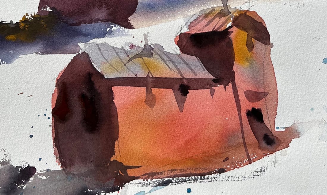
- Target result: Medium-intensity red building
- Application approach: Use intense, almost garish red initially
- Final result: Perfect medium-intensity after absorption
Advanced Variegation Techniques
Supercharged Approach:
- Gray roof foundation with generous yellow ochre addition for bleeding effects
- Intense red application with strategic yellow ochre and blue integration
- Immediate complexity rather than building gradually
Visual Impact: "Look how much more exciting that wash is already at this point."
Progressive Problem-Solving Analysis
Version Comparison Strategy
Version 1: Non-Variegated Baseline
- Simple, flat wash application
- Provides comparison standard
- Demonstrates basic technique limitations
Version 2: Subtle Variegation
- Introduces complexity but remains understated
- Shows improvement but lacks visual power
- Identifies need for more dramatic approach
Version 3: Supercharged Results
- Prominent variegation that "speaks louder on the page"
- Demonstrates full problem-solving potential
- Provides exciting, vibrant final results
Strategic Layering for Intensity
Foundation Layer Considerations
Absorption Factor: First layers on dry paper experience maximum color loss Compensation Strategy: Apply significantly stronger initial colors Quality Balance: Maintain luminosity while boosting intensity
Building Layer Strategy
Reduced Loss Principle: "Because we're layering over a dry wash already, you're not going to lose as much color intensity."
Application Approach:
- Use milk consistency for shadow areas
- Avoid tea mixtures that may appear too weak
- Balance opacity with underlying wash transparency
Critical Balance:
- Too thick: Risk losing luminosity and wash quality
- Too weak: Insufficient shadow depth and color development
Detail Layer Precision
Honey Mixture Strategy: "When I added the windows, especially on the shadow side... that was like a honey mixture, so that was real thick because I know dropping that thick paint into a wet wash is going to dissolve."
Technical Logic:
- Thicker paint resists dissolution better
- Thin paint risks cauliflowering and unwanted effects
- Strategic paint consistency prevents detail loss
Troubleshooting Common Intensity Problems
Problem: Consistently Flat Results
Diagnosis: Insufficient initial color intensity Solution: Double the strength of initial color applications Mindset Shift:Accept that strong initial colors are necessary, not excessive
Problem: Muddy Layering
Diagnosis: Poor paint consistency choices for layering Solution: Use milk consistency over dried washes, avoid tea mixtures Prevention: Plan layer consistency based on underlying surface
Problem: Lost Details
Diagnosis: Paint too thin for application conditions Solution: Use honey consistency for detail work Understanding:Thicker paint maintains integrity in challenging conditions
Advanced Color Strategy Integration
Systematic Approach:
- Plan for 40-50% intensity loss in initial applications
- Adjust color strength dramatically beyond comfort level
- Layer strategically using appropriate paint consistencies
- Build systematically toward exciting final results
Color Relationships:
- Maintain harmony despite intensity adjustments
- Consider temperature relationships in supercharged colors
- Balance excitement with compositional needs
The Psychology of Color Intensity
Visual Impact Principle: Washes that "speak louder on the page" create more engaging, successful paintings.
Artist Development:
- Learn to trust intense initial applications
- Develop comfort with bold color choices
- Build confidence in absorption compensation
Integration with Complete Wet-on-Dry Mastery
Technique Progression:
- Fundamentals: Clean, controlled basic technique
- Variegation: Adding controlled complexity
- Troubleshooting: Solving intensity and excitement problems
- Mastery: Integrating all approaches strategically
Decision Framework:
- Identify when intensity boosting is needed
- Apply appropriate compensation strategies
- Balance excitement with overall composition needs
Next Steps in Advanced Application
This troubleshooting approach enables:
- Confident color intensity decisions in any wet-on-dry situation
- Strategic problem-solving for flat, disappointing results
- Advanced wash applications with predictable, exciting outcomes
- Integration skills for complex, multi-technique paintings
Key Takeaways
- 40-50% color loss occurs with dry paper absorption
- Supercharge initial colors beyond comfort level for proper final intensity
- Layer consistency matters - use milk over dried washes, honey for details
- Progressive approach - compare versions to identify improvement needs
- Visual impact - aim for washes that "speak louder on the page"
- Trust the process - intense initial colors become perfect after absorption
Advanced wet-on-dry troubleshooting transforms technical understanding into exciting, vibrant results. The key lies in compensating for watercolor's natural behavior rather than fighting against it.
Your Wet-on-Dry Learning Journey
Previous: Wet-on-Dry Variegated Washes: Add Color Complexity with Control
Learn to balance simple and complex effects while maintaining controlled technique.
Series Home: Complete Wet-on-Dry Mastery Series
All three lessons for systematic wet-on-dry technique mastery.
- Student Critique Series - See real problem-solving in action
- Complete Wet-in-Wet Mastery - Master organic, flowing watercolor effects
- Watercolor Techniques Hub - Explore all systematic instruction
Struggling with flat watercolor washes? Share your specific intensity challenges in the comments—this troubleshooting approach solves one of watercolor's most common frustrations.
Continue Learning
👉 Next stop: check out my Free Watercolor Painting Course or browse the Watercolor Tutorials Hub to keep building your skills.
👉 Follow me on Pinterest for daily watercolor inspiration!
👉 Visit Painterly Hub - loosen up with easy to follow tutorials
If you enjoy these kinds of raw insights and loose watercolor demos, you’ll feel right at home here. Subscribe to Crafted by Robert and follow along as I share painting inspiration, tips, and behind-the-scenes stories straight from my garage studio. 👉 Subscribe to Crafted by Robert
My Toolbox
Here are the materials I use all the time and have for decades. I only buy from Blick Art but feel free to shop where you prefer.
Recommended Watercolor Materials
-
Holbein Professional Watercolor Paints – 8 Essential Hues
Yellow Ochre, Cadmium Lemon Yellow, Ultramarine Blue, Cerulean Blue, Alizarin Crimson, Cadmium Red Light, Neutral Tint, Burnt Sienna -
Fabriano Artistico Watercolor Paper – 140lb Cold Press
Buy full sheets and cut into quarter sheets for best value -
Silver Jumbo Wash Brush
Great coverage, excellent quality for the price -
Princeton Neptune Point Rounds (No. 12 & 6)
Reliable and affordable detail & wash brushes -
Princeton Neptune Dagger (1/2")
Versatile size for lines, edges, and detail work -
Masterson Aqua Pro Palette
Durable, with deep wells for generous mixing space -
Gator Board
Lightweight, long-lasting painting support board -
Holbein White Gouache
Optional for highlights and fine details - Miscellaneous: plastic water containers, paper towels, masking tape