Advanced Composition Tips for Landscape Painting
Refine your acrylic landscape designs with advanced composition tips. Learn how to avoid symmetry, vary angles, and use uneven spacing to add rhythm and depth.

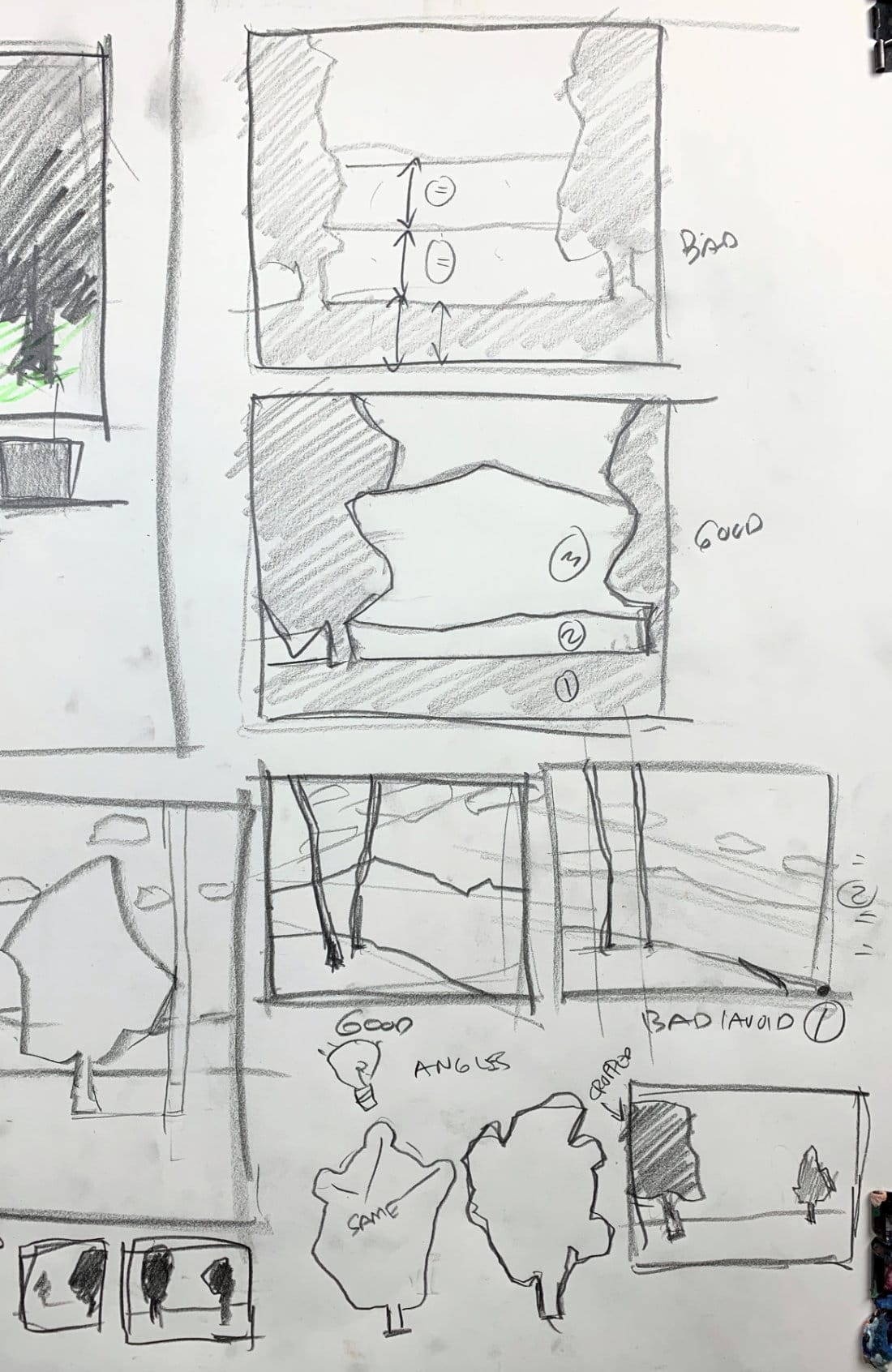
Once you’ve learned the basics of framing and value balance, it’s time to refine your compositions even further. In this lesson, I’ll cover a few subtle but important design principles that separate strong paintings from average ones — including symmetry, spacing, angles, and variation in shape and placement.
This lesson is part of the Acrylic Landscape Painting Fundamentals Course.
Avoid Unintentional Symmetry
Symmetry can make a painting feel stiff or unnatural when it happens accidentally.
If you have two vertical elements like trees or poles placed evenly on each side of the composition, the result feels rigid — almost like bookends.
Instead, slide one over slightly or crop it off the edge of the frame.
That small shift breaks the mirror effect and introduces asymmetry, which feels much more natural and dynamic.
Intentional symmetry can work — but only when it’s done consciously, not by accident.

Unequal Spacing Adds Rhythm
Another common problem is equal divisions in the landscape — like when the sky, middle ground, and foreground are all the same size. When everything divides evenly, the composition lacks rhythm and flow.
Try adjusting proportions:
- Make one area dominant (like two-thirds land and one-third sky).
- Compress or expand one section to emphasize depth.
- Use overlapping shapes to lead the viewer’s eye through layers.
Uneven spacing gives your painting movement and hierarchy — it feels designed rather than divided.
Vary Angles for More Interest
If all your main lines — hills, ground planes, and cloud edges — follow the same angle, the scene feels flat and predictable. To fix this, introduce variety: let one slope steeper, another more gradual, and clouds run at a slightly different diagonal.
This difference in angles keeps the eye moving and gives the composition a natural, organic rhythm.
Break Repetition in Vertical Elements
When adding trees, fence posts, or poles, vary spacing, angle, and height.
Two trees that are identical in size and perfectly aligned will instantly feel artificial.
Try this instead:
- Make one tree slightly taller or closer.
- Angle the trunks differently.
- Let one overlap the other to create depth.
Even tiny variations make a big difference in how believable and engaging your design feels.
Crop and Layer for Depth
If you include multiple large objects (like two trees), try cropping one partially off the canvas edge. This creates depth and makes it feel like the scene extends beyond the frame.
In contrast, placing both trees fully inside the frame — especially at equal distances — flattens the image.
Cropping adds mystery and movement, pulling the viewer deeper into the scene.
Key Takeaways
- Avoid accidental symmetry — shift or crop to create asymmetry.
- Use unequal spacing to build rhythm and hierarchy.
- Vary angles to keep shapes lively and organic.
- Break up repetition in verticals — change spacing, angle, or size.
- Crop and overlap elements to enhance depth and visual flow.
Course Navigation
Previous Lesson: Avoiding Common Composition Mistakes in Landscape Painting
Next Lesson: Master's Landscape Design & Composition Analysis
Acrylic Landscape Painting Course - view all lessons and modules
Learn & Improve Your Acrylic Skills
- Acrylic Hub– Your go-to guide for tutorials, tips, and resources.
- Ultimate Beginner Acrylic Course - Start painting with confidence.
- Subscribe for More Great Content - Get tutorials, tips, and updates straight to your inbox.
- Follow Me on Pinterest - Daily inspiration, tips, and fresh ideas.
Recommended Acrylic Painting Materials
-
Princeton Catalyst Brushes – Flats (#6, #12), Rounds (#4, #8), Fan (#4), Liner Brush
Durable synthetic bristles for versatile acrylic techniques -
Liquitex Heavy Body Acrylic Paint – Essential Colors
Cadmium Yellow, Yellow Ochre, Alizarin Crimson, Cadmium Red Light, Ultramarine Blue, Cobalt Blue, Burnt Sienna, Titanium White -
Winsor & Newton Cotton Canvas
Reliable stretched canvas for studio and plein air work -
Strathmore 400 Series Mixed Media Paper
Heavyweight, acid-free paper for acrylic and mixed media -
Fabriano Artistico 140lb Cold Press Paper
Excellent for acrylic, mixed media, and textured effects -
Blick Multi-Colored Painting Knife Set
Variety of shapes for texture, scraping, and bold strokes - Miscellaneous: Two pint-sized water containers, paper towels (from Home Depot or Walmart)
- Note: I use canvas or sturdy cardboard as my palette — no store-bought palettes needed.


