Advanced Color Gradation
Master advanced watercolor color gradation techniques using complex variegated foundations. Learn atmospheric color temperature relationships, systematic value control, and universal application methods.

Master advanced watercolor color gradation techniques using complex variegated foundations. Learn atmospheric color temperature relationships, systematic value control, and universal application methods.

Explore expressive painting progressions with collage and acrylic. Learn to loosen up your art and paint with confident, painterly energy.
A short demo about breaking watercolor habits — no drawing, no color-matching, just instinct and design.
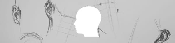
Robert demonstrates his ear drawing process using quick three-minute sketches. Learn how to focus on structure, rhythm, and connection.

Practice your ear drawing with quick three-minute studies. Focus on structure, rhythm, and flow while discovering each ear’s unique character.