Acrylic Paint Mixing Made Easy: Beginner’s Guide
Discover how to mix acrylic paint with just six primaries. This beginner guide shows you how to chart, tint, and shade colors — and shares the travel-to-online story that made tutorials like this possible.


When I was refreshing this acrylic paint mixing post and eliminating the shameful AI-written copy, I was reminded of how I first started teaching online. So before we get into all the nerdy color-mixing stuff, let me share that short story.
Back when I first started teaching, I was invited to lead workshops in places like California, Minnesota, and Wisconsin. It was exciting, and I loved the teaching part. But our first child, Olivia, had just been born — and every trip meant missing time at home.
👉 If you’re brand new, you can start at the Acrylic Hub — it’s got all the free courses and guides in one place.
That’s when I realized I didn’t want to live on the workshop circuit. I still loved teaching, but I needed a way to share my ideas without being gone all the time. So I switched to teaching online. And honestly, if I hadn’t made that decision, tutorials like this one — and all the other full courses on this site — wouldn’t exist today.
👉 You’re here to learn how to mix acrylic paint with just six primaries. This simple approach has saved me (and my students) a lot of headaches. No suitcase full of tubes, just a handful of colors and a little practice. Let’s get into it.
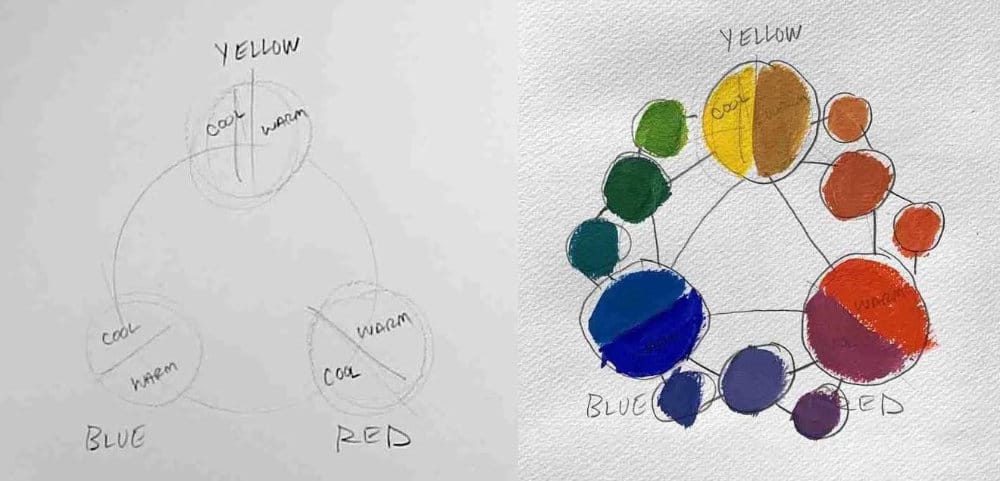
The Six-Primary Palette
You don’t need 48 paints to start mixing. With six primaries — a warm and cool version of each color — you can mix just about anything.
Reds
- Cool: Alizarin Crimson
- Warm: Cadmium Red Light
Yellows
- Cool: Cadmium Yellow Lemon
- Warm: Yellow Ochre
Blues
- Cool: Cerulean or Cobalt Blue
- Warm: Ultramarine
White
- Titanium White for tints
Step 1: Build a Color Chart
Creating your own chart is the best way to understand how these paints interact.
- Label your six primaries.
- Mix secondaries (orange, green, violet) by combining warms/cools.
- Add tints with white.
- Add shadows by mixing with complements.
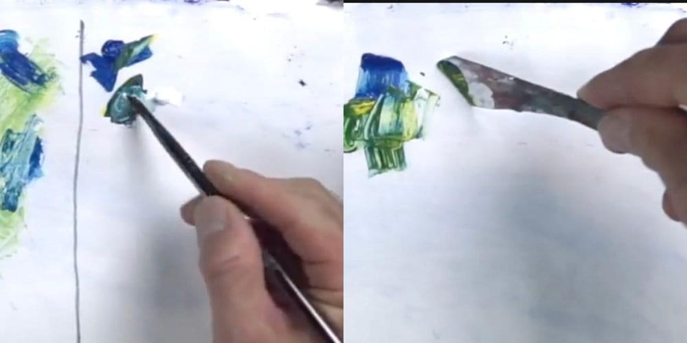
Step 2: Two Ways to Mix
Palette Knife
- Keeps colors clean.
- Great for large mixes.
Brush Mixing
- Faster and intuitive.
- Just be careful to wipe your brush often.
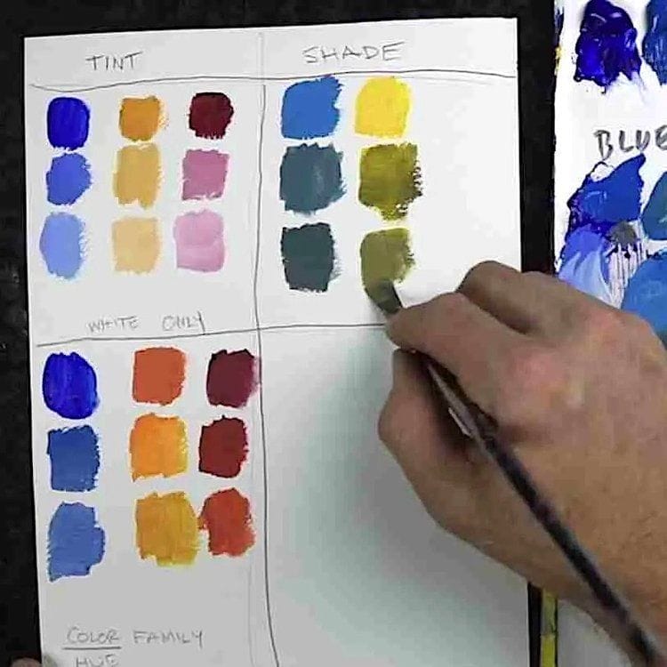
Step 3: Tints, Shades, and Neutrals
- Tinting: Add white to lighten.
- Shading: Add complement (red + green, blue + orange, etc.) to darken.
- Neutrals: Mix near complements to mute intensity without muddying.
Step 4: Other Harmony Tricks
- Analogous: Three colors side-by-side on the wheel (calm, natural).
- Complementary: Opposites (dynamic contrast).
- Triadic: Even triangle on the wheel (balanced, colorful).
These aren’t rules — just starting points. Play, experiment, and take notes.
Wrap-Up
Color mixing doesn’t have to be overwhelming. With a simple six-primary palette, you can:
- Mix every secondary and tertiary you need.
- Control tints, shades, and saturation.
- Build harmony in your paintings without buying more tubes.
This tutorial is just one piece of the bigger picture. Because I shifted from traveling workshops to teaching online, you now have full access to in-depth courses right here — at your own pace, no plane ticket required.
So start simple, make a chart, and enjoy the process. Every mix you make builds confidence.
Learn & Improve Your Acrylic Skills
- Acrylic Hub– Your go-to guide for tutorials, tips, and resources.
- Subscribe for More Great Content - Get tutorials, tips, and updates straight to your inbox.
- Follow Me on Pinterest - Daily inspiration, tips, and fresh ideas.