High Key Value Painting - Light, Airy Landscapes from Monet
Learn high-key value painting from Monet's landscapes. Discover how to compress values into lighter ranges for bright, airy atmosphere in your landscape paintings.

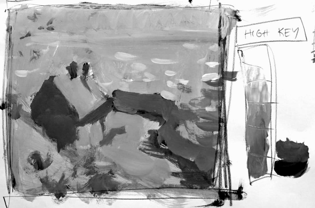
Now the opposite: high-key value painting. Light, airy landscapes with compressed lighter values.
Same Monet cottage. Completely different mood.
This lesson is part of the Acrylic Landscape Painting Fundamentals Course - Section 2: Value Hierarchy.
What Is High Key?
High key = working in the lighter value range.
Instead of the full 1-10 scale, you limit yourself to values 5-10 (maybe 4).
The result? Light, bright, airy landscapes with delicate atmosphere.
Low key was dark and moody. High key is luminous and ethereal.
Same Composition, Different Mood
Watch what happens when you take the same Monet cottage scene and push everything lighter:
Low key version:
- Dark, dramatic, moody
- Values 1-5 range
- Heavy atmosphere
High key version:
- Light, airy, bright
- Values 5-10 range
- Delicate atmosphere
Same painting. Completely different feeling.
Finding Your Extremes in High Key
For this high-key study:
Lightest lights: White caps on the waves (value 10 - pure white)
Darkest darks: Cottage shadows and door (value 5, maybe 4)
Everything else falls between those compressed lighter values.
Notice: Your "darkest dark" in high key is lighter than your mid-values in a standard painting.
The Big Difference
Compare the two studies side by side.
Immediate visual difference: The high-key version feels completely different even though it's the same composition.
Why? You've compressed the entire value range into the lighter zone.
Sky, water, shore, cottage - all pushed lighter. Only small dark accents keep it from floating away.
Monet's Actual Approach
Looking at the original Monet, he probably used a standard value range (values 2-9).
He wasn't intentionally pushing high or low key.
His genius? Using variation within masses through color, not extreme value contrasts.
But by studying his work in both high and low key, you learn how value range affects mood.
Creating the High Key Study
Start with the big unified mass - but keep it light:
Main landscape block: Values 6-7 (light gray)
- Sky
- Water
- Shore
- Cottage walls
This is much lighter than the low-key version's mid-dark mass.
Darkest Accents
In high key, your darkest values are accents, not dominant masses:
- Cottage shadow side (value 5)
- Door and windows (value 4-5)
- Deep grass shadows (value 5)
These darks anchor the painting so it doesn't feel washed out.
But they're still much lighter than they'd be in a standard or low-key painting.
Lightest Lights
White caps on waves = pure white (value 10).
Maybe a touch of light on the cottage roof (value 8-9).
These brightest lights give sparkle and create focal points.
In high-key paintings, your lightest lights are your power moves.
The Mood Shift
High key creates:
- Soft, romantic atmosphere
- Gentle, peaceful feeling
- Dreamlike quality
- Ethereal luminosity
- Optimistic tone
Perfect for:
- Misty mornings
- Bright sunny days
- Foggy landscapes
- Beach scenes
- Snow scenes
- Backlit subjects
You Don't Have to Push Extremes
Here's the key insight: You don't HAVE to paint in high or low key.
Most landscape paintings use the standard middle range (values 2-9).
But knowing high and low key exist gives you options:
- Want drama? Go low key.
- Want airiness? Go high key.
- Want balance? Stay in the middle.
Intentional choice = better paintings.
Using Dark Notes Sparingly
In high-key landscapes, if you DO use really dark values, use them sparingly.
A few dark accents:
- Birds in the sky
- Distant figures
- Small shadow details
- Accent marks
A little dark goes a long way in a high-key painting.
The 4-5 Value Simplification (High Key)
Even in high key, you can simplify to 4-5 values:
- Main unified light mass (sky-water-shore) - value 6-7
- Cottage structure - value 7-8
- Darkest accents - value 5
- Lightest lights - value 9-10
- Mid-tone variations - value 6
Compressed into the lighter range, but still organized.
Comparing Keys: What You Learn
By doing BOTH low and high key studies of the same scene, you discover:
- How value range dramatically affects mood
- How to compress values intentionally
- How the same composition creates different feelings
- How to use extremes for specific effects
- How value choices are creative decisions
This is advanced landscape thinking.
Standard Range vs. Compressed Range
Standard range (most landscapes): Values 2-9
- Balanced, natural feel
- Full contrast available
- Versatile for most scenes
Low key: Values 1-5
- Dark, dramatic, moody
- Heavy atmosphere
- Limited to darker zone
High key: Values 5-10
- Light, airy, bright
- Delicate atmosphere
- Limited to lighter zone
All three are valid choices. Pick based on the mood you want.
The Creative Power
Understanding high and low key gives you creative control over atmosphere.
You're not just copying what you see. You're interpreting reality through value choices.
That's what separates painters from photo-copiers.
Course Navigation
Next Lesson: Practice Reel Assignment - Apply value hierarchy concepts
Previous Lesson: Value - Low Key Demo with Monet - Dark, moody landscapes
Course Hub: Acrylic Landscape Fundamentals
Learn & Improve Your Acrylic Skills
- Acrylic Hub– Your go-to guide for tutorials, tips, and resources.
- Ultimate Beginner Acrylic Course - Start painting with confidence.
- Subscribe for More Great Content - Get tutorials, tips, and updates straight to your inbox.
- Follow Me on Pinterest - Daily inspiration, tips, and fresh ideas.
Recommended Acrylic Painting Materials
-
Princeton Catalyst Brushes – Flats (#6, #12), Rounds (#4, #8), Fan (#4), Liner Brush
Durable synthetic bristles for versatile acrylic techniques -
Liquitex Heavy Body Acrylic Paint – Essential Colors
Cadmium Yellow, Yellow Ochre, Alizarin Crimson, Cadmium Red Light, Ultramarine Blue, Cobalt Blue, Burnt Sienna, Titanium White -
Winsor & Newton Cotton Canvas
Reliable stretched canvas for studio and plein air work -
Strathmore 400 Series Mixed Media Paper
Heavyweight, acid-free paper for acrylic and mixed media -
Fabriano Artistico 140lb Cold Press Paper
Excellent for acrylic, mixed media, and textured effects -
Blick Multi-Colored Painting Knife Set
Variety of shapes for texture, scraping, and bold strokes - Miscellaneous: Two pint-sized water containers, paper towels (from Home Depot or Walmart)
- Note: I use canvas or sturdy cardboard as my palette — no store-bought palettes needed.