Value Hierarchy Demonstration - The 7-Value Landscape Plan
See value hierarchy in action with a complete landscape demonstration. Learn the 7-value plan for organizing sky, hills, trees, and foreground for maximum depth.


Now watch value hierarchy in action. A complete landscape demonstration using a 7-value plan. This is where theory becomes practice.
This lesson is part of the Acrylic Landscape Painting Fundamentals Course - Section 2: Value Hierarchy.
The 7-Value Goal
Here's your target: Reduce your entire landscape scene to 7 values.
If you can't get it down to 7, you haven't simplified enough. You haven't merged shapes and values properly.
7 is the magic number for organized, readable landscape paintings.
Planning Your 7 Values
Before touching paint, ask:
- Where's my lightest light? (Usually sky)
- Where's my darkest dark? (Usually foreground tree shadows)
- How do other elements fit between those extremes?
For this landscape scene:
- Sky (lightest)
- Ground plane
- Tree - light side
- Distant hills
- Tree - shadow side
- Road/grass shadow
- Foreground shadow (darkest)
That's your value roadmap.
Sky and Clouds: One Value or Two?
Look at your sky. Are the clouds SO light and the sky SO dark that you need two separate values?
Usually no.
For most landscapes, merge sky and clouds into one unified value. Small value shifts within that range won't break the hierarchy.
Save your value steps for the bigger contrasts.
Distant Hills: Avoid Jagged Edges
When painting distant hills, keep edges soft.
Too many jagged, hard edges in the distance ruin depth. Distance should feel atmospheric, not crisp.
Soft edges = depth.
Hard edges = brings things forward.
Merging Values Through Hue
Can the distant hills and the road share the same value?
Yes - if you differentiate them with color in the final painting.
Maybe hills are cool blue-gray. Road is warm tan-gray. Same value, different hue.
Value studies show structure. Color adds distinction.
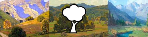
The Tree: Light Side and Shadow Side
For the main tree:
- Shadow side (darker value) = where light doesn't hit
- Light side (lighter value) = sun-facing surfaces
These are two distinct values in your 7-value plan.
Don't make shadow side too light. Don't make light side too dark. Clear value separation = clear form.
Ground Plane Decisions
Is your ground plane lighter or darker than the sky?
Usually slightly darker.
But not by much. Ground reflects sky light, especially in open landscapes.
Keep your ground value close to sky value, just a step or two darker.
Connecting Values
Notice how the road's value connects to the distant hills' value? They share a value family.
This creates visual harmony. Not everything needs its own unique value.
Smart merging = cohesive painting.
The Darkest Dark
Your darkest value should be reserved for emphasis:
- Tree trunk shadow
- Deep foreground shadows
- Strong cast shadows
Don't scatter dark values everywhere. Place them intentionally where you want the eye to go.
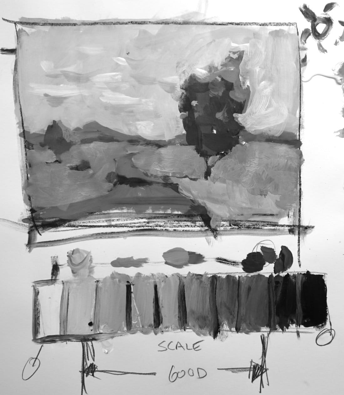
Check Your Value Scale
Keep your painted value scale next to your study. Compare constantly.
You'll discover tendencies:
- Do you paint too light overall?
- Do you paint too dark?
- Do you avoid the extremes?
Your value scale keeps you honest.
Does It Work?
Step back. Squint at your value study.
Ask:
- Does this create depth?
- Are shapes clearly readable?
- Is there a clear lightest and darkest area?
- Would this make a good painting?
If it doesn't work in value, it won't work in color.
Fix it now, not later.
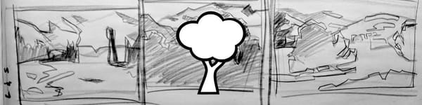
The Mickey Mouse Problem
See those two perfectly round tree shapes side-by-side? That's the "Mickey Mouse ears" problem.
Vary your shapes. Make one tree taller, one wider. Overlap them. Create interesting negative space.
Boring shapes = boring paintings, no matter how perfect your values are.
Simplify Before You Paint
This value study takes maybe 20 minutes. It saves you hours of frustration later.
When you start the final color painting, you'll know:
- Where every value goes
- How dark your darks should be
- How light your lights should be
- Which values to merge
No guessing. Just execution.
The Big Picture
You've learned value hierarchy theory. Now you've seen it applied.
7 values. Clear hierarchy. Intentional placement.
That's the foundation of every successful landscape painting.
Next lesson: Common value mistakes and how to avoid them.
Course Navigation
Next Lesson: Common Value Mistakes - Fix flat, muddy landscapes
Previous Lesson: Value Hierarchy 101 - Understanding value scales
Course Hub: Acrylic Landscape Fundamentals
Learn & Improve Your Acrylic Skills
- Acrylic Hub– Your go-to guide for tutorials, tips, and resources.
- Ultimate Beginner Acrylic Course - Start painting with confidence.
- Subscribe for More Great Content - Get tutorials, tips, and updates straight to your inbox.
- Follow Me on Pinterest - Daily inspiration, tips, and fresh ideas.
Recommended Acrylic Painting Materials
-
Princeton Catalyst Brushes – Flats (#6, #12), Rounds (#4, #8), Fan (#4), Liner Brush
Durable synthetic bristles for versatile acrylic techniques -
Liquitex Heavy Body Acrylic Paint – Essential Colors
Cadmium Yellow, Yellow Ochre, Alizarin Crimson, Cadmium Red Light, Ultramarine Blue, Cobalt Blue, Burnt Sienna, Titanium White -
Winsor & Newton Cotton Canvas
Reliable stretched canvas for studio and plein air work -
Strathmore 400 Series Mixed Media Paper
Heavyweight, acid-free paper for acrylic and mixed media -
Fabriano Artistico 140lb Cold Press Paper
Excellent for acrylic, mixed media, and textured effects -
Blick Multi-Colored Painting Knife Set
Variety of shapes for texture, scraping, and bold strokes - Miscellaneous: Two pint-sized water containers, paper towels (from Home Depot or Walmart)
- Note: I use canvas or sturdy cardboard as my palette — no store-bought palettes needed.