Value Hierarchy 101 - Organizing Values in Landscape Painting
Master value hierarchy specifically for landscape painting. Learn how to organize sky, distance, middle ground, and foreground values to create convincing atmospheric depth.

You've simplified landscape masses. You've added light and shadow. Now organize those values into a hierarchy.
This is what separates flat landscapes from paintings with real depth.
This lesson is part of the Acrylic Landscape Painting Fundamentals Course - Section 2: Value Hierarchy.
Value Hierarchy in Landscapes
Value hierarchy means organizing your landscape elements from lightest to darkest in a way that creates atmospheric depth.
In most landscapes:
- Sky = lightest values (7-10 range)
- Distant hills = mid-light values (6-8 range)
- Middle ground fields = mid values (4-7 range)
- Foreground trees/shadows = darkest values (1-4 range)
This progression creates natural depth through atmospheric perspective.
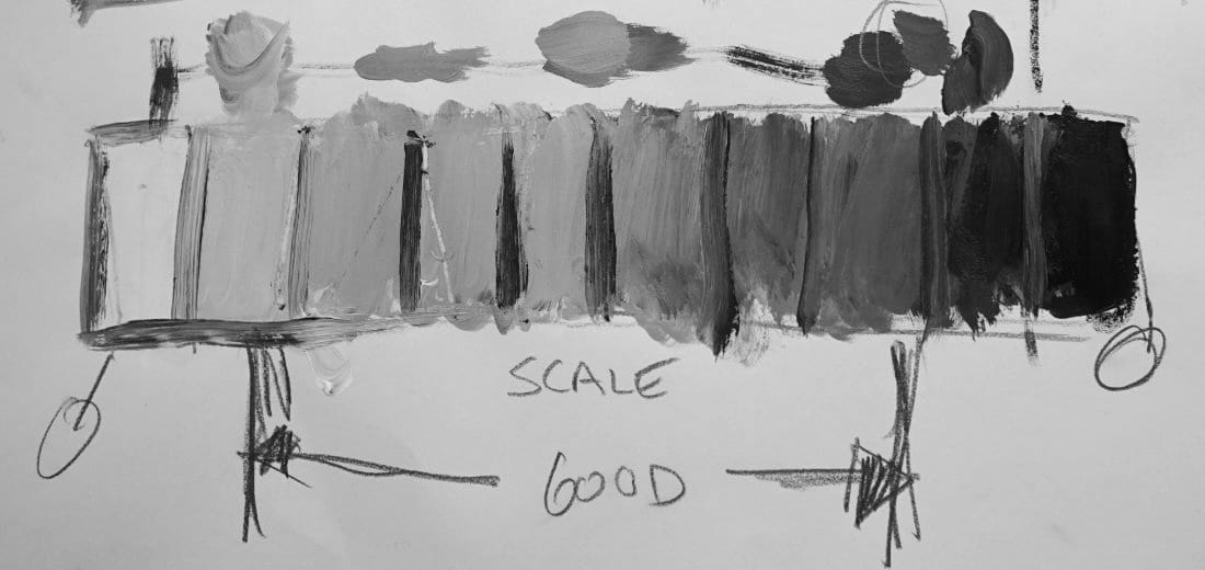
The 10-Step Landscape Scale
Paint your own value scale: Pure white (10) to pure black (1).
Between those extremes, you have 8 steps to work with.
For landscapes, the sweet spot is values 2-9.
Why? Because pure black and pure white are accents in nature:
- Pure white = tiny sunlit highlights, bright clouds
- Pure black = deep shadow accents, dark tree trunks
The bulk of your landscape lives in the 2-9 range.
Turn Off Color, See Gray
Here's the hard part: When planning value hierarchy, ignore color completely.
That blue sky? It's a light gray (value 8-9).
Those green trees? They're mid-dark gray (value 3-5).
That yellow field? It's mid-light gray (value 6-7).
Desaturate your reference photo to grayscale. This reveals the true value structure of your landscape.
Landscape Value Patterns
Pattern 1: Light sky, dark foreground
- Sky: 8-10
- Distance: 6-8
- Middle ground: 4-6
- Foreground: 2-4
This is your classic landscape progression. Distance fades lighter, foreground stays darker.
Pattern 2: Dramatic sky (storm clouds)
- Sky: 3-7 (wide range!)
- Distance: 5-7
- Middle ground: 4-6
- Foreground: 2-5
Dark clouds create different hierarchy. Sky can be darker than distant hills.
Why Landscapes Look Flat
If your landscape looks flat, check your values:
Problem: Everything is mid-value (4-6 range)
Fix: Push your darks darker, lights lighter
Problem: Foreground and background have same value
Fix: Darken foreground OR lighten distance
Problem: No clear lightest/darkest areas
Fix: Establish clear value extremes
Value contrast = depth.
The Atmospheric Perspective Rule
As landscape elements recede into distance, they:
- Get lighter in value
- Lose contrast
- Shift toward sky color
Foreground tree: Darkest darks (value 2) to lightest lights (value 6) = 4-value range
Distant tree: Darkest darks (value 5) to lightest lights (value 7) = 2-value range
Distance compresses your value range. That's what creates atmospheric depth.
Planning Your Landscape Values
Before painting, ask:
- What's my lightest element? (usually sky or sunlit clouds)
- What's my darkest element? (usually foreground shadows or tree trunks)
- How do my middle ground elements fit between those extremes?
- Does my value progression create depth?
If you can't answer these questions, you're not ready to paint.
The Big Picture
Masses give you structure. Light and shadow give you form.
Value hierarchy gives you depth.
Organize your landscape values intentionally, and your paintings will have convincing atmosphere and space.
Next lesson: See this applied in a complete landscape demonstration.
Course Navigation
Next Lesson: Value Hierarchy Demonstration - See value organization in action
Previous Lesson: Robert's Practice Reel Part 2 - Section 1 complete
Course Hub: Acrylic Landscape Fundamentals
Learn & Improve Your Acrylic Skills
- Acrylic Hub– Your go-to guide for tutorials, tips, and resources.
- Ultimate Beginner Acrylic Course - Start painting with confidence.
- Subscribe for More Great Content - Get tutorials, tips, and updates straight to your inbox.
- Follow Me on Pinterest - Daily inspiration, tips, and fresh ideas.
Recommended Acrylic Painting Materials
-
Princeton Catalyst Brushes – Flats (#6, #12), Rounds (#4, #8), Fan (#4), Liner Brush
Durable synthetic bristles for versatile acrylic techniques -
Liquitex Heavy Body Acrylic Paint – Essential Colors
Cadmium Yellow, Yellow Ochre, Alizarin Crimson, Cadmium Red Light, Ultramarine Blue, Cobalt Blue, Burnt Sienna, Titanium White -
Winsor & Newton Cotton Canvas
Reliable stretched canvas for studio and plein air work -
Strathmore 400 Series Mixed Media Paper
Heavyweight, acid-free paper for acrylic and mixed media -
Fabriano Artistico 140lb Cold Press Paper
Excellent for acrylic, mixed media, and textured effects -
Blick Multi-Colored Painting Knife Set
Variety of shapes for texture, scraping, and bold strokes - Miscellaneous: Two pint-sized water containers, paper towels (from Home Depot or Walmart)
- Note: I use canvas or sturdy cardboard as my palette — no store-bought palettes needed.