Common Value Mistakes in Landscape Painting - Avoid Choppy Results
Avoid the most common value mistake: cramming your entire value range into small areas. Learn to simplify sky values and organize your landscape for clear, readable paintings.


Curious what the most common value mistake in landscape painting? Cramming your entire value range into small spaces. Here's how to recognize and fix it.
This lesson is part of the Acrylic Landscape Painting Fundamentals Course - Section 2: Value Hierarchy.
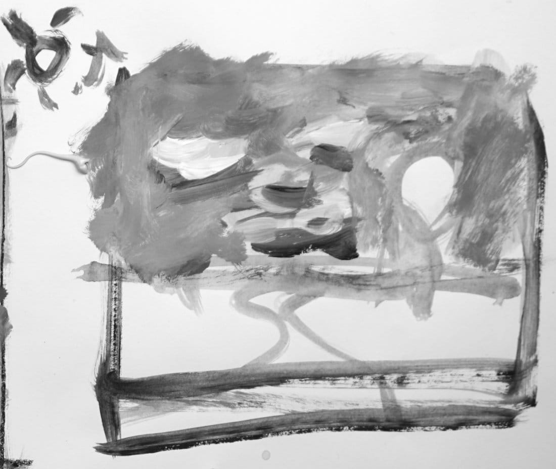
The Choppy Sky Problem
You're painting the sky. You see:
- Really dark areas under clouds
- Bright highlights on cloud tops
- Blue gradation from dark to light
- Variations in cloud shadows
So you paint ALL of that. Full value range in just the sky.
Big mistake.
What Happens Next
When you add the rest of the landscape - trees, ground, hills - everything looks choppy.
Nothing reads clearly. The painting feels busy and disorganized.
Why? You used up your entire value range in one small area.
Now you have nowhere to go for the trees, foreground, or shadows.
The Root Cause
Zooming in instead of seeing the whole.
Students get caught up looking at one area - dissecting every subtle value shift in the clouds or analyzing every shadow variation.
They forget to ask:
- Where are my darkest darks in the ENTIRE scene?
- Where are my lightest lights in the ENTIRE scene?
- How does this sky value relate to the ground, trees, and hills?
You paint the part without planning the whole.
The Fix: Simplify First
Look at the entire scene. Decide:
Sky = One value (maybe two max)
Yes, there are clouds. Yes, there are gradations. Yes, there are shadow variations.
But the sky is ONE value family.
You can add subtle shifts within that value later. But establish it as one unified value first.
Adding Variation Within Unity
Once your sky is established as a single value, you CAN add:
- Light cloud tops (slightly lighter)
- Cloud shadows underneath (slightly darker)
- Sky gradation (subtle shift)
Key word: SLIGHTLY.
These variations stay within your established sky value family. They don't break into other value ranges.
That's variation within unity.
The Same-Value Trap
Here's another common mistake: Painting everything the same value.
Sky, ground, hills, trees - all mid-value gray.
Result: Flat, lifeless landscape with no depth.
Fix: Establish clear value hierarchy. Sky lighter. Distance mid-light. Foreground darker.
Using the Full Range Smartly
You HAVE a full value range (1-10). But you don't use it all in one area.
Spread it across the entire landscape:
- Sky = values 8-9
- Distant hills = values 6-7
- Ground = values 5-6
- Tree light side = values 4-5
- Tree shadow side = values 2-3
- Darkest accents = value 1
Every element gets its place on the scale.
The Big Picture Test
Step back. Squint.
Do you see:
- Clear value separation between elements?
- Organized progression from light to dark?
- Readable shapes?
Or do you see:
- Choppy, busy confusion?
- Everything competing for attention?
- No clear focal point?
If it's choppy, you've crammed too many values into small spaces.
The Acrylic Drying Factor
Pro tip: Acrylic paint dries darker.
That beautiful light sky you just painted? It'll dry 1-2 values darker.
Solution: Paint it slightly lighter than you think it should be.
Check your value against your scale while it's still wet. Adjust before it dries.
Plan, Then Execute
The mistake isn't in the painting technique. It's in the planning (or lack of it).
Before you paint:
- Establish your 7-value plan
- Assign value families to each element
- Know where your extremes are
- Commit to simplification
Then paint with confidence.
Common Scenario: The Sky
Wrong approach:
"I see dark blue at top, light blue at horizon, bright clouds, dark cloud shadows... I'll paint all of that!"
Result: Sky uses values 3-10. Nowhere left for the rest of the landscape.
Right approach:
"Sky and clouds = one value family (8-9 range). I can add subtle cloud variations within that range later."
Result: Sky stays unified. Full value range available for the rest of the landscape.
The Takeaway
See the whole scene first.
Plan your values for the entire landscape before painting any part.
Don't get seduced by details in one area. Stay organized. Stay simplified.
Your paintings will read clearer, feel more cohesive, and have better depth.
Course Navigation
Next Lesson: Value - Low Key Demo with Monet - Dark, moody landscapes
Previous Lesson: Value Hierarchy Demonstration - 7-value plan in action
Course Hub: Acrylic Landscape Fundamentals
Learn & Improve Your Acrylic Skills
- Acrylic Hub– Your go-to guide for tutorials, tips, and resources.
- Ultimate Beginner Acrylic Course - Start painting with confidence.
- Subscribe for More Great Content - Get tutorials, tips, and updates straight to your inbox.
- Follow Me on Pinterest - Daily inspiration, tips, and fresh ideas.
Recommended Acrylic Painting Materials
-
Princeton Catalyst Brushes – Flats (#6, #12), Rounds (#4, #8), Fan (#4), Liner Brush
Durable synthetic bristles for versatile acrylic techniques -
Liquitex Heavy Body Acrylic Paint – Essential Colors
Cadmium Yellow, Yellow Ochre, Alizarin Crimson, Cadmium Red Light, Ultramarine Blue, Cobalt Blue, Burnt Sienna, Titanium White -
Winsor & Newton Cotton Canvas
Reliable stretched canvas for studio and plein air work -
Strathmore 400 Series Mixed Media Paper
Heavyweight, acid-free paper for acrylic and mixed media -
Fabriano Artistico 140lb Cold Press Paper
Excellent for acrylic, mixed media, and textured effects -
Blick Multi-Colored Painting Knife Set
Variety of shapes for texture, scraping, and bold strokes - Miscellaneous: Two pint-sized water containers, paper towels (from Home Depot or Walmart)
- Note: I use canvas or sturdy cardboard as my palette — no store-bought palettes needed.