Robert's Practice Reel Part 2 - Adding Light & Shadow
Watch Robert add light and shadow to the practice reel drawings using tracing paper. Learn how to make creative decisions about shadows that enhance your landscape designs.

You've got your simplified masses. Now add light and shadow. Using tracing paper makes this easy.
This lesson is part of the Acrylic Landscape Painting Fundamentals Course - learn to paint expressive landscapes from scratch.
The Tracing Paper Method
Why trace instead of redrawing?
Because you already made good shape decisions. Don't waste time redrawing them.
Lay tracing paper over your mass studies. Trace the outlines. Now you can add light and shadow without messing up your original work.
If you need the drawing practice? Redraw them. But tracing is faster and lets you focus on light/shadow decisions.
Always Mark Your Light Source
Before adding any shadows, draw an arrow showing where light comes from.
This keeps you consistent. Every shadow decision relates back to that light direction.
No guessing. No contradictory shadows.
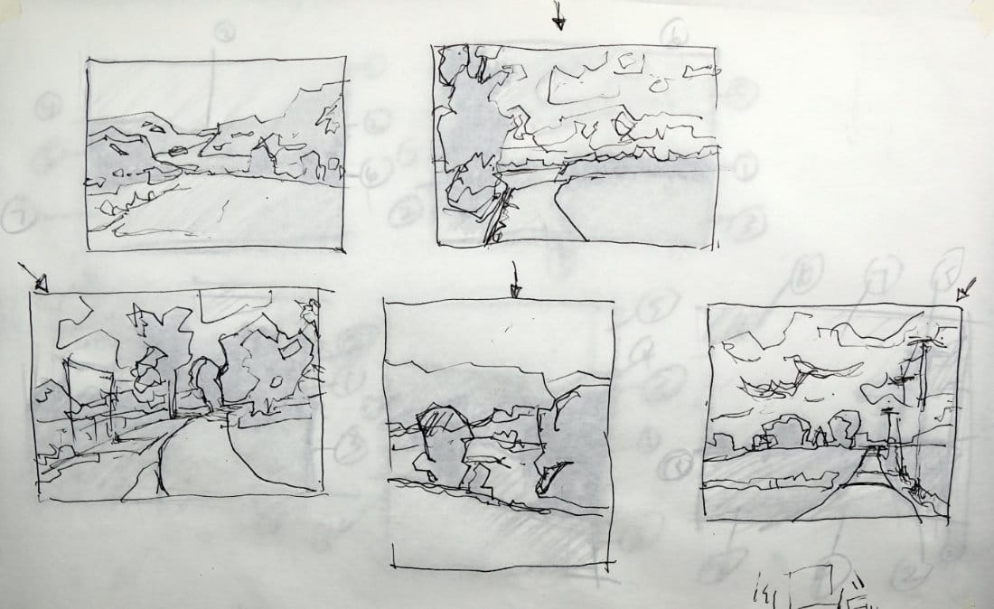
Image 1: Mountain Lake - Subtle Light
This one doesn't have strong light/shadow. Very soft.
What I added:
- Light hitting middle ground rock formations
- Slight change on the right mountain (more green where trees grow through rock)
- Hint of light/shadow on foreground field
The foreground is bland. Not much happening. In a finished painting, I'd need to create more interest there through color gradations.
Image 2: Path Through Fields - High Noon Light
Light is coming straight down. Hard to see direction because it's not side-lit.
What I added:
- Patches of sunlight on tree leaves (not individual leaves!)
- Light hitting tops of middle ground trees
- Shadow shapes in clouds (makes them more interesting)
Key insight: When masses are simple, enhance the clouds. They become a major design element that adds interest.
The sky will need serious gradation work in a finished piece to make this painting compelling.
Image 3: Fence and Large Bush - Enhanced Shadows
Creative decision here: The fence shadows aren't strong in the reference. But I added them anyway.
Why? They break up that foreground grass shape. Create more interest.
What I added:
- Cast shadows from fence posts crossing the grass
- Light hitting left side of right tree
- Subtle light on distant trees (very soft - they're far away)
- Shadow side of the path
Design thinking: The grass on the right stays simple and clean. The grass on the left gets broken up by shadows. Variety = interest.
Image 4: Rolling Hills - Atmospheric Perspective
This one is TOUGH. The light is so diffused and soft.
What I added:
- Light on lower bush (breaks up that dark mass a bit)
- Light on top of foreground hill
- Subtle light on distant hills
The real beauty here? Atmospheric perspective. How values and colors shift with distance.
Very little strong light/shadow. More about soft gradations and color temperature changes.
Image 5: Telephone Poles - Cross-Contour Shadows
This one has BIG dramatic clouds casting shadows on the earth below.
But those shadows are FUZZY because the clouds are so far away. Light bounces around in the sky dome, softening everything.
What I added:
- Light from top right
- Shadow dividing the field (shows elevation change)
- Telephone pole shadows going UP AND OVER the road (cross-contour!)
- Light on middle ground trees (very soft)
- Shadow where field elevation drops near the mow line
- Cloud bellies with shadow shapes
Watch out for repetition! I had three identical arched cloud shadows. Fixed them - can't have everything the same.
The Cross-Contour Shadow Trick
See how those telephone pole shadows go up and over the road?
That's not flat shadow. It's following the contour of the ground.
This shows VOLUME. The road has dimension. It's not just a flat ribbon.
Use shadows to describe form.
When Light is Ambiguous
Some images have unclear light direction (heavy overcast, high noon, filtered photos).
You decide.
Pick a light direction that makes sense. Stick with it. Create shadows that serve your design.
You're not copying reality. You're interpreting it.
Enhancing vs. Copying
Notice I added fence shadows that weren't strong in the reference?
That's smart painting.
If something improves your design - add it. If something clutters your design - remove it.
Your job: Make the painting better, not more accurate.
Avoid Repetition in Shadows
Three identical cloud shapes? Boring.
Evenly spaced fence shadows? Predictable.
Same-sized light patches? Dull.
Vary everything. Size, spacing, intensity, shape.
This is why you practice with masses first. You learn to see and avoid repetition before you waste hours painting.
What This Stage Teaches You
By adding light and shadow to simplified masses, you:
- Understand how light defines form
- Learn to use shadows for design (not just reality)
- See how details can enhance or destroy masses
- Practice making creative decisions that improve paintings
- Develop the skill to work from ambiguous references
These are professional-level thinking skills.
You've Completed Section 1!
Congratulations! You now understand:
- Abstract masses and simplification
- The 6-7 group rule
- Light and shadow fundamentals
- Adding local color to masses
- Gradations and variations
- Common mistakes to avoid
- Learning from master paintings
- Applying everything through practice
This is your foundation. Everything else builds on this.
Course Navigation
Section Complete! Continue to Section 2 for Value Hierarchy 101
Previous Lesson: Robert's Practice Reel Part 1 - Mass simplification demo
Course Hub: Acrylic Landscape Fundamentals
Learn & Improve Your Acrylic Skills
- Acrylic Hub– Your go-to guide for tutorials, tips, and resources.
- Ultimate Beginner Acrylic Course - Start painting with confidence.
- Subscribe for More Great Content - Get tutorials, tips, and updates straight to your inbox.
- Follow Me on Pinterest - Daily inspiration, tips, and fresh ideas.
Recommended Acrylic Painting Materials
-
Princeton Catalyst Brushes – Flats (#6, #12), Rounds (#4, #8), Fan (#4), Liner Brush
Durable synthetic bristles for versatile acrylic techniques -
Liquitex Heavy Body Acrylic Paint – Essential Colors
Cadmium Yellow, Yellow Ochre, Alizarin Crimson, Cadmium Red Light, Ultramarine Blue, Cobalt Blue, Burnt Sienna, Titanium White -
Winsor & Newton Cotton Canvas
Reliable stretched canvas for studio and plein air work -
Strathmore 400 Series Mixed Media Paper
Heavyweight, acid-free paper for acrylic and mixed media -
Fabriano Artistico 140lb Cold Press Paper
Excellent for acrylic, mixed media, and textured effects -
Blick Multi-Colored Painting Knife Set
Variety of shapes for texture, scraping, and bold strokes - Miscellaneous: Two pint-sized water containers, paper towels (from Home Depot or Walmart)
- Note: I use canvas or sturdy cardboard as my palette — no store-bought palettes needed.