Add Gradations & Variations to Landscape Paintings
Discover how subtle color gradations and variations bring life, depth, and atmosphere to your acrylic landscape paintings while keeping your design simple.

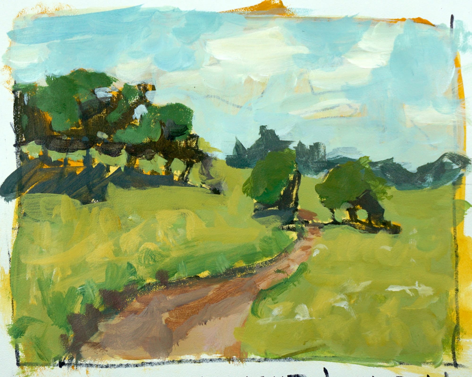
In this lesson, we go beyond simplified color masses to explore how gradations and variations can bring a landscape painting to life. Up to now, our focus has been on simplifying shapes and grouping color. That foundation is essential — but once you have strong, simple masses, the next step is to add subtle transitions that make your work feel more natural.
Watch the full course here: 👉 Acrylic Landscape Painting Fundamentals
Gradations are small shifts in hue or value — the kind that make a sky fade softly toward the horizon, or a field of grass warm slightly as it approaches the foreground. These controlled changes help eliminate the “flat” look and add depth, light, and a touch or realism to your acrylic landscapes.
How to Use Color Gradations Without Losing Simplicity
When painting gradations in acrylics, it’s easy to overdo it. A slight hue change can add life and depth — but a big one can instantly become to loud and obvious. Here are a few reminders I covered in the video:
- Keep gradations within your existing color group. Don’t jump to a new hue too quickly.
- Test colors on scrap paper before adding them to your painting.
- Add warmth to the foreground and cool tones to the distance to create depth.
- Step back often and check that your masses still read as one unified shape.
This lesson also introduces the idea of variation — small, smart adjustments to color or texture that add visual interest without overwhelming the viewer. Used correctly, variation gives your work a sense of movement and atmosphere.
Creating Depth and Light With Gradations
Gradations are one of the best ways to add depth to an acrylic landscape without painting every tiny detail. A few well-placed transitions can suggest sunlight filtering through a tree canopy, distant hills fading into haze, or a path that leads naturally into space.
These are the building blocks of great painting — not complexity, but control and restraint. When your color groups stay connected and your gradations flow smoothly, your landscape will start to feel more alive.
Course Navigation
Previous Lesson: Simplify Color Masses
Next Lesson: Common Mistakes (coming soon)
Return to Hub: Acrylic Landscape Painting Fundamentals
Learn & Improve Your Acrylic Skills
- Acrylic Hub– Your go-to guide for tutorials, tips, and resources.
- Ultimate Beginner Acrylic Course - Start painting with confidence.
- Subscribe for More Great Content - Get tutorials, tips, and updates straight to your inbox.
- Follow Me on Pinterest - Daily inspiration, tips, and fresh ideas.
Recommended Acrylic Painting Materials
-
Princeton Catalyst Brushes – Flats (#6, #12), Rounds (#4, #8), Fan (#4), Liner Brush
Durable synthetic bristles for versatile acrylic techniques -
Liquitex Heavy Body Acrylic Paint – Essential Colors
Cadmium Yellow, Yellow Ochre, Alizarin Crimson, Cadmium Red Light, Ultramarine Blue, Cobalt Blue, Burnt Sienna, Titanium White -
Winsor & Newton Cotton Canvas
Reliable stretched canvas for studio and plein air work -
Strathmore 400 Series Mixed Media Paper
Heavyweight, acid-free paper for acrylic and mixed media -
Fabriano Artistico 140lb Cold Press Paper
Excellent for acrylic, mixed media, and textured effects -
Blick Multi-Colored Painting Knife Set
Variety of shapes for texture, scraping, and bold strokes - Miscellaneous: Two pint-sized water containers, paper towels (from Home Depot or Walmart)
- Note: I use canvas or sturdy cardboard as my palette — no store-bought palettes needed.