Mixing Greens for Landscape Painting in Acrylics
Learn how to mix vibrant and natural greens using Phthalo, Viridian, and Ultramarine with yellows and ochres for realistic landscape color control.

Greens can be one of the trickiest colors to control in landscape painting. They can quickly become too bright, too artificial, or too dull. In this lesson, I share how to mix a range of natural greens using Phthalo Green, Viridian, and Ultramarine Blue combined with Cad Yellow Light and Yellow Ochre.
This lesson is part of the Acrylic Landscape Painting Fundamentals Course.
The Starting Palette
To create a useful range of greens, I recommend keeping two base greens on your palette:
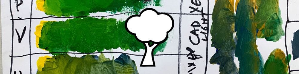
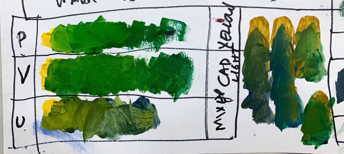
- Phthalo Green – a powerful, transparent, high-chroma green.
- Viridian – slightly more opaque and softer in intensity.
Mix each with Cad Yellow Light and you’ll immediately see two distinct families:
- Phthalo + Cad Yellow Light = vibrant, clean greens.
- Viridian + Cad Yellow Light = more muted, painterly greens.
The Blue + Yellow Method
If you prefer to mix greens from primaries instead of using tube greens, start with Ultramarine Blue and Cad Yellow Light.
This combination creates a softer, slightly grayer green because Ultramarine has a red bias, which mutes the result.
It’s perfect for distant trees, shaded foliage, and cooler landscape passages.
Adding Earth and Neutrals
Once you’re comfortable with your main greens, try modifying them with Yellow Ochre or even a touch of your mixed black:
- Yellow Ochre + Blue: makes a gray-green ideal for foggy or atmospheric conditions.
- Phthalo/Viridian + Black: quickly tones down intensity for deep forest shadows.
These variations help you build harmony instead of scattered, isolated greens.
Painting Strategy
When painting landscapes, always begin with your most intense mix on the palette — then subdue it gradually.
It’s easier to tone down color than to rebuild intensity later.
Mix small swatches on your palette before committing them to the canvas to stay in control.
Key Takeaways
- Phthalo = high chroma, Viridian = muted and natural.
- Ultramarine + Cad Yellow Light = neutral, gray-green for distance.
- Add Yellow Ochre or Black to desaturate for realism.
- Always test warm/cool balance before applying to your painting.
Course Navigation
Previous Lesson: Mixing Black and Gray in Acrylic Painting
Next Lesson: Color Vibrations
Acrylic Landscape Hub - view all lessons
Learn & Improve Your Acrylic Skills
- Acrylic Hub– Your go-to guide for tutorials, tips, and resources.
- Ultimate Beginner Acrylic Course - Start painting with confidence.
- Subscribe for More Great Content - Get tutorials, tips, and updates straight to your inbox.
- Follow Me on Pinterest - Daily inspiration, tips, and fresh ideas.
Recommended Acrylic Painting Materials
-
Princeton Catalyst Brushes – Flats (#6, #12), Rounds (#4, #8), Fan (#4), Liner Brush
Durable synthetic bristles for versatile acrylic techniques -
Liquitex Heavy Body Acrylic Paint – Essential Colors
Cadmium Yellow, Yellow Ochre, Alizarin Crimson, Cadmium Red Light, Ultramarine Blue, Cobalt Blue, Burnt Sienna, Titanium White -
Winsor & Newton Cotton Canvas
Reliable stretched canvas for studio and plein air work -
Strathmore 400 Series Mixed Media Paper
Heavyweight, acid-free paper for acrylic and mixed media -
Fabriano Artistico 140lb Cold Press Paper
Excellent for acrylic, mixed media, and textured effects -
Blick Multi-Colored Painting Knife Set
Variety of shapes for texture, scraping, and bold strokes - Miscellaneous: Two pint-sized water containers, paper towels (from Home Depot or Walmart)
- Note: I use canvas or sturdy cardboard as my palette — no store-bought palettes needed.