Master’s Examples of Planes & Light and Shadow
Study how master painters used planes and values to create believable light, shadow, and depth in landscapes using simple, powerful design principles.

In this lesson, I'll share how painters like Edgar Payne and other tonal masters simplified light and form through clean value structure and strong plane separation. Each painting shows how effective design relies more on value organization than detail.
This lesson is part of the Acrylic Landscape Painting Fundamentals Course
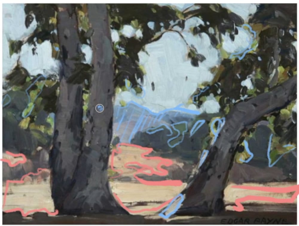
Vertical Planes and Cast Shadows
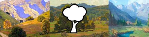
In the first painting, Payne demonstrates a classic landscape setup — strong vertical planes in the trees, the flat ground plane, and the angled mountain slopes beyond.
- The darkest darks live in the upright tree trunks and shadows.
- The cast shadows on the ground are slightly lighter because they reflect ambient light.
- The ground plane catches the brightest light, unifying the composition through consistent sun direction.
- Even with minimal modeling, Payne achieves volume simply through value contrast.
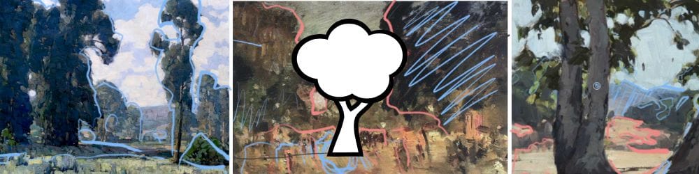
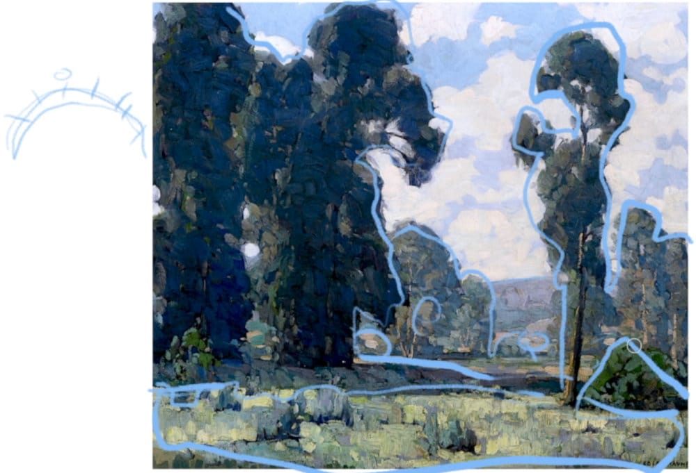
Midground Planes and Atmosphere
In the second piece, the blue outlines show how Payne layered atmospheric depth:
- Foreground trees are dark, vertical, and cool.
- Middle ground fields step lighter and warmer.
- Distant hills fade to gray-blue.
- This gradual shift in value and temperature creates spatial depth without heavy detail.
- It’s a reminder that planes and atmosphere work together — the further the plane, the lighter and cooler the value.
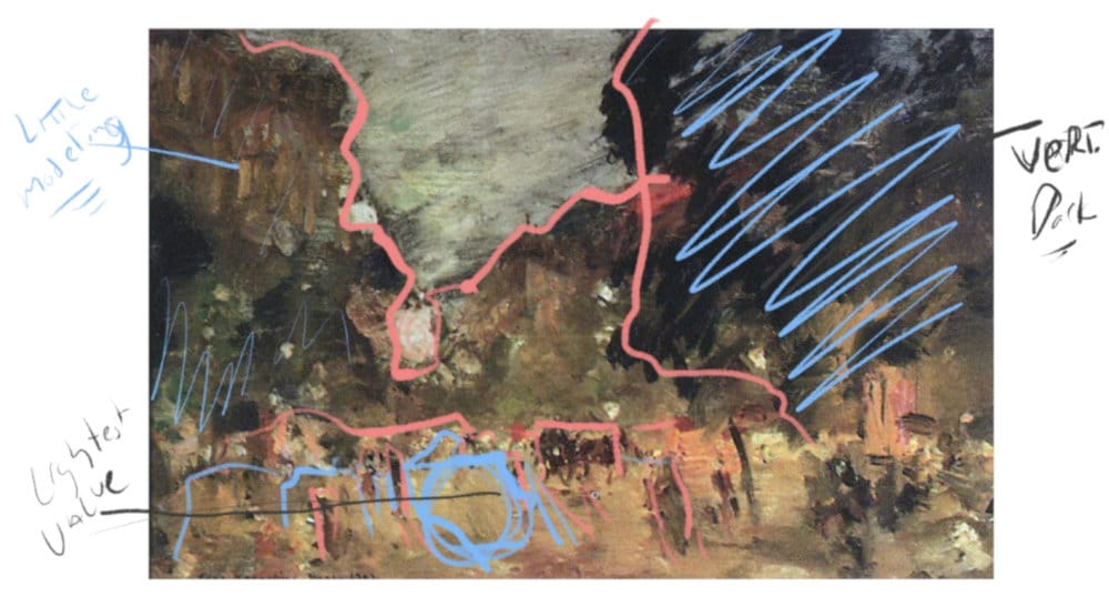
Simplifying Complexity
The final example shows how Payne reduced architectural and figure-heavy scenes to broad shapes.
- Vertical elements (buildings, figures) stay dark and simple.
- Ground reflections and low light are handled with minimal strokes.
- Details are omitted to preserve clarity in the light and shadow pattern.
It’s proof that even complex subjects benefit from simple, readable value design
Practice Takeaway
Look for three things in every reference or plein air scene:
- The flat plane — where the light hits strongest.
- The verticals — your darkest shapes.
- The angles — your middle tones that define form.
Then simplify everything into these three categories before worrying about color or detail.
Course Navigation
Previous Lesson: Light & Shadow and the Three Common Planes
Next Lesson: Light & Shadow Assignment
Return to Hub: Free Acrylic Landscape Painting Course
Learn & Improve Your Acrylic Skills
- Acrylic Hub– Your go-to guide for tutorials, tips, and resources.
- Ultimate Beginner Acrylic Course - Start painting with confidence.
- Subscribe for More Great Content - Get tutorials, tips, and updates straight to your inbox.
- Follow Me on Pinterest - Daily inspiration, tips, and fresh ideas.
Recommended Acrylic Painting Materials
-
Princeton Catalyst Brushes – Flats (#6, #12), Rounds (#4, #8), Fan (#4), Liner Brush
Durable synthetic bristles for versatile acrylic techniques -
Liquitex Heavy Body Acrylic Paint – Essential Colors
Cadmium Yellow, Yellow Ochre, Alizarin Crimson, Cadmium Red Light, Ultramarine Blue, Cobalt Blue, Burnt Sienna, Titanium White -
Winsor & Newton Cotton Canvas
Reliable stretched canvas for studio and plein air work -
Strathmore 400 Series Mixed Media Paper
Heavyweight, acid-free paper for acrylic and mixed media -
Fabriano Artistico 140lb Cold Press Paper
Excellent for acrylic, mixed media, and textured effects -
Blick Multi-Colored Painting Knife Set
Variety of shapes for texture, scraping, and bold strokes - Miscellaneous: Two pint-sized water containers, paper towels (from Home Depot or Walmart)
- Note: I use canvas or sturdy cardboard as my palette — no store-bought palettes needed.