Master's Analysis - Learning from Isaac Levitan's Landscapes
Study Isaac Levitan's landscape paintings to learn how masters simplified complex scenes into clear, readable masses. This analysis reveals the techniques behind dramatic, atmospheric landscapes.

Want to learn how the masters simplified landscapes? Study their work.
Today we're analyzing Isaac Levitan - a Russian master known for gorgeous, atmospheric landscapes.
This lesson is part of the Acrylic Landscape Painting Fundamentals Course - learn to paint expressive landscapes from scratch.
Why Study the Masters?
Because they already figured out what works.
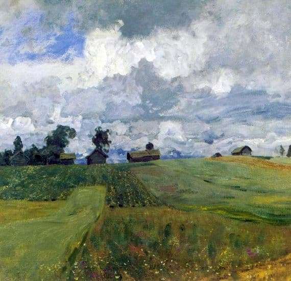
Look at that Levitan painting above. Dramatic sky. Simple fields. Buildings grouped together. Everything simplified into clear, readable masses.
Your job: Understand HOW he did it.
This Isn't About Copying
You're not trying to recreate Levitan's exact painting.
You're interpreting how he grouped shapes. How he simplified complexity. How he made decisions.
Then you apply those lessons to YOUR landscapes.
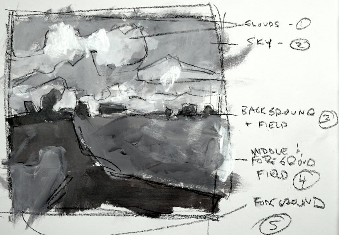
Identifying the Groups
Looking at Levitan's painting, I see:
Group 1: Clouds - That dramatic sky with light breaking through
Group 2: Sky area - The lighter, calmer sky between clouds
Group 3: Distant trees & buildings - The middle ground, all grouped together (barns, farmhouses, trees = one mass)
Group 4: Middle/foreground field - The darker green field running into foreground
Group 5: Foreground patch - Lower left lighter area
Six groups. Just like we've been learning.
Working in Grayscale First
I start with a value study in grayscale. Why?
Because value is more important than color.
If your values work, you can make any color scheme succeed. If your values are wrong, no amount of pretty color will save you.
So I block in each group with simplified values:
- Darkest: distant trees/buildings
- Mid-dark: field on right
- Mid-light: foreground left
- Light: sky
- Lightest: clouds
Making Shapes Interesting
As I work, I'm constantly asking: Are these shapes interesting?
If all the buildings were identical size - boring.
If all the clouds were similar - boring.
If the field edges were too geometric - boring.
I adjust shapes to make them more dynamic.
Sometimes that means tweaking what Levitan did. That's fine. This is about learning principles, not slavish copying.
Understanding Gradations
Look at that field on the right. There's gradation happening - it gets slightly lighter toward the foreground.
But does it break up the group?
No. Squint at it. It still reads as ONE mass.
That's the key: Gradation within unity.
The subtle value shifts add interest without destroying the simplified structure.
The Interpretation Process
Step 1: Simple contour drawing to define groups
Step 2: Block in values (grayscale)
Step 3: Refine shapes - make them interesting
Step 4: Add gradations carefully
Step 5: Check: Do the 6 groups still read clearly?
Step 6: (Next lesson) Add color
Asking Questions as You Work
"How does this change affect the group?"
Every time you add a gradation or detail, pause. Is it helping or hurting?
If you're breaking up the mass too much - stop.
"Are these shapes interesting to look at?"
Variety in size, shape, and placement keeps the eye engaged.
"Does the whole painting still work?"
Step back regularly. Don't get lost in one corner.
What You Learn from This
By analyzing Levitan's work, you discover:
- How to group complex scenes
- Where to place darkest/lightest values
- How much detail is actually needed (not much!)
- How gradation works within masses
- How to create drama with simple shapes
These lessons apply to EVERY landscape you paint.
The Big Takeaway
Even master painters simplified ruthlessly.
That dramatic Levitan landscape? Look closer. It's just 6 groups of simplified shapes with careful value relationships.
Simple structure + interesting shapes = powerful painting.
You can do this too.
Course Navigation
Next Lesson: Master's Analysis Part 2 - Adding Color to Levitan Study
Previous Lesson: Common Mistakes - Don't break your masses
Course Hub: Acrylic Landscape Fundamentals
Learn & Improve Your Acrylic Skills
- Acrylic Hub– Your go-to guide for tutorials, tips, and resources.
- Ultimate Beginner Acrylic Course - Start painting with confidence.
- Subscribe for More Great Content - Get tutorials, tips, and updates straight to your inbox.
- Follow Me on Pinterest - Daily inspiration, tips, and fresh ideas.
Recommended Acrylic Painting Materials
-
Princeton Catalyst Brushes – Flats (#6, #12), Rounds (#4, #8), Fan (#4), Liner Brush
Durable synthetic bristles for versatile acrylic techniques -
Liquitex Heavy Body Acrylic Paint – Essential Colors
Cadmium Yellow, Yellow Ochre, Alizarin Crimson, Cadmium Red Light, Ultramarine Blue, Cobalt Blue, Burnt Sienna, Titanium White -
Winsor & Newton Cotton Canvas
Reliable stretched canvas for studio and plein air work -
Strathmore 400 Series Mixed Media Paper
Heavyweight, acid-free paper for acrylic and mixed media -
Fabriano Artistico 140lb Cold Press Paper
Excellent for acrylic, mixed media, and textured effects -
Blick Multi-Colored Painting Knife Set
Variety of shapes for texture, scraping, and bold strokes - Miscellaneous: Two pint-sized water containers, paper towels (from Home Depot or Walmart)
- Note: I use canvas or sturdy cardboard as my palette — no store-bought palettes needed.