Understanding Local Color in Landscape Painting
Discover how local color changes under different lighting and how painters use it creatively to build harmony and depth in landscapes.

When most people think of “color,” they think of what they see — a red apple, a green leaf, a blue sky. But painters know it’s not that simple. In painting, local color refers to the object’s dominant hue under neutral light, before it’s influenced by shadows, reflections, and temperature shifts.
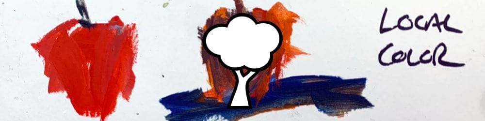
In this lesson, I use a simple apple study to show how easily local color changes depending on light, environment, and artistic intent.
This lesson is part of the Acrylic Landscape Painting Fundamentals Course.
What Is Local Color?
Local color is the base hue you associate with an object — for example, a banana is yellow, a tree trunk is brown, or an apple is red. But that’s just the starting point. Once you introduce lighting conditions, reflections, and atmosphere, that base hue begins to shift.
As artists, we rarely paint the “literal” local color. Instead, we interpret it through the lens of temperature, value, and light.
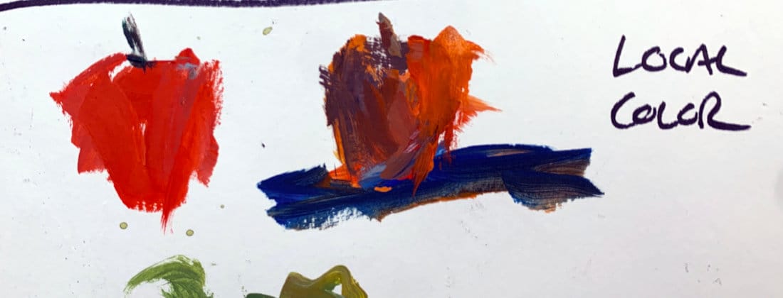
The Local Color Demo
In the video, I start with a basic red apple. Then I paint another version of it sitting on a blue surface. The blue light reflecting upward dulls the reds, creating muted violets and cooler neutrals.
So while the apple’s local color might be “red,” the version in the painting has very little pure red at all — and yet, it still reads as a red apple.
That’s the painter’s version of reality: it’s not about copying nature, it’s about interpreting it.
Why This Matters in Landscape Painting
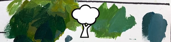
Understanding local color helps you push your landscapes beyond realism. A tree’s foliage isn’t just “green” — it’s a mix of cool shadows, warm highlights, and reflected tones from the sky and ground.
Recognizing local color gives you a reference point, but knowing how to bend and modify it gives your art atmosphere and emotion.
Key Takeaways
- Local color = the object’s dominant hue under neutral light.
- Lighting, reflection, and surroundings always affect local color.
- A painter often alters local color to serve mood and design.
- True artistry comes from interpretation, not replication.
Course Navigation
Previous Lesson: Understanding Hues Versus Colors
Next Lesson: Color Mixing 101
Acrylic Landscape Painting Course Hub - view all lessons
Learn & Improve Your Acrylic Skills
- Acrylic Hub– Your go-to guide for tutorials, tips, and resources.
- Ultimate Beginner Acrylic Course - Start painting with confidence.
- Subscribe for More Great Content - Get tutorials, tips, and updates straight to your inbox.
- Follow Me on Pinterest - Daily inspiration, tips, and fresh ideas.
Recommended Acrylic Painting Materials
-
Princeton Catalyst Brushes – Flats (#6, #12), Rounds (#4, #8), Fan (#4), Liner Brush
Durable synthetic bristles for versatile acrylic techniques -
Liquitex Heavy Body Acrylic Paint – Essential Colors
Cadmium Yellow, Yellow Ochre, Alizarin Crimson, Cadmium Red Light, Ultramarine Blue, Cobalt Blue, Burnt Sienna, Titanium White -
Winsor & Newton Cotton Canvas
Reliable stretched canvas for studio and plein air work -
Strathmore 400 Series Mixed Media Paper
Heavyweight, acid-free paper for acrylic and mixed media -
Fabriano Artistico 140lb Cold Press Paper
Excellent for acrylic, mixed media, and textured effects -
Blick Multi-Colored Painting Knife Set
Variety of shapes for texture, scraping, and bold strokes - Miscellaneous: Two pint-sized water containers, paper towels (from Home Depot or Walmart)
- Note: I use canvas or sturdy cardboard as my palette — no store-bought palettes needed.