Light vs Dark: Balancing Asymmetry in Landscape Design
Learn how to design stronger landscapes using asymmetrical value patterns. Discover why ¾ light and ¼ shadow creates more visual energy than equal halves.

Great landscape design isn’t about painting everything you see — it’s about controlling the balance of light and shadowto create impact. In this lesson, I’ll show how to design with asymmetry, using simple shapes and value control to build stronger, more dynamic compositions.
This lesson is part of the Acrylic Landscape Painting Fundamentals Course.
Why Asymmetry Matters
Balanced doesn’t mean equal. A painting feels more natural and engaging when one element dominates — usually the light or the dark.
If both occupy equal space, the composition tends to feel flat or static.
For example:
- A design that’s ¾ light and ¼ shadow feels open, airy, and dynamic.
- A design that’s ½ light and ½ shadow feels too even — the eye doesn’t know where to rest.
Asymmetry gives rhythm, flow, and focus — qualities every successful landscape needs.
Designing with Intent
Start by simplifying your scene into two big shapes: light and dark. Don’t worry about details yet.
Ask yourself:
- Where is my dominant group — light or dark?
- How can I group smaller shapes to support that dominance?
- Can I overlap elements to improve depth and variety?
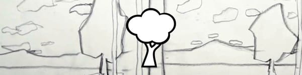
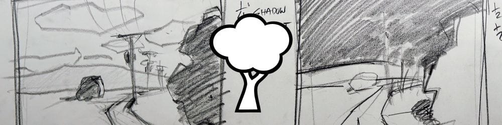
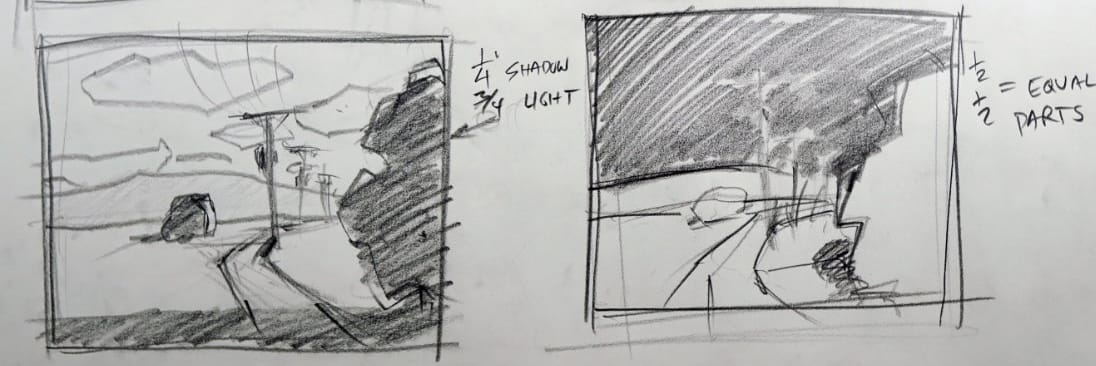
In the example sketch above, the large foreground shadow takes up roughly one-quarter of the design, while the remaining three-quarters is bathed in light. That imbalance creates visual strength and a natural sense of depth.
Avoiding Symmetrical Traps
It’s easy to fall in love with a photo reference and not notice that it divides evenly — half sky, half land, half light, half dark.
The problem is that equal divisions make for static, predictable paintings. To fix this, shift your horizon or shadow pattern slightly to favor one side. Even a small adjustment can change the energy completely.
When in doubt, choose imbalance over equality. The eye loves contrast and variety.
Practical Design Tips
- Start each painting by mapping the dominant value — light or dark.
- Use the ¼ vs ¾ rule as a guide for proportion.
- Avoid equal halves unless symmetry is intentional.
- Simplify early: block shapes into big light and dark masses.
- Test designs in pencil or marker thumbnails before painting.
Key Takeaways
- Strong designs rely on unequal value distribution.
- Use asymmetry to guide the viewer’s eye through your landscape.
- Simplify your design into light and dark masses before adding color.
- Avoid static, 50/50 layouts — imbalance adds energy and direction.
Course Navigation
Previous Lesson: Linear vs Mass Composition in Landscape Design
Next Section: Acrylic Landscape Painting Assignments and Practice
Acrylic Landscape Painting Course - view all lessons and modules
Learn & Improve Your Acrylic Skills
- Acrylic Hub– Your go-to guide for tutorials, tips, and resources.
- Ultimate Beginner Acrylic Course - Start painting with confidence.
- Subscribe for More Great Content - Get tutorials, tips, and updates straight to your inbox.
- Follow Me on Pinterest - Daily inspiration, tips, and fresh ideas.
Recommended Acrylic Painting Materials
-
Princeton Catalyst Brushes – Flats (#6, #12), Rounds (#4, #8), Fan (#4), Liner Brush
Durable synthetic bristles for versatile acrylic techniques -
Liquitex Heavy Body Acrylic Paint – Essential Colors
Cadmium Yellow, Yellow Ochre, Alizarin Crimson, Cadmium Red Light, Ultramarine Blue, Cobalt Blue, Burnt Sienna, Titanium White -
Winsor & Newton Cotton Canvas
Reliable stretched canvas for studio and plein air work -
Strathmore 400 Series Mixed Media Paper
Heavyweight, acid-free paper for acrylic and mixed media -
Fabriano Artistico 140lb Cold Press Paper
Excellent for acrylic, mixed media, and textured effects -
Blick Multi-Colored Painting Knife Set
Variety of shapes for texture, scraping, and bold strokes - Miscellaneous: Two pint-sized water containers, paper towels (from Home Depot or Walmart)
- Note: I use canvas or sturdy cardboard as my palette — no store-bought palettes needed.