Master's Analysis Part 2 - Adding Color to Your Levitan Study
Take your Levitan grayscale study to the next level by adding simplified color. Learn how to apply color to masses without breaking up your structure - essential skill for landscape painting.

Your grayscale value study is done. Now comes the fun part: color. But remember - you're still simplifying landscapes into masses. Just with color this time.
This lesson is part of the Acrylic Landscape Painting Fundamentals Course - learn to paint expressive landscapes from scratch.
The Goal Remains the Same
Each group gets its own simplified color. Each group has its own value.
You're not painting every detail you see in Levitan's work.
You're understanding how he used color within his simplified mass structure.
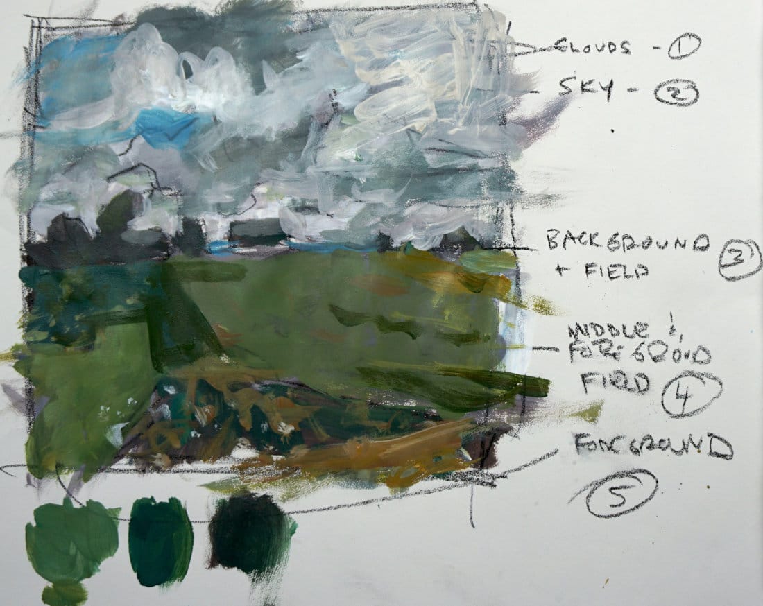
Starting with the Dark Green Field
That left-hand field running down through the painting? Start there.
Mix up a simplified green. Block it in. Don't overthink it.
Big picture first. Gradations later.
Get the base color down so you can see how it relates to everything else.
The Swatch Trick
See those green test swatches at the bottom of the study?
That's smart painting.
When you're mixing colors on your palette, they look different than when you put them on your painting. Having a test area helps you:
- Compare colors side-by-side
- See if your mix actually works
- Make adjustments before committing
Test your colors before you apply them.
Working Through the Groups
Group 1: Dark green field (left)
- Start here, establish your darkest green
Group 2: Lighter field (right)
- Add yellow ochre to warm it up
- Should be lighter and warmer than left field
Group 3: Sky
- Punches of blue breaking through
- Gray-blue sections in clouds
- Blue trickling down into hillside
Group 4: Clouds
- Mostly white/gray (from your value study)
- Add subtle blue and gray variations
- Don't break up the cloud mass with too much detail
Group 5: Buildings/trees (middle ground)
- Keep this dark and simplified
- Little roof catching light = small color accent
- Don't overwork it
Group 6: Foreground earth tones (optional)
- Warm browns working through the front
- Could be part of the field group
- Decide if it needs to be separate
The Complex Sky
Levitan's sky has SO much going on. Clouds, blues, grays, light breaking through.
You're not painting all of that.
You're getting the essence of it. The big shapes. The overall feeling.
Dark grays submerging into blues. Light clouds catching sun. That's it.
Simplify ruthlessly.
Making Decisions as You Go
"Does this color break up my group?"
Add a little blue to the sky. Step back. Does the sky still read as one or two unified masses?
If yes - keep going.
If no - simplify more.
Every color decision affects the whole.
This Isn't About Copying
You're not trying to recreate Levitan's exact painting.
You're learning:
- How he simplified color
- How he kept masses intact
- How he added gradations without chaos
- How color relates across groups
Take these lessons to YOUR landscapes.
When to Add Gradations
Once your base colors are down, you can start adding subtle shifts:
- Green lacing through the field
- Foreground getting slightly warmer
- Sky transitioning from gray to blue
But always check: Is this gradation serving the mass or breaking it?
Knowing When to Stop
This isn't a finished gallery painting.
It's a study. A learning exercise.
When you understand how Levitan used masses and color - you're done.
Don't keep noodling. Don't add every flower and grass blade.
Get what you need to learn, then move on.
What You Learned
By adding color to your Levitan study, you discovered:
- How to simplify complex color into clear groups
- How value is more important than color (you did value first!)
- How to test colors before committing
- How to add gradations without losing structure
- How masters think about color in masses
These lessons work for every landscape you paint.
The Big Picture
Even Levitan's dramatic, colorful landscapes are built on:
- 6-7 simplified masses
- Clear value structure
- Restrained color choices
- Careful gradations
Simplicity creates power.
You now understand this at a deeper level.
Course Navigation
Next Lesson: Practice Reel Assignment - Put everything into practice
Previous Lesson: Master's Analysis - Levitan - Grayscale value study
Course Hub: Acrylic Landscape Fundamentals
Learn & Improve Your Acrylic Skills
- Acrylic Hub– Your go-to guide for tutorials, tips, and resources.
- Ultimate Beginner Acrylic Course - Start painting with confidence.
- Subscribe for More Great Content - Get tutorials, tips, and updates straight to your inbox.
- Follow Me on Pinterest - Daily inspiration, tips, and fresh ideas.
Recommended Acrylic Painting Materials
-
Princeton Catalyst Brushes – Flats (#6, #12), Rounds (#4, #8), Fan (#4), Liner Brush
Durable synthetic bristles for versatile acrylic techniques -
Liquitex Heavy Body Acrylic Paint – Essential Colors
Cadmium Yellow, Yellow Ochre, Alizarin Crimson, Cadmium Red Light, Ultramarine Blue, Cobalt Blue, Burnt Sienna, Titanium White -
Winsor & Newton Cotton Canvas
Reliable stretched canvas for studio and plein air work -
Strathmore 400 Series Mixed Media Paper
Heavyweight, acid-free paper for acrylic and mixed media -
Fabriano Artistico 140lb Cold Press Paper
Excellent for acrylic, mixed media, and textured effects -
Blick Multi-Colored Painting Knife Set
Variety of shapes for texture, scraping, and bold strokes - Miscellaneous: Two pint-sized water containers, paper towels (from Home Depot or Walmart)
- Note: I use canvas or sturdy cardboard as my palette — no store-bought palettes needed.