Common Mistakes - Don't Break Up Your Masses
Avoid the most common landscape painting mistake: breaking up your simplified masses with too many details. Learn how to add variation while maintaining unity in your compositions.

You've simplified your masses. You've added gradations. Everything's working.
Then you ruin it. Here's how it happens - and how to stop it.
This lesson is part of the Acrylic Landscape Painting Fundamentals Course - learn to paint expressive landscapes from scratch.
The Most Common Mistake
You're painting the foreground. Your camera reference shows every blade of grass, every shadow, every tiny detail.
So you start adding them.
A little lighter value here. A darker patch there. A few more details over here.
Next thing you know, your beautifully simplified ground plane looks like confetti.
Your mass is broken.
What Happens in the Example
Look at that bottom left corner in the demo. I got carried away adding:
- Lighter patches
- Darker spots
- Random details
- Too many value changes
The foreground, which should read as ONE cohesive mass, now looks choppy and confusing.
The painting fell apart.
Why This Happens
The camera picks up everything.
Especially in the foreground where details are sharpest. Your brain sees all those subtle nuances and thinks "I should paint those!"
No. You shouldn't.
The Fix
Step back regularly.
Ask yourself: "Is this detail serving my mass, or breaking it up?"
If you're adding so many value changes that the mass no longer reads as one unified shape - stop.
You've gone too far.
The Rule
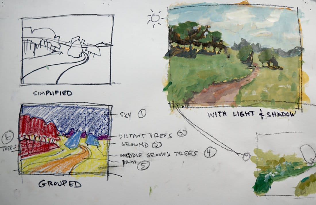
Each of your 6-7 groups should still read as a unified mass even after adding gradations and details.
Yes, there's variation within the mass. But it should still hold together as one shape.
Think: Variation WITHIN unity.
Not: Random patches everywhere.
How to Avoid This
1. Squint at your painting
If your masses disappear when you squint, you've broken them up too much.
2. Work on the whole painting
Don't get obsessed with one corner. Move around. Keep the big picture in mind.
3. Remember your original simplification
Go back to your masses drawing from Lesson 2. Are you honoring those groups?
4. Less is more
When in doubt, add less detail. You can always add more later.
The Reality
This mistake is incredibly common.
Even experienced painters fall into this trap when they zone out and start copying their reference photo detail-for-detail.
Your job isn't to copy the photo.
Your job is to interpret it into a simplified, cohesive painting.
Course Navigation
Next Lesson: Master's Analysis - Levitan - Learn from the pros
Previous Lesson: Gradations & Variations - Add depth to your masses
Course Hub: Acrylic Landscape Fundamentals
Learn & Improve Your Acrylic Skills
- Acrylic Hub– Your go-to guide for tutorials, tips, and resources.
- Ultimate Beginner Acrylic Course - Start painting with confidence.
- Subscribe for More Great Content - Get tutorials, tips, and updates straight to your inbox.
- Follow Me on Pinterest - Daily inspiration, tips, and fresh ideas.
Recommended Acrylic Painting Materials
-
Princeton Catalyst Brushes – Flats (#6, #12), Rounds (#4, #8), Fan (#4), Liner Brush
Durable synthetic bristles for versatile acrylic techniques -
Liquitex Heavy Body Acrylic Paint – Essential Colors
Cadmium Yellow, Yellow Ochre, Alizarin Crimson, Cadmium Red Light, Ultramarine Blue, Cobalt Blue, Burnt Sienna, Titanium White -
Winsor & Newton Cotton Canvas
Reliable stretched canvas for studio and plein air work -
Strathmore 400 Series Mixed Media Paper
Heavyweight, acid-free paper for acrylic and mixed media -
Fabriano Artistico 140lb Cold Press Paper
Excellent for acrylic, mixed media, and textured effects -
Blick Multi-Colored Painting Knife Set
Variety of shapes for texture, scraping, and bold strokes - Miscellaneous: Two pint-sized water containers, paper towels (from Home Depot or Walmart)
- Note: I use canvas or sturdy cardboard as my palette — no store-bought palettes needed.