Color Vibrations in Landscape Painting
Discover how color vibration brings life to acrylic landscapes. Learn broken color, scrubbing, and layering techniques to create energy and atmosphere.

Color vibration is one of those techniques that separates a flat, lifeless painting from one that feels alive and breathing. It’s the subtle interplay of color, value, and texture — when warm and cool tones sit side by side, or when bits of underpainting peek through and create a lively shimmer on the surface.
In this lesson, I show how to use color vibration to bring energy to skies, fields, and distant hills using acrylics on both white and toned surfaces.
This lesson is part of the Acrylic Landscape Painting Fundamentals Course.
What Is Color Vibration?
Color vibration happens when two colors of similar value but different temperature or hue sit next to each other without being blended. The eye perceives that subtle contrast as a “buzz” or movement — a sense of light and air within the painting.
You can create this naturally through broken color, scrubbing, or simply not overblending your strokes. It’s one of those painterly effects that comes more from how you apply paint than what colors you use.
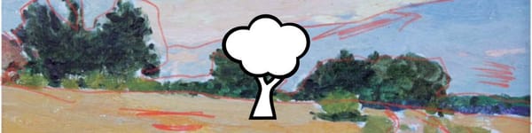
Two Starting Points: White vs. Toned Canvas
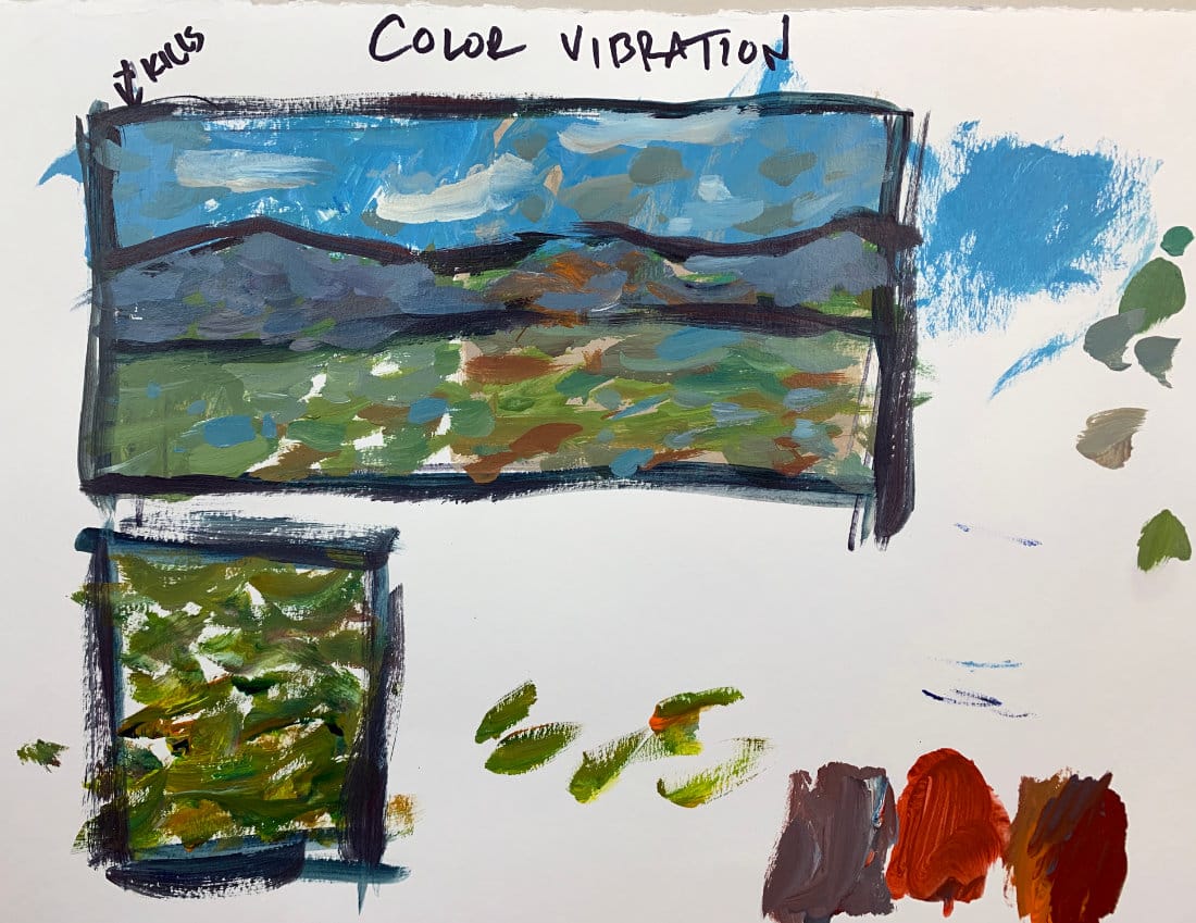
I start the demo by comparing two surfaces:
- White Canvas: High contrast; color vibration comes easily because each stroke stands out.
- Toned Canvas: Lower contrast but more unity; colors feel harmonized, and the vibration reads more subtly.
Try both. You’ll discover that the toned surface gives softer, more atmospheric results — perfect for landscapes.
Practical Ways to Achieve Color Vibration
- Leave Specks of the Underpainting Showing
Don’t cover everything. Bits of the base color or white canvas help your top layers breathe. - Use the Scrubbing Technique
Apply thin paint with the side of your brush so it skips across the surface, letting what’s beneath peek through. - Layer Broken Color
Place dabs of warm and cool hues of similar value next to each other — for instance, blue-green beside yellow-green — to create subtle shimmer. - Avoid Overblending
The quickest way to kill vibration is to blend everything into sameness. Let brushstrokes stay visible and distinct.
Why It Works in Landscapes
In nature, you’ll never find flat, uniform color. Grass, sky, and distant hills all contain variations in light and temperature. By letting color vibrate, you mimic that visual complexity — especially in open fields, tree canopies, or clouds where light constantly shifts.
Key Takeaways
- Color vibration adds visual energy through contrast in hue and temperature.
- Avoid blending every stroke — broken color keeps things lively.
- White canvas = stronger vibration; toned canvas = softer harmony.
- Use the technique anywhere a landscape feels “too flat.”
Course Navigation
Previous Lesson: Mixing Greens for Landscape Painting in Acrylics
Next Section: Cropping & Format Choice or Landscape Composition and Design
Acrylic Landscape Painting Course - view all lessons and modules
Learn & Improve Your Acrylic Skills
- Acrylic Hub– Your go-to guide for tutorials, tips, and resources.
- Ultimate Beginner Acrylic Course - Start painting with confidence.
- Subscribe for More Great Content - Get tutorials, tips, and updates straight to your inbox.
- Follow Me on Pinterest - Daily inspiration, tips, and fresh ideas.
Recommended Acrylic Painting Materials
-
Princeton Catalyst Brushes – Flats (#6, #12), Rounds (#4, #8), Fan (#4), Liner Brush
Durable synthetic bristles for versatile acrylic techniques -
Liquitex Heavy Body Acrylic Paint – Essential Colors
Cadmium Yellow, Yellow Ochre, Alizarin Crimson, Cadmium Red Light, Ultramarine Blue, Cobalt Blue, Burnt Sienna, Titanium White -
Winsor & Newton Cotton Canvas
Reliable stretched canvas for studio and plein air work -
Strathmore 400 Series Mixed Media Paper
Heavyweight, acid-free paper for acrylic and mixed media -
Fabriano Artistico 140lb Cold Press Paper
Excellent for acrylic, mixed media, and textured effects -
Blick Multi-Colored Painting Knife Set
Variety of shapes for texture, scraping, and bold strokes - Miscellaneous: Two pint-sized water containers, paper towels (from Home Depot or Walmart)
- Note: I use canvas or sturdy cardboard as my palette — no store-bought palettes needed.