Strategic Color Control in Acrylic Landscape Painting
Learn how to stay in control of your palette with this strategic color mixing approach focused on value, temperature, and chroma.

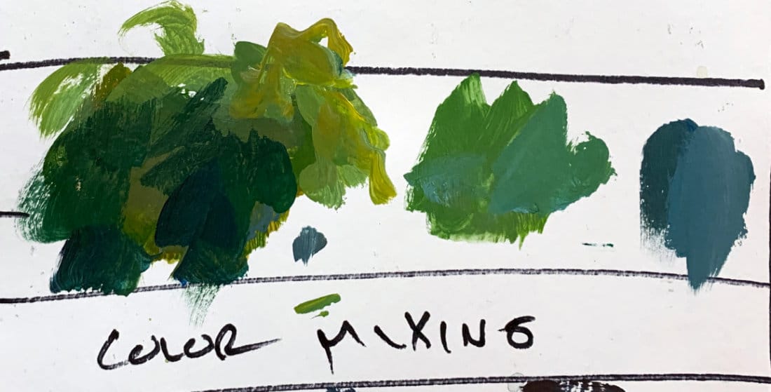
Color mixing isn’t just about memorizing formulas. It’s about observation and control — knowing what adjustments to make when a mixture isn’t working. In this lesson, I’ll walk through a strategic approach to mixing color using greens as the example, focusing on value, temperature, and palette management rather than the traditional primary/secondary system.
This lesson is part of the Acrylic Landscape Painting Fundamentals Course.
The First Question: Is the Value Right?
Every color decision starts with value. If the value is wrong, no amount of temperature or saturation tweaking will fix it. So before worrying about whether a green is too yellow or too blue, squint and ask yourself if it’s the right light or dark.
Warming and Cooling Adjustments
Once the value works, you can adjust the temperature.
- To warm up a color: add orange, red, or ochre.
- To cool it down: add blue or white.
Keep those tweaks subtle — a tiny touch of the opposite temperature can make a huge difference.
Staying in Control of Your Palette
When colors start to get muddy or dull, that’s usually a sign of overmixing.
Instead of fighting it, do this:
- Wipe your brush clean.
- Move to a fresh area of your palette.
- Remix with purpose, starting clean.
This small reset keeps mixtures fresh and saves time compared to endlessly adjusting a muddy pile.
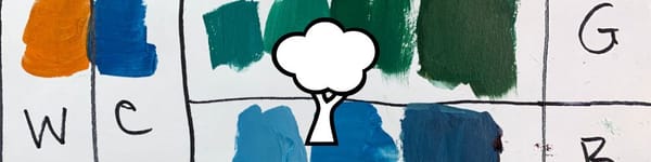
Managing Chroma (Saturation)
If your color looks too intense, the easiest way to knock it down is to mix in another color of similar value.
For example, add a muted blue-green to a high-chroma green. This keeps the value consistent while lowering saturation — no need to add white or black.
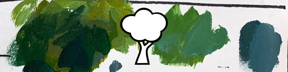
Light and Shadow Strategy
For landscapes, it’s useful to think in broad zones:
- Sunlit areas: slightly warmer, often leaning toward yellows or oranges.
- Shadows: typically cooler, leaning toward blues or violets.
But don’t treat this as a rule — it’s a starting point for observation, not a formula.
Key Takeaways
- Value is the foundation — fix that first.
- Clean palette = clean color.
- Knock down saturation using similar-value mixes, not just white.
- Warm light, cool shadows — use observation to guide your adjustments.
- Start bold; it’s easier to remove intensity than add it later.
Course Navigation
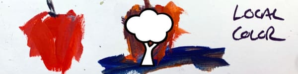
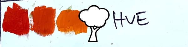
Previous Lesson: Understanding Local Color in Landscape Painting
Next Lesson: Mixing Black and Gray in Acrylic Painting
Acrylic Landscape Hub - see all resources and tutorials
Learn & Improve Your Acrylic Skills
- Acrylic Hub– Your go-to guide for tutorials, tips, and resources.
- Ultimate Beginner Acrylic Course - Start painting with confidence.
- Subscribe for More Great Content - Get tutorials, tips, and updates straight to your inbox.
- Follow Me on Pinterest - Daily inspiration, tips, and fresh ideas.
Recommended Acrylic Painting Materials
-
Princeton Catalyst Brushes – Flats (#6, #12), Rounds (#4, #8), Fan (#4), Liner Brush
Durable synthetic bristles for versatile acrylic techniques -
Liquitex Heavy Body Acrylic Paint – Essential Colors
Cadmium Yellow, Yellow Ochre, Alizarin Crimson, Cadmium Red Light, Ultramarine Blue, Cobalt Blue, Burnt Sienna, Titanium White -
Winsor & Newton Cotton Canvas
Reliable stretched canvas for studio and plein air work -
Strathmore 400 Series Mixed Media Paper
Heavyweight, acid-free paper for acrylic and mixed media -
Fabriano Artistico 140lb Cold Press Paper
Excellent for acrylic, mixed media, and textured effects -
Blick Multi-Colored Painting Knife Set
Variety of shapes for texture, scraping, and bold strokes - Miscellaneous: Two pint-sized water containers, paper towels (from Home Depot or Walmart)
- Note: I use canvas or sturdy cardboard as my palette — no store-bought palettes needed.