Atmospheric Perspective: Master’s Landscape Examples
Breaking down how master painters used edges, color, and value shifts to create atmosphere and depth in landscape painting.

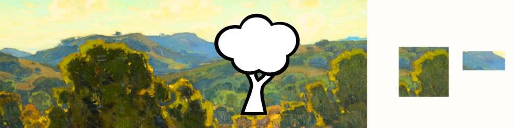
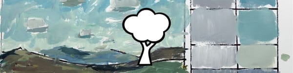
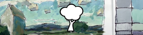
In this lesson, I’m breaking down how some of the greats handled atmospheric perspective. I pulled a few examples from William Wendt and other California Impressionists to show how they managed edges, color, and value to create believable depth.
This lesson is part of the Acrylic Landscape Painting Fundamentals Course.
What I Notice in These Paintings
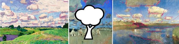
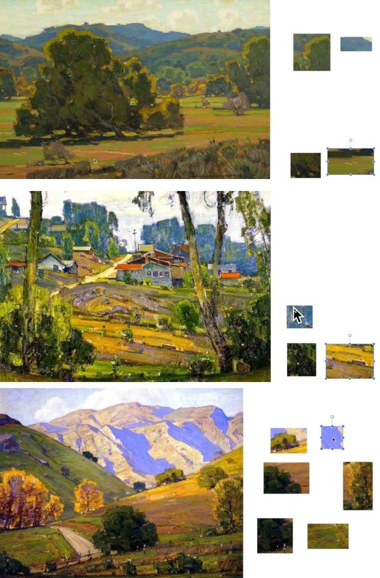
When you zoom in on a Wendt landscape, you can really see how the foreground and background speak two different visual languages.
- Foregrounds are packed with crisp edges, higher contrast, and warmer yellows and greens.
- Middle and distant planes gradually lose saturation and warmth, leaning cooler and lighter — often with a subtle blue or gray haze.
- Edges soften as things move back. Trees, buildings, and hills start to melt into the surrounding air, helping that sense of distance really come alive.
Even the shadows shift temperature — darker and warmer up front, lighter and cooler as they recede. It’s a small change that makes a huge difference.
Studying the Masters
Looking closely at these pieces, you’ll spot how every brush mark is working to organize space:
- Foreground color masses are heavier, more defined.
- Middle ground shapes simplify.
- Backgrounds fade to near abstraction — just a hint of tone and temperature to imply form.
These artists weren’t painting every leaf or rooftop — they were painting air and light.
When you start seeing those transitions in your own work, your paintings will immediately feel more believable and open.
Course Navigation
Previous Lesson: Atmospheric Perspective – Color Demo
Next Lesson: Atmospheric Perspective – Demonstration Part 1
Return to Hub: Acrylic Landscape Painting Fundamentals
Learn & Improve Your Acrylic Skills
- Acrylic Hub– Your go-to guide for tutorials, tips, and resources.
- Ultimate Beginner Acrylic Course - Start painting with confidence.
- Subscribe for More Great Content - Get tutorials, tips, and updates straight to your inbox.
- Follow Me on Pinterest - Daily inspiration, tips, and fresh ideas.
Recommended Acrylic Painting Materials
-
Princeton Catalyst Brushes – Flats (#6, #12), Rounds (#4, #8), Fan (#4), Liner Brush
Durable synthetic bristles for versatile acrylic techniques -
Liquitex Heavy Body Acrylic Paint – Essential Colors
Cadmium Yellow, Yellow Ochre, Alizarin Crimson, Cadmium Red Light, Ultramarine Blue, Cobalt Blue, Burnt Sienna, Titanium White -
Winsor & Newton Cotton Canvas
Reliable stretched canvas for studio and plein air work -
Strathmore 400 Series Mixed Media Paper
Heavyweight, acid-free paper for acrylic and mixed media -
Fabriano Artistico 140lb Cold Press Paper
Excellent for acrylic, mixed media, and textured effects -
Blick Multi-Colored Painting Knife Set
Variety of shapes for texture, scraping, and bold strokes - Miscellaneous: Two pint-sized water containers, paper towels (from Home Depot or Walmart)
- Note: I use canvas or sturdy cardboard as my palette — no store-bought palettes needed.