Acrylic Painting – Atmospheric Perspective Demo Part 3
I wrap up the atmospheric perspective demo by refining edges, pushing light, and balancing temperature to create believable depth.


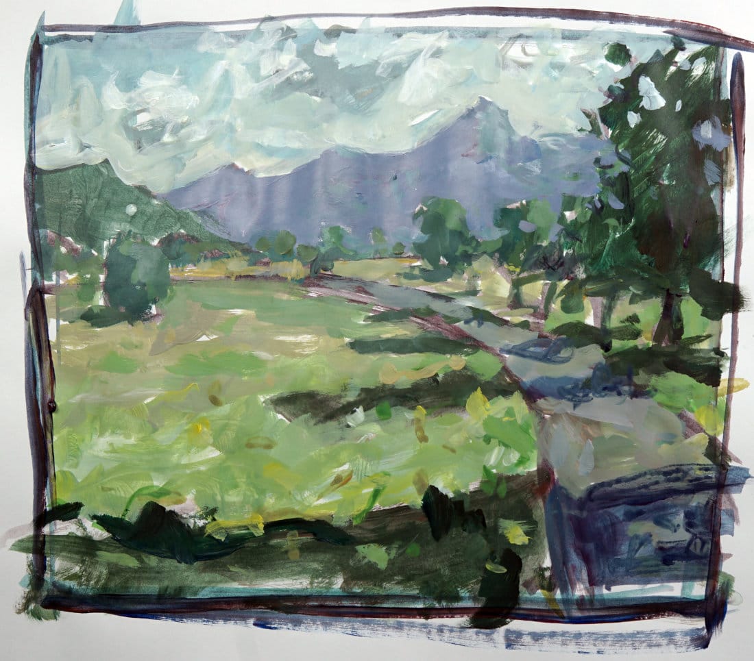
In this final part of the demo, I’m wrapping things up by adjusting edges, fine-tuning contrast, and pulling the whole painting together. Once the paint dries a little, I can better judge the true value range — acrylics often dry a bit darker, so I make a few tweaks to restore the light and contrast.
This lesson is part of the Acrylic Landscape Painting Fundamentals Course.
Refining the Sky and Edges
I finally jump into the sky and keep it warm and simple — just a touch of blue with soft gradation near the horizon. The trick is not to overdo the contrast between the sky and distant hills. I want just enough separation for clarity, but not so much that it kills the sense of atmosphere.
As clouds move away, their edges get sharper and easier to define; closer clouds, on the other hand, have softer, more diffused edges. The same logic applies to the hills — the farther they are, the less distinct the edges and contrast become.
Adding Light and Final Touches
I mix a little yellow and push it lightly through the foreground and path, just to hint at sun hitting those planes. As it moves back, that yellow fades and picks up more gray — that’s what keeps the space believable.
Then, a few final pops of light on the trees and clouds, maybe softening a few transitions to keep it painterly and loose. It’s all about creating harmony — no harsh edges or isolated colors fighting for attention.
In the end, this piece is a simple practice in applying the rules of aerial perspective — controlling edge quality, color temperature, and contrast. Once you get comfortable with that, you can start experimenting and making it your own.
Course Navigation
Previous Lesson: Atmospheric Perspective Demo – Part 2
Next Lesson: Atmospheric Perspective Assignment
Return to Hub: Acrylic Landscape Painting Fundamentals
Learn & Improve Your Acrylic Skills
- Acrylic Hub– Your go-to guide for tutorials, tips, and resources.
- Ultimate Beginner Acrylic Course - Start painting with confidence.
- Subscribe for More Great Content - Get tutorials, tips, and updates straight to your inbox.
- Follow Me on Pinterest - Daily inspiration, tips, and fresh ideas.
Recommended Acrylic Painting Materials
-
Princeton Catalyst Brushes – Flats (#6, #12), Rounds (#4, #8), Fan (#4), Liner Brush
Durable synthetic bristles for versatile acrylic techniques -
Liquitex Heavy Body Acrylic Paint – Essential Colors
Cadmium Yellow, Yellow Ochre, Alizarin Crimson, Cadmium Red Light, Ultramarine Blue, Cobalt Blue, Burnt Sienna, Titanium White -
Winsor & Newton Cotton Canvas
Reliable stretched canvas for studio and plein air work -
Strathmore 400 Series Mixed Media Paper
Heavyweight, acid-free paper for acrylic and mixed media -
Fabriano Artistico 140lb Cold Press Paper
Excellent for acrylic, mixed media, and textured effects -
Blick Multi-Colored Painting Knife Set
Variety of shapes for texture, scraping, and bold strokes - Miscellaneous: Two pint-sized water containers, paper towels (from Home Depot or Walmart)
- Note: I use canvas or sturdy cardboard as my palette — no store-bought palettes needed.