Atmospheric Perspective Acrylic Landscape Demo Part 2
In this demo, I add color and warmth to the landscape, shifting temperature and value to build believable light and depth.

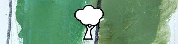
In this second part of the demo, I start introducing light and color temperature across the landscape. The idea here is to create variety without losing the overall unity — warmer, more saturated tones in the foreground and cooler, muted tones as we move back.
This lesson is part of the Acrylic Landscape Painting Fundamentals Course.
Adding the Lights
Before jumping into highlights, I do a quick check on my darker passages. Some of them are reading too dark, so I mix in a touch of blue to cool them and lift the value a little. Once that’s balanced, I begin introducing warmer yellows and oranges into the foreground — this instantly brings energy and depth to the scene.
Closer to the viewer, the ground plane gets more yellow and orange, while the middle ground transitions to lighter, duller versions of those same colors. The distant field still carries traces of warmth, but it’s filtered through cooler, grayer tones to maintain that sense of atmosphere.
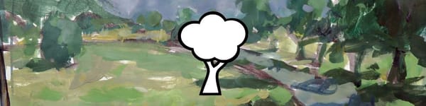
Fine-Tuning the Planes
As I work across the landscape, I start adding little bursts of light — a few flecks of yellow cutting through the shadows, a bit of orange on the sunlit field. The closer these marks are to the viewer, the stronger the temperature shift.
Farther back, I soften the edges and knock down the intensity, letting the cooler greens and muted violets take over. This helps the whole piece breathe.
For the trees, I keep the shadow shapes warm and dark in front, but cool them with blue-green mixes as they move back. Even a subtle change like that helps push depth.
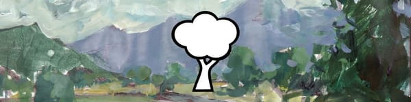
By the end of this pass, I’ve built a foundation of color and atmosphere that’s ready for refinement in Part 3.
Course Navigation
Previous Lesson: Atmospheric Perspective Demo – Part 1
Next Lesson: Atmospheric Perspective Demo – Part 3
Return to Hub: Acrylic Landscape Painting Fundamentals
Learn & Improve Your Acrylic Skills
- Acrylic Hub– Your go-to guide for tutorials, tips, and resources.
- Ultimate Beginner Acrylic Course - Start painting with confidence.
- Subscribe for More Great Content - Get tutorials, tips, and updates straight to your inbox.
- Follow Me on Pinterest - Daily inspiration, tips, and fresh ideas.
Recommended Acrylic Painting Materials
-
Princeton Catalyst Brushes – Flats (#6, #12), Rounds (#4, #8), Fan (#4), Liner Brush
Durable synthetic bristles for versatile acrylic techniques -
Liquitex Heavy Body Acrylic Paint – Essential Colors
Cadmium Yellow, Yellow Ochre, Alizarin Crimson, Cadmium Red Light, Ultramarine Blue, Cobalt Blue, Burnt Sienna, Titanium White -
Winsor & Newton Cotton Canvas
Reliable stretched canvas for studio and plein air work -
Strathmore 400 Series Mixed Media Paper
Heavyweight, acid-free paper for acrylic and mixed media -
Fabriano Artistico 140lb Cold Press Paper
Excellent for acrylic, mixed media, and textured effects -
Blick Multi-Colored Painting Knife Set
Variety of shapes for texture, scraping, and bold strokes - Miscellaneous: Two pint-sized water containers, paper towels (from Home Depot or Walmart)
- Note: I use canvas or sturdy cardboard as my palette — no store-bought palettes needed.