Acrylic Landscape Painting – Atmospheric Perspective Demo Part 1
Blocking in shadows and planning values for an atmospheric perspective painting. Learn how to cool colors and compress values for distance.


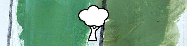
For this landscape painting demo, I’m using a familiar scene that has great layers for showing atmospheric perspective — distant hills, trees, and a winding path that naturally leads the eye back in space.
I start by sketching the main shapes and noting where light and shadow fall. I’m not getting too detailed — just mapping out the big masses and making sure my perspective and scale feel right. Once that’s set, I start blocking in the shadows first.
This lesson is part of the Acrylic Landscape Painting Fundamentals Course.
Setting the Foundation
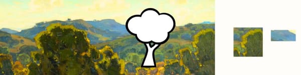
Before painting, I like to test my values on a scrap sheet so I don’t go too dark too soon. In acrylics, shadows tend to dry darker, so I always mix a touch lighter than I think I need.
Here’s what I’m thinking as I work:
- The foreground tree gets my darkest dark.
- As trees recede, I lighten the value and reduce the yellow — adding a little blue to cool them down.
- Distant hills shift even lighter and cooler, often picking up violet tones.
Each stage should feel like it’s breathing a little more air between you and the subject.
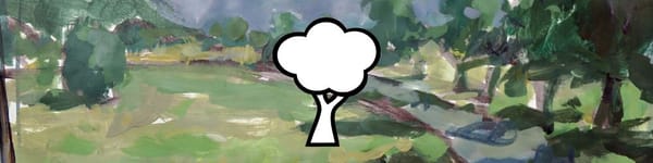
Laying in the Shadows
I move across the composition from foreground to background, adjusting the shadow temperature as I go. Closer shadows stay warmer and darker — more yellow or red in them — while distant shadows get cooler and lighter.
That gradual value and temperature change is what gives the illusion of distance.
Even though the scene might read as mostly green, the trick is knowing which greens belong to what plane.
This stage wraps up with all my shadow patterns mapped in and ready for the light pass next.
Course Navigation
Previous Lesson: Atmospheric Perspective – Master’s Examples
Next Lesson: Atmospheric Perspective Demo – Part 2
Return to Hub: Acrylic Landscape Painting Fundamentals
Learn & Improve Your Acrylic Skills
- Acrylic Hub– Your go-to guide for tutorials, tips, and resources.
- Ultimate Beginner Acrylic Course - Start painting with confidence.
- Subscribe for More Great Content - Get tutorials, tips, and updates straight to your inbox.
- Follow Me on Pinterest - Daily inspiration, tips, and fresh ideas.
Recommended Acrylic Painting Materials
-
Princeton Catalyst Brushes – Flats (#6, #12), Rounds (#4, #8), Fan (#4), Liner Brush
Durable synthetic bristles for versatile acrylic techniques -
Liquitex Heavy Body Acrylic Paint – Essential Colors
Cadmium Yellow, Yellow Ochre, Alizarin Crimson, Cadmium Red Light, Ultramarine Blue, Cobalt Blue, Burnt Sienna, Titanium White -
Winsor & Newton Cotton Canvas
Reliable stretched canvas for studio and plein air work -
Strathmore 400 Series Mixed Media Paper
Heavyweight, acid-free paper for acrylic and mixed media -
Fabriano Artistico 140lb Cold Press Paper
Excellent for acrylic, mixed media, and textured effects -
Blick Multi-Colored Painting Knife Set
Variety of shapes for texture, scraping, and bold strokes - Miscellaneous: Two pint-sized water containers, paper towels (from Home Depot or Walmart)
- Note: I use canvas or sturdy cardboard as my palette — no store-bought palettes needed.