Landscape Atmospheric Perspective Assignment
Simple exercise to explore color temperature in landscape painting. Mix scales with blue and yellow to see how temperature affects depth.

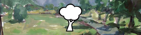
It’s time to put all the theory and demo work into practice! For this assignment, you’ll be creating two simple color scales to help you understand how color temperature affects depth in your paintings.
Assignment Steps
First Color Scale – Add Blue Gradually: Start with a pure color (I used green in my example). As you move up the scale, gradually mix in more blue. This cools the color and helps it recede visually, which mimics what happens naturally in landscapes.
Second Color Scale – Reduce Yellow: This time, do the opposite — keep the same base color, but slowly reduce the yellow as you go up the scale. This creates a cooler, more distant feeling even without adding extra blue.
Keep your brushstrokes loose and casual. The goal isn’t perfection — it’s to train your eye to see how subtle temperature shifts can make a huge difference in atmospheric perspective.
Course Navigation
Previous Lesson: Atmospheric Perspective Demo – Part 3
Return to Hub: Acrylic Landscape Painting Fundamentals
Congrats! You finished Section 4, Module 5 will be coming soon...
Learn & Improve Your Acrylic Skills
- Acrylic Hub– Your go-to guide for tutorials, tips, and resources.
- Ultimate Beginner Acrylic Course - Start painting with confidence.
- Subscribe for More Great Content - Get tutorials, tips, and updates straight to your inbox.
- Follow Me on Pinterest - Daily inspiration, tips, and fresh ideas.
Recommended Acrylic Painting Materials
-
Princeton Catalyst Brushes – Flats (#6, #12), Rounds (#4, #8), Fan (#4), Liner Brush
Durable synthetic bristles for versatile acrylic techniques -
Liquitex Heavy Body Acrylic Paint – Essential Colors
Cadmium Yellow, Yellow Ochre, Alizarin Crimson, Cadmium Red Light, Ultramarine Blue, Cobalt Blue, Burnt Sienna, Titanium White -
Winsor & Newton Cotton Canvas
Reliable stretched canvas for studio and plein air work -
Strathmore 400 Series Mixed Media Paper
Heavyweight, acid-free paper for acrylic and mixed media -
Fabriano Artistico 140lb Cold Press Paper
Excellent for acrylic, mixed media, and textured effects -
Blick Multi-Colored Painting Knife Set
Variety of shapes for texture, scraping, and bold strokes - Miscellaneous: Two pint-sized water containers, paper towels (from Home Depot or Walmart)
- Note: I use canvas or sturdy cardboard as my palette — no store-bought palettes needed.