Adding Local Color to Masses - Bring Your Landscape to Life
Add simplified local color to your landscape masses. Learn to mix and apply flat colors to each group before adding gradations and details in this fundamental acrylic painting lesson.

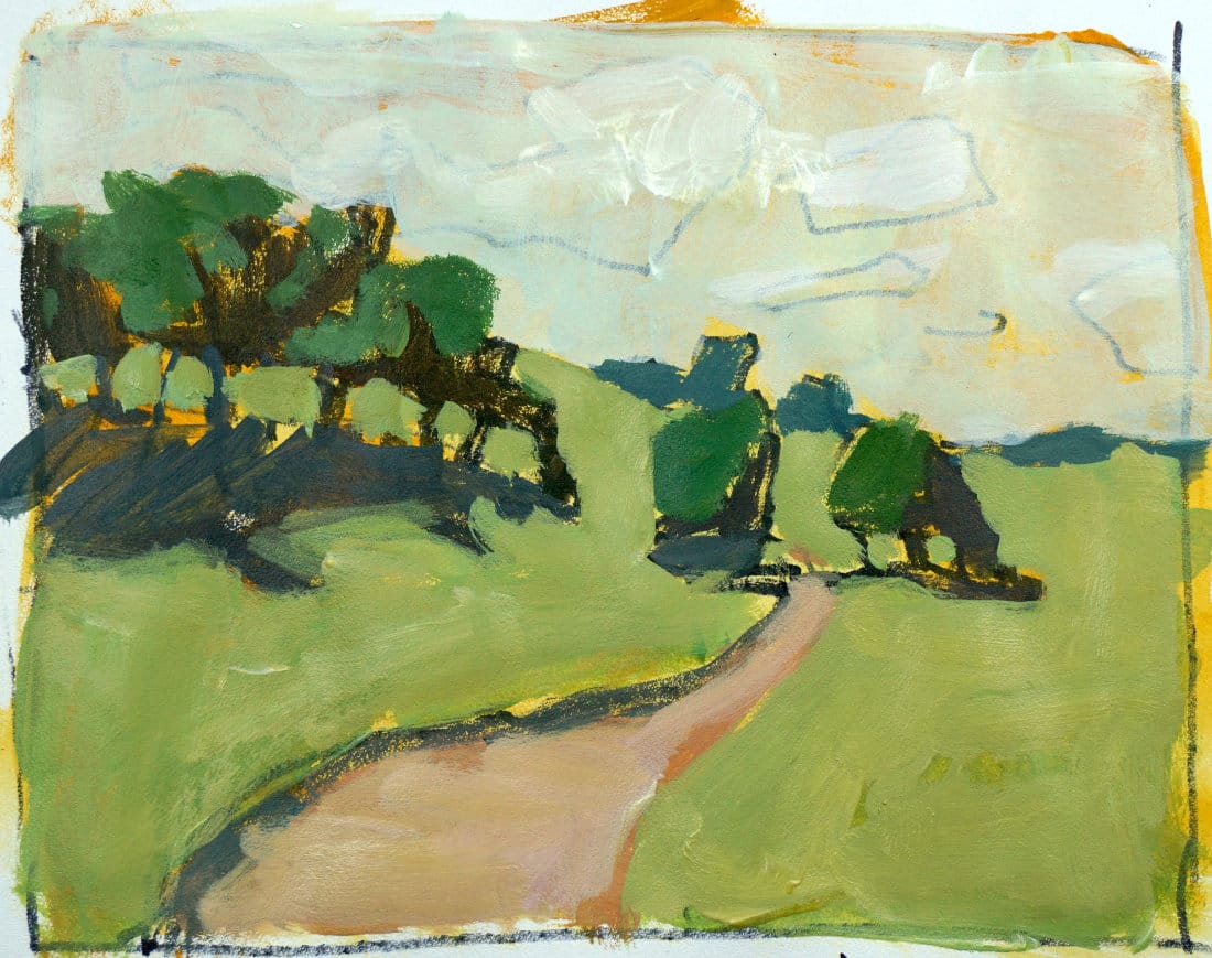
Time to add color to the landscape painting. But not gradations, not details, not subtle shifts. Flat, simplified color masses. That's it.
This lesson is part of the Acrylic Landscape Painting Fundamentals Course - learn to paint expressive landscapes from scratch.
The Palette
For this lesson, you'll need:
- Yellow Ochre
- Cadmium Orange
- Cadmium Red Light
- Cadmium Yellow Light
- Phthalo Blue
- Alizarin Crimson (optional but helpful)
- Titanium White
Simple setup. That's all you need.
Start with a Toned Surface (Optional)
I'm toning my drawing with ochre, orange, and white. Just a light wash.
Why? It gives me a warmer base to work from instead of stark white paper.
You don't have to do this. Some artists prefer working on white or a neutral gray. Your call.
Think in Groups, Not Details
Remember your 6-7 groups from Lesson 2? Now you're assigning one simplified color to each group.
Group 1: Dark tree shadows
- Mix phthalo blue + orange + red = dark green
- Paint ALL the tree shadows this same color
- Trunks, cast shadows on path, shadows under canopies = one color
Group 2: Sky
- Ochre + touch of phthalo + white = light neutral sky
- Ignore clouds for now (we'll add them later)
- One flat color across the entire sky
Group 3: Distant trees
- Phthalo + alizarin crimson = cool violet-green
- Pushing background trees cooler helps create depth
- One flat color for that entire hill
Group 4: Ground plane
- Yellow + ochre + touch of phthalo + white = warm light green
- Entire foreground field = one simplified hue
- Don't worry about grass texture yet
Group 5: Lit tree canopies
- Phthalo + yellow + touch of red = medium green
- Lighter than shadows, darker than ground
- Top of all trees = one color
Group 6: Path
- Crimson + red light + orange + ochre + blue + white = pinkish tan
- That S-curve winding through = one simplified color
Understanding Color Temperature
Notice I used alizarin crimson (cool red) for the distant trees instead of cadmium red (warm red)?
Here's why: Mixing warm red + blue = muddy gray. Mixing cool red + blue = cleaner violet.
Cool colors recede. Warm colors advance.
Distant trees should be cooler. Foreground should be warmer.
Everything Should Look Flat
Look at the painting above. Super flat. Almost graphic looking.
That's exactly right.
No gradations yet. No subtle shifts. Just big, bold, simplified color masses.
If you start adding details now, you're jumping ahead. Resist that urge.
Making Edits
Halfway through, I realized:
- The ground was too bright and green (distracting)
- The horizon line was too high (compressed the space)
- Some tree trunks were too evenly spaced (predictable)
So I changed them.
That's the beauty of these studies. You can tweak things without wasting hours on a finished painting.
The Reality Check (Again)
Step back. Look at your simplified color masses.
Do the colors relate to each other?
Are the values working?
Is anything too distracting?
Fix it now. Because in the next lesson, we're adding gradations - and you want a solid foundation first.
Course Navigation
Next Lesson: Gradations & Variations - Add depth and atmosphere
Previous Lesson: Light & Shadow Drawing - Define your masses with value
Course Hub: Acrylic Landscape Fundamentals
Learn & Improve Your Acrylic Skills
- Acrylic Hub– Your go-to guide for tutorials, tips, and resources.
- Ultimate Beginner Acrylic Course - Start painting with confidence.
- Subscribe for More Great Content - Get tutorials, tips, and updates straight to your inbox.
- Follow Me on Pinterest - Daily inspiration, tips, and fresh ideas.
Recommended Acrylic Painting Materials
-
Princeton Catalyst Brushes – Flats (#6, #12), Rounds (#4, #8), Fan (#4), Liner Brush
Durable synthetic bristles for versatile acrylic techniques -
Liquitex Heavy Body Acrylic Paint – Essential Colors
Cadmium Yellow, Yellow Ochre, Alizarin Crimson, Cadmium Red Light, Ultramarine Blue, Cobalt Blue, Burnt Sienna, Titanium White -
Winsor & Newton Cotton Canvas
Reliable stretched canvas for studio and plein air work -
Strathmore 400 Series Mixed Media Paper
Heavyweight, acid-free paper for acrylic and mixed media -
Fabriano Artistico 140lb Cold Press Paper
Excellent for acrylic, mixed media, and textured effects -
Blick Multi-Colored Painting Knife Set
Variety of shapes for texture, scraping, and bold strokes - Miscellaneous: Two pint-sized water containers, paper towels (from Home Depot or Walmart)
- Note: I use canvas or sturdy cardboard as my palette — no store-bought palettes needed.