Front-Lit Landscape Painting in Acrylic
Learn how to paint front-lit landscapes in acrylic. Find contrast and balance in bright lighting conditions where everything seems evenly lit.

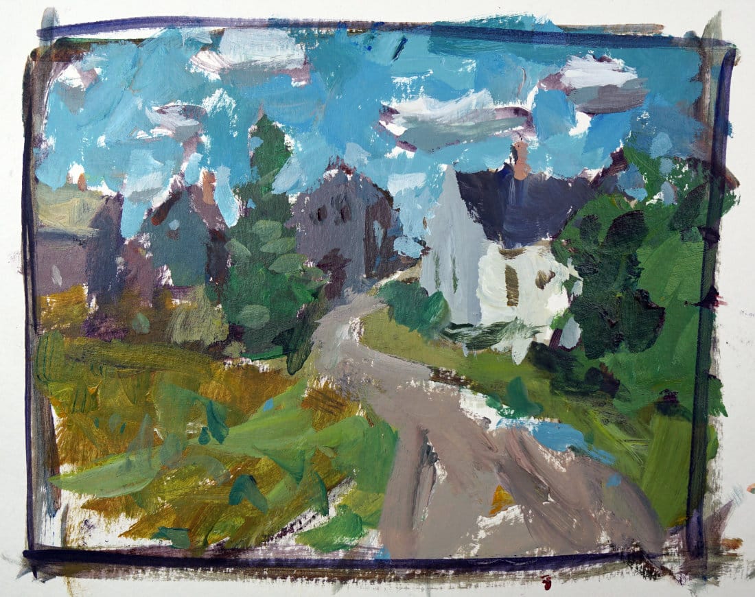
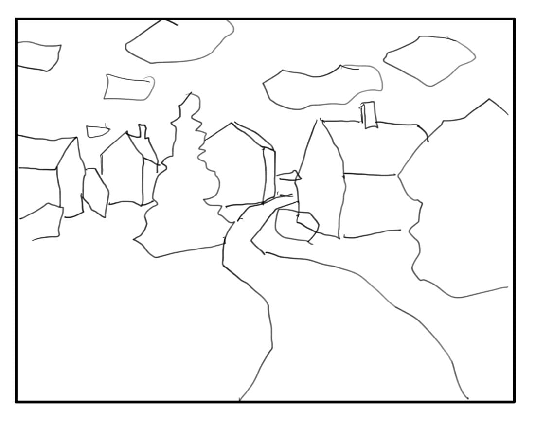
Front-lit landscape scenes can be both simple and challenging at the same time. In this demo, I’ll walk you through painting a landscape where the sunlight hits everything directly — the houses, trees, and the path — and show you how to create contrast even when the light feels flat.
This lesson is part of the Acrylic Landscape Painting Fundamentals Course.
Understanding Front Lighting
When the sun is directly behind you, the entire scene is illuminated evenly. That can make everything appear to share the same value — no strong shadows, no dramatic backlight — and that’s where the challenge lies. Instead of relying on lighting contrast, you need to look for local color contrast.
That could be something like a light house against dark trees, or yellow grass beside a deep green bush. If all the elements in your scene share similar values, it’s better to move on to a different setup. Front-lit conditions demand that you consciously seek light-against-dark or dark-against-light moments.
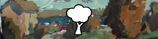
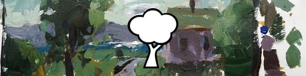
In my demo, I built the composition around a light-colored home with a winding path, darker background houses, and a few vertical trees that help break up the design. The placement of those elements is key — it’s what gives life to an otherwise even-toned landscape.
Painting Process and Color Choices
I started with the ground plane, mixing viridian with yellow ochre and a touch of red to get a natural, earthy hue. Adding white gave me a warm, sunlit tone for the grass. To keep things fresh, I introduced subtle color shifts — a bit of reddish brown in the foreground, fading to pale green as it recedes.
The trees are handled carefully; even though they’re darker than the grass, the sunlight still hits them, so I avoid going too deep in value. For the homes, I alternate warm and cool accents: violet and brown in the shadowed sides, greenish and reddish tones on roofs catching the light. This variation keeps everything feeling balanced without harsh contrasts.
Final Touches and Observations
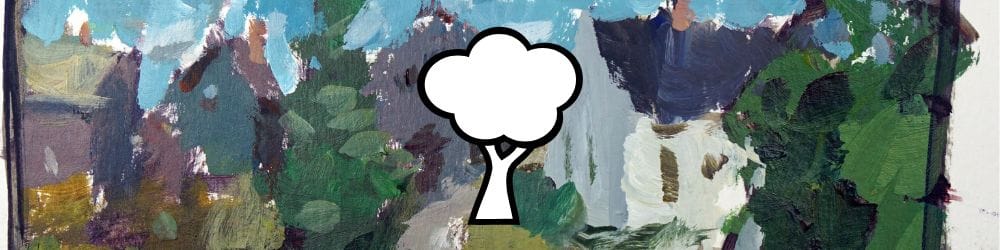
In front-lit scenes, the sky often appears darker than you’d expect — sometimes even close in value to the land. Using a mix of cerulean and viridian, I darken the top slightly, then soften it toward the horizon. A few subtle clouds add interest and help suggest depth.
The result is a calm, balanced composition that feels bright and open without being washed out. When painting front-lit subjects, always remember: if you can’t find natural contrast in the light, create it through color temperature, edges, and local value shifts.
Course Navigation
Next Lesson: Back-Lit Landscape Painting
Previous Lesson: Sunrise & Sunset Light Effects
Landscape Hub: View All Acrylic Landscape Lessons
Learn & Improve Your Acrylic Skills
- Acrylic Hub– Your go-to guide for tutorials, tips, and resources.
- Ultimate Beginner Acrylic Course - Start painting with confidence.
- Subscribe for More Great Content - Get tutorials, tips, and updates straight to your inbox.
- Follow Me on Pinterest - Daily inspiration, tips, and fresh ideas.
Recommended Acrylic Painting Materials
-
Princeton Catalyst Brushes – Flats (#6, #12), Rounds (#4, #8), Fan (#4), Liner Brush
Durable synthetic bristles for versatile acrylic techniques -
Liquitex Heavy Body Acrylic Paint – Essential Colors
Cadmium Yellow, Yellow Ochre, Alizarin Crimson, Cadmium Red Light, Ultramarine Blue, Cobalt Blue, Burnt Sienna, Titanium White -
Winsor & Newton Cotton Canvas
Reliable stretched canvas for studio and plein air work -
Strathmore 400 Series Mixed Media Paper
Heavyweight, acid-free paper for acrylic and mixed media -
Fabriano Artistico 140lb Cold Press Paper
Excellent for acrylic, mixed media, and textured effects -
Blick Multi-Colored Painting Knife Set
Variety of shapes for texture, scraping, and bold strokes - Miscellaneous: Two pint-sized water containers, paper towels (from Home Depot or Walmart)
- Note: I use canvas or sturdy cardboard as my palette — no store-bought palettes needed.