Understanding Color Intensity: Chroma, Saturation, and Value Control
This tutorial clarifies the relationship between chroma, saturation, and color intensity - terms that describe the same color property. You'll learn systematic methods for reducing color intensity while maintaining value relationships

This tutorial clarifies the relationship between chroma, saturation, and color intensity - terms that describe the same color property. You'll learn systematic methods for reducing color intensity while maintaining value relationships, essential skills for controlling color temperature and creating harmonious color schemes.
This lesson is part of the Acrylic Landscape Painting Fundamentals Course.
Watch Video: Learn tips for color theory.
What These Terms Actually Mean
For practical painting purposes, I treat chroma, saturation, and intensity as the same thing - they all describe how pure or vivid a color appears. A color straight from the tube represents maximum intensity. Any mixing that introduces neutral elements reduces that color's visual impact.
Technical Note: Color theorists distinguish between these terms (chroma relates to colorfulness vs brightness, saturation to colorfulness vs the color's own brightness), but for studio work, these distinctions rarely affect painting decisions. The systematic approach matters more than theoretical precision.
The Challenge: Reducing Intensity While Preserving Value
The critical skill involves reducing a color's intensity without changing its value relationship within your painting. This requires understanding how to match values across different hues and create systematic desaturation methods.
Value Matching Technique
Gray Scale Method
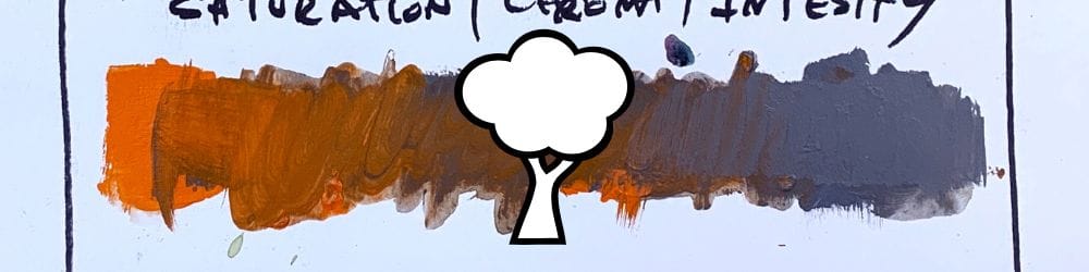
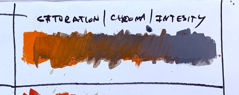
To reduce chroma systematically, first mix a neutral gray that matches your target color's value. This gray represents complete desaturation of your original color.
Testing Your Value Match
- Create swatches of your pure color and mixed gray
- Photograph both swatches in good daylight
- Convert the photo to grayscale to verify value accuracy
- Adjust gray mixture if values don't match
Systematic Desaturation Process
Creating the Scale
Once you have a value-matched gray, create intermediate steps by mixing varying proportions of your pure color with the gray. This produces a range from high chroma to completely neutral while maintaining consistent value.
Practical Application
This method solves common painting problems where a color appears correct in value but too intense for the composition. Rather than changing the color entirely, you can dial down its intensity precisely.
Why This Matters for Color Control
Compositional Harmony
Overly intense colors can disrupt visual balance. Systematic desaturation allows you to maintain color relationships while controlling visual impact.
Temperature Relationships
Understanding chroma control helps manage warm and cool relationships without accidentally shifting values, which affects form and light patterns.
Color Mixing Efficiency
Rather than guessing at color modifications, this systematic approach provides predictable results for intensity adjustments.
Advanced Considerations
Neutral Gray Mixing
Create truly neutral grays by balancing warm and cool pigments rather than using black and white alone. This prevents unwanted color bias in your desaturation process.
Daylight Evaluation
Color relationships change under different lighting conditions. Always evaluate color matches in consistent, natural lighting for accurate assessment.
Progressive Mixing
Work gradually when creating intensity scales. Small additions of gray or pure color allow precise control over the desaturation process.
Recommended Practice Exercise
- Select a high-chroma color straight from the tube
- Mix a value-matched neutral gray using systematic comparison
- Create a five-step scale from pure color to complete desaturation
- Test under daylight and photograph for grayscale verification
- Evaluate accuracy and adjust technique accordingly
This systematic approach to chroma control provides the foundation for sophisticated color mixing and harmonious color relationships in painting. Understanding these relationships allows intentional color choices rather than accidental results.
Course Navigation
Previous Lesson: Warm and Cool Colors in Landscape Painting
Next Lesson: Understanding Color Value Relationships - coming soon....
View Acrylic Landscape Painting Hub for all lessons.
Learn & Improve Your Acrylic Skills
- Acrylic Hub– Your go-to guide for tutorials, tips, and resources.
- Ultimate Beginner Acrylic Course - Start painting with confidence.
- Subscribe for More Great Content - Get tutorials, tips, and updates straight to your inbox.
- Follow Me on Pinterest - Daily inspiration, tips, and fresh ideas.
Recommended Acrylic Painting Materials
-
Princeton Catalyst Brushes – Flats (#6, #12), Rounds (#4, #8), Fan (#4), Liner Brush
Durable synthetic bristles for versatile acrylic techniques -
Liquitex Heavy Body Acrylic Paint – Essential Colors
Cadmium Yellow, Yellow Ochre, Alizarin Crimson, Cadmium Red Light, Ultramarine Blue, Cobalt Blue, Burnt Sienna, Titanium White -
Winsor & Newton Cotton Canvas
Reliable stretched canvas for studio and plein air work -
Strathmore 400 Series Mixed Media Paper
Heavyweight, acid-free paper for acrylic and mixed media -
Fabriano Artistico 140lb Cold Press Paper
Excellent for acrylic, mixed media, and textured effects -
Blick Multi-Colored Painting Knife Set
Variety of shapes for texture, scraping, and bold strokes - Miscellaneous: Two pint-sized water containers, paper towels (from Home Depot or Walmart)
- Note: I use canvas or sturdy cardboard as my palette — no store-bought palettes needed.